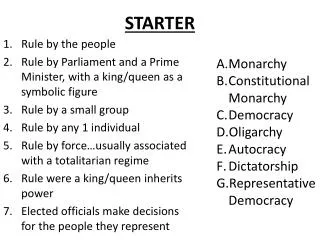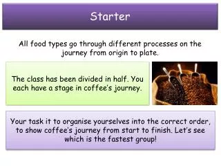
Starter
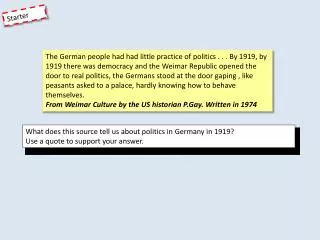
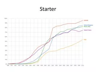
Starter. What do you think this represents?. Starter - Answer. Internet users as percentage of population. Lesson Objectives. Be able to create graphs using spreadsheet software Be able to label graphs and charts appropriately. Be able to select an appropriate chart for a specific data set.

Starter
E N D
Presentation Transcript
Starter • What do you think this represents?
Starter - Answer Internet users as percentage of population
Lesson Objectives • Be able to create graphs using spreadsheet software • Be able to label graphs and charts appropriately. • Be able to select an appropriate chart for a specific data set
Graphs • This is the same data you saw on the first slide for the UK. • Why is this less useful?
What are they good for? Pie Charts • Displaying the proportion that each ‘group’ is of the whole. Bar/Column Charts • Comparing values across different categories.
Task 1 – Which Graph? Scatter Graphs • To see how closely one quantity depends on another (correlation). Line Graphs • Showing trends. Usually over time.
Task 1 – Which Graph? • Put the following 4 subheadings in your book leaving 3 lines between each one. Scatter Graph Line Graph Pie Chart Bar/Column Chart • Write the following scenarios under the correct sub-heading: Finding the most popular type of chocolate bar from the pupils in your class. Comparing sales figures across departments Comparing a pupils attendance with their average GCSE score. Tracking the value of a car over 10 years.
Answers Finding the most popular type of chocolate bar from the pupils in your class. Comparing sales figures across departments Tracking the value of a car over 10 years. Comparing a pupils attendance with their average GCSE score.
Task 2 • You will need the files saved in the following folder: >Dept Share > ICT…etc… > Practical Skills > 14 – Spreadsheets > Lesson 5 - Graphs > Task 2 Files • Complete the following activities: • 14.18 – Pages 194-196 • 14.19 – Pages 197-202 • 14.20 – Pages 203-204 • 14.21 – Pages 204-206 • 14.22 – Pages 206-209 • Extension – Enter some data of your own into Excel and use this to create a suitable graph When asked to print, choose ‘Adobe PDF’ as the printer. Save the PDFs to your Practical Skills folder.
Plenary • Describe what the following graphs are used for. • Line Graph • Bar Chart • Pie Chart • Scatter Graph