Download
1 / 20
200 likes | 348 Vues
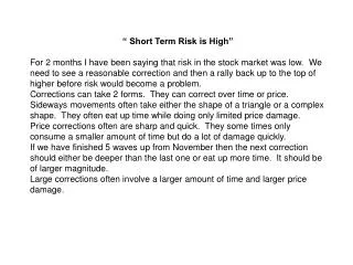
“ Short Term Risk is High” For 2 months I have been saying that risk in the stock market was low. We need to see a reasonable correction and then a rally back up to the top of higher before risk would become a problem.

E N D
“ Short Term Risk is High” For 2 months I have been saying that risk in the stock market was low. We need to see a reasonable correction and then a rally back up to the top of higher before risk would become a problem. Corrections can take 2 forms. They can correct over time or price. Sideways movements often take either the shape of a triangle or a complex shape. They often eat up time while doing only limited price damage. Price corrections often are sharp and quick. They some times only consume a smaller amount of time but do a lot of damage quickly. If we have finished 5 waves up from November then the next correction should either be deeper than the last one or eat up more time. It should be of larger magnitude. Large corrections often involve a larger amount of time and larger price damage.
There are additional concerns. From the March high the market moved sideways. It is fairly easy to see a triangle. After the strong move up which normally is a wave 3, a 4th wave triangle confirms that it was a wave 3. When the triangle ends you will have 1 more move in the same direction the market was traveling before the triangle. In this case it would be a move UP.(5TH WAVE) That completed a 5 wave advance from the late Feb low.
5th Wave Wedge Triangle 5 waves up from late Feb low. Wave 3 sub-divided into 5 wave also. In the 5th wave, since wave 4 down cut into the top of wave 1 around Feb 27th it tells us that wave 5 is a diagonal wedge which will quickly retrace 100% of it’s self.
Russell 2 is lot weaker than the S&P Weakness being led by the small caps!! NOT GOOD
5 waves up from mid November low Target for the correction should be between 38 to 50% of the total move up. 1570 – 1350 = 220 PT X 38% = 84 1570 – 84 = 1486 area (4th wave of lesser degree is 1540 down to 1490) Should be larger 3 wave formation. A down, B up, C down
Previous advance from June 2012 to Sept and sell off into mid Nov that retraced 70% of the previous advance.
The most positive thing about the Nasdaq Summation is that the top was made when it was above 2,400 even though it has now fallen to below 1800 and still declining. While my model stayed positive so I stayed invested. Rarely do major decline begin from a summation well above 2000. I was surprised by the strong rally that began on the 8th. While the Russell is still a little weaker than the Blue Chips, it is performing pretty well. The breakout by the S&P seems to indicate that another larger 5th wave began at the 1540 intraday low. If so the current move is a strong wave 3 with in the subdividing 5th wave up. It clearly has further to go.
McClellan Market Report BOTTOM LINE Look for a sudden burst of volatility, a quick hit that should take the major averages down into a bottom due April 12-17. We don’t know what news might spark it, but it should get people saying that, “this is the correction everyone’s been looking for.” After that quick hit, look for the market to find its footing again, and push to a marginally higher top due May 8. That should cause everyone to conclude the correction is over, and to start leaning the wrong way. Then the real ugliness begins, and should bring a more severe decline from that May 8 top toward a bottom due in September. Gold appears to be putting in its major 13-1/2 month cycle bottom right about now, and indeed the bottom may already be in. Sentiment toward both gold and silver is horrendously bearish, just right for a bottom.
World Market’s Already Showing Pain
The Fed’s continuous pumping of money into the banking system has been helping keep the stock market aloft, or at least that is the case for the U.S. stock market. But already the rest of the world’s markets are starting to show pain in a meaningful way. The chart stack here on page 1 shows the SP500 versus the German DAX, the London FTSE, and the Paris CAC 40. Those 3 European exchanges are already down 4-5% from their recent highs, not tagging along with the SP500’s effort to make an incremental new high. We already know that the Fed’s $85 billion of QE bond purchases has a bullish effect. But is it bullish enough? It is analogous to trying to fill a sink hole with sand. We know how much sand the Fed is bringing in, but we don’t know how big the sink hole is, nor how fast the new sand is getting eaten up by the sink hole monster. What we do know is that when the U.S. surges to higher highs and that action is not matched by the other world markets, it can be a sign of larger problems than the Fed can fix. The U.S. financial crisis is often blamed on out of control mortgage markets, excessive sub-prime lending, and a failure by Washington DC to appropriately regulate all of it. But if that’s true, then loose lending standards on Miami condos
and Las Vegas houses must also have brought down all of Europe and Asia, and that’s a bit of a stretch. The reality is that we are in a worldwide market for financial liquidity, and it flows to where it thinks it will be treated best. When the U.S. looks fine but money is flowing out of the rest of the world, the message is that someone pulled the plug on the liquidity bathtub. This can perhaps be seen even better when we look at the emerging markets, which are arguably even less deserving of investors’ in an environment where liquidity is drying up. The chart on page 2 shows a comparison of the SP500 and EEM, which is the iShares MSCI Emerging Markets ETF. EEM peaked back on January 2, 2013, and has been in a downtrend ever since, even though the SP500 pushed ahead to higher highs. Interestingly, this divergence effect is a relatively new phenomenon. Back in 2007, EEM swooped up to a blowoff peak coincident with the peak in the U.S. markets, and in spite of downturns in the European markets. Chalk that up to speculative enthusiasm at the end of a bull market.
Since then, EEM has done a really nice job of serving as one of the liquidity canaries, turning down ahead of the SP500 when liquidity starts to dry up. This disparity between the U.S. and world markets is much more likely to matter in a big way after the top due in early May, which we discuss in greater depth on page 8. Bottom Line: The rest of the world’s market’s are already saying that there are liquidity problems, in spite of the money printing that the Federal Reserve is doing. Perhaps $85 billion per month is just not enough.
Bottom Could Be Here There is an important cycle in gold prices which produces meaningful bottoms about every 13-1/2 months. It is shown in the top chart on page 4. There is a lot more detail to the way that this cycle behaves, including its tendency to see an important mid-cycle low about halfway between the major cycle lows. The mid-cycle low is not the issue of the moment, so we’ll save that for another time. What is important at this juncture is that a major 13-1/2 month cycle bottom is due right about now, and indeed it may already be here. It is not actually due until May, but it is also not precisely punctual. It can come a month early or late, and still be considered “on time”. And as we saw in 2012, it can also split into two separate bottoms, with the pair centered on the cycle bottom date. That same split phenomenon also occurred back in 2006 (not shown). So with a cycle low due anytime now, the task turns to identifying whether the current condition is worthy of such a bottom. The middle chart provides evidence that this could be that bottoming condition now. Spot gold prices have now pulled back down to test the top side of the broken declining tops line which dates back to the 2011 top. At the same time, the commercial traders’ net position in gold futures is at a bottom-worthy low level.
The commercial gold futures traders have been continuously net short to varying degrees ever since late 2001, so the game consists of evaluating their relative net short position. Last week’s COT Report showed them at a comparatively low level, not quite as low as we saw just a few weeks earlier, but consistent with the levels that were good enough to put in the bottoms in May through July 2012. It is an even more extreme situation in silver futures, as shown in the bottom chart. The commercial silver futures traders are back down almost to the low level of a net short position seen in late June 2012. From the associated price low, silver prices mounted a rally of 32% from low to high. There is no guarantee we’ll get that big of a rally this time. Our point is only that the COT data are in a similar condition to what produced that sized rally the last time the commercial traders were this bullish. The commercials are presumed to be the “smart” money, and proven to be eventually right nearly every time. That qualifier of “eventually” is an important one. Bottom Line: Gold is due for a cycle bottom that we have been waiting for over the past several months. There is no telling exactly when the bottom should arrive, but the sentiment data from the COT Report are saying that it is close, if not already here.
Trend Indicator Shows Topping Condition There is an indicator we have made a lot of use of over the years, which we came to call our Trend Indicator. It is more difficult to calculate than a lot of other indicators, but we find it is worth the extra trouble for the cool insights it provides. We start by calculating the Price Oscillator for the SP500 (or for any other price series). Then we calculate a Summation Index of all previous Price Oscillator values. Dividing that Summation Index by 10 puts it back down into the realm of where prices are, as the “Sum/10” line shows in the top chart on page 5. It acts somewhat like a moving average, but no simple or exponential moving average moves exactly like this line does. After going through all that math, we finally get to the Trend Indicator, which represents how far the price is above or below the Sum/10 line. It is an unbounded oscillator, moving above and below its zero line, and getting to overbought or oversold readings at extreme points. That’s all nice, and not much different from other indicators. Where it gets really interesting is in how the Trend Indicator relates to its own 5.8% Trend. Why a 5.8% smoothing constant? The answer is that it just seems to work right. Having the Trend Indicator cross through its 5.8% Trend successfully is a useful sign of trend reversal. But there are also minor penetrations which can be a fake out.
Seeing the Trend Indicator fail to penetrate the 5.8% Trend is a much more decisive signal, and we are just now seeing one of those. Generally speaking, the final price high for an uptrend won’t come at the most extreme Trend Indicator reading. Instead, the final tops usually come as the Trend Indicator fails at the underside of its 5.8% Trend line. That understandably also means that there will be a divergent condition relative to prices. So we have a potential top signal condition.
have a potential top signal condition. But does that mean the market is ready to go down? The bottom chart on page 5 may help us with that question. It shows an indicator known as the Choppiness Index. Created by E.W. “Bill” Dreiss, it is intended to quantify how linear or non-linear price action has been over the lookback period. Readings below 38% show very linear recent behavior, and suggest that a non-trending period is likely. High readings like the one we are seeing now indicate a decidedly choppier period, and the implication is that it should be followed by a trending period for a prices in one direction or the other. One problem is that this indicator does not say in which direction prices might trend, only that a trending move is more likely. We are left to watch for signs of actual price movement to divine which direction that trend expectation was talking about. The inference which we make, based on all our work and especially on the Trend Indicator condition described above, is that a down move is the more likely answer to the expectation for a “trending” move.