Download
1 / 3
30 likes | 139 Vues
Beautiful pictures, well written copy, awesome testimonials…now if I could only find that miniscule size 8 font, “contact me” link located 3 screen scrolls down and on the bottom left hand side of the page!

E N D
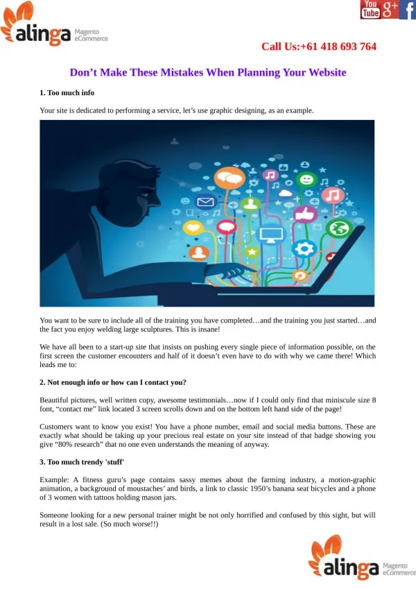
Call Us:+61 418 693 764 Don’t Make These Mistakes When Planning Your Website 1. Too much info Your site is dedicated to performing a service, let’s use graphic designing, as an example. You want to be sure to include all of the training you have completed…and the training you just started…and the fact you enjoy welding large sculptures. This is insane! We have all been to a start-up site that insists on pushing every single piece of information possible, on the first screen the customer encounters and half of it doesn’t even have to do with why we came there! Which leads me to: 2. Not enough info or how can I contact you? Beautiful pictures, well written copy, awesome testimonials…now if I could only find that miniscule size 8 font, “contact me” link located 3 screen scrolls down and on the bottom left hand side of the page! Customers want to know you exist! You have a phone number, email and social media buttons. These are exactly what should be taking up your precious real estate on your site instead of that badge showing you give “80% research” that no one even understands the meaning of anyway. 3. Too much trendy 'stuff' Example: A fitness guru’s page contains sassy memes about the farming industry, a motion-graphic animation, a background of moustaches’ and birds, a link to classic 1950’s banana seat bicycles and a phone of 3 women with tattoos holding mason jars. Someone looking for a new personal trainer might be not only horrified and confused by this sight, but will result in a lost sale. (So much worse!!)
Yes, your Magneto online store or ecommerce site can be built to look good and showcase a variety of things —but they don’t have to hit every trend available to offer value to your customer. No infographic in the world will get to the point faster than clear information on what type of training you provide and if your clients successfully achieved their goals. Working with a Brisbane Magneto developer will help with weeding out the trendy garbage leaving only the essential design aesthetics. Do you worry that your site is making mistakes and instead of drawing in customers you are pushing them away? We would be happy to talk with you and evaluate how you are doing. Please get in contact with us today, visit Alinga Magneto eCommerce, for a free quote!
Company Name : Magento Web design Address : 1 Como Crescent, Gold Coast QLD 4215, Australia Contact Number : +61 418 693 764 Email ID : alingawebdesign@gmail.com Website : http://www.magentowebdesign.net.au