Analysing finished magazine
100 likes | 262 Vues
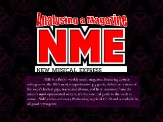
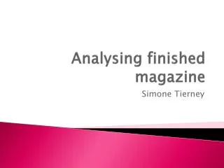
Analysing finished magazine. Simone Tierney. Analysing finished magazine. Issue number. Date. Price. Mast head. Logo. Barcode. Slogan . Splash. Sub title. Main picture . Logo & Font .

Analysing finished magazine
E N D
Presentation Transcript
Analysing finished magazine Simone Tierney
Analysing finished magazine Issue number Date Price Mast head Logo Barcode Slogan Splash Sub title Main picture
Logo & Font I have chosen to put the school logo in my magazine so that people are aware that it is about the school. I have chose the font I have used as it is very similar to the school logo, this makes it look more relevant, related and more professional to the school
Font colour The font colour that I have chosen to use is red, yellow and green, I have used these colours as they match the colour theme that the school uses. This again makes the magazine look like it is made for the school in a professional way. I have also used these colours as they are easy to read, bold and are eye catching.
Background I have chosen to use a black colour background as it makes the text colours stand out more. I have chosen it not to be patterned or as a picture background as I don't want it to be more dominant than my text, so using no patterned background makes the text more noticeable and eye catching.
Main background image My main background image is a group of teenagers with revision books in there hand. I have used this as it is relevant with what my magazine is about. I have made the edges of the image blurry so that the students within the image stand out.
Slogan My slogan for my magazine is ‘Bringing the latest news about Hazeley academy sixth form’ I have used this as it straight to the point and people would know exactly what the magazine is about, which would make the audience want to know what it says inside.
Name My name of my magazine is called ‘Sixth form updates’, I have chosen this name as it sounds professional and easy to know what would be included in it.
Splashes I have done splashes of the different things that are included in the magazine. These are in bright colours to stand out so people are more interacted to want to buy the magazine. Younger people are more intrigued by colour, so my magazine being colour makes the younger audience want to read it.
Price The price of my magazine is at £1.50. I have chosen it at this price as it is reasonable and affordable for sixth form students and parents.