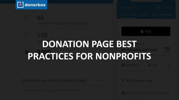
Optimizing Donation Pages: A Comprehensive Approach to Boosting Engagement and Conversions
Discover effective tactics for optimizing donation pages to enhance user experience and increase contributions. This case study from Grassriots details the journey of Humane Society International in refining their donation process over several phases, focusing on minimizing steps and errors, improving mobile responsiveness, and showcasing the impact of donor contributions. With over seven years of experience in fundraising optimization, Grassriots emphasizes the importance of blending technology with compassionate storytelling to foster higher donor retention and increased monthly giving.

Optimizing Donation Pages: A Comprehensive Approach to Boosting Engagement and Conversions
E N D
Presentation Transcript
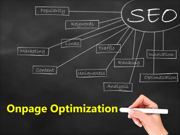
Donation Page Optimization TACTICS + TESTING
Grassriots • Ryan Baillargeon & SenningLuk • Small Agency, based in Toronto, with clients in Canada, US, Australia • Over 7 years experience in Engaging Networks. • Focused on Campaign and Platform Development, and training.
… 2013 was Busy • Migrating Walk Free from Purpose to EN • walkfree.org • Cooperate 4 Canada • Cooperate4.ca • Global Slavery Index • globalslaveryindex.org • Slavery is not a Game • slaveryisnotagame.com • Defend Our Climate • defendourclimate.ca To Name just a Few….
Case Study • Humane Society International • Donation Page Optimization
History • Started working with Humane Society International in 2012 after meeting at an EN community conference in Toronto • Helping lead a data import process, and to help train staff new to the platform. • Solve issues with existing Advocacy and Fundraising Pages ported from CONVIO.
In the beginning… • Every Campaign Needed to Manage • 3 Country Specific Payment Gateways + Paperless Direct Debit Option • One-time and Monthly Versions • Copy for WEB and APPEAL versions • 12 Donation Pages to manage a single campaign.
2011 • Separate Gift Selection and Payment Screens • Donate button was below the fold. • Security Device Hidden • Requires Navigating away to correct donation amount. • Extra Form Fields that are confusing. • Every gateway has specific, particular requirements – can cause headaches when setting up (Form Field Names, Required Fields, Default Values, Payment Types, Data Formats)
Problem • Extremely difficult and lengthy to deploy • Even more difficult to test • Complex form dependencies were hard to maintain, payment gateway specific. • Ineffective for sharing / marketing • Added complexity to broadcasts / segmenting. • Users were complaining and donations were failing.
Phase One • Optimizing our process. • We had a process problem. Errors were being introduced when campaigns were duplicated and we were losing donations because of it, high error rates in the logs. • Our focus became to develop a template that was easy to customize and simple to deploy.
Our Focus • Reduce the number of steps to complete a donation. • Reducing the number of payment options and gateways. • Implementing Monthly + OTG on the same form. • Tighten up the User Interface
2012 • We called this, the integrated form. • We replaced complexity with either JavaScript code of Form Dependencies. • Used PayFlow Pro Gateway to handle currencies. • Had 1 extra form to manage PDD using RSM Gateway. • Convinced the accounting department to absorb some extra complexity in their process to reduce it on the donation end.
Results • Much easier to deploy campaigns. Quicker out the door • Lower error rates / lower incompletes. • Feedback was the the forms were “cold” and weren’t necessarily pulling heartstrings. • Increased Page logic did require ongoing debugging of edge cases where the page would break. Caveats
Phase Two • HSI now had forms they could trust, and a baseline for their performance. • Through a review process it was determined that the focus be on increasing the monthly donors base and overall conversions. • With a new level of comfort, they also wanted this new form to be visually representative of how a donor’s gift directly impacts animals. • HJC New Media Designed a Novel Fundraising Page, Grassriots Implemented the Concept.
See The Formhttps://hsi.netdonor.net/ea-action/action?ea.client.id=104&ea.campaign.id=16680 Read Elise’s Report http://www.engagingnetworks.net/sites/default/files/documents/2013-dma-template-eliseledsinger-slides.pdf
Results • Huge Payoff. Three Campaigns were transitioned to the Slider format with a focus on Monthly Donations, year-end results showed over 50% of donations were recurring. • The focus on visually communicating the issue also saw a higher average recurring gift.
Behavior Change • When we added complexity to the interactivity of the form, we quickly realized that the experience was not optimized for mobile devices. • While we tried our best to accommodate the devices in the design, it was not something that was easily accomplished. • We also began to notice that the number of user’s reading our emails and visiting our pages from a mobile device was increasing.
Phase 3 – Optimize all the things. • Device Experience • Page Load Speed • Number of Steps • Number of Form Fields • Donation Amounts • Number of Donation Options • Donate Button
Device • Decided on implementing a mobile framework that would allow us to rapidly design, develop and deploy templates. • Foundation or Bootstrap are two very full featured options, and I highly recommend them. • Engaging Networks has mobile detection and you can customize a template without the use of a responsive framework.
Page Speed • 47% of consumers expect a page to load in 2 seconds or less. After this peak the rate drops by 6.7% for each additional second. • KISSMETRICS • A 1-second delay in page-load time equals 11% fewer page views, a 16% decrease in customer satisfaction, and 7% loss in conversions. • ABERDEEN GROUP
# of Steps Our process had 3 Steps • Selecting your Donation • Giving us your details • Selecting your Payment Options We wanted to find situations where we could reduce one ore more of these steps, and bring the user directly to payment options.
# of Fields • Ask only for the information you require • Hide the information you already know • Pre-fill the information you can determine on your own.
Donation Amounts • We needed flexibility in our form to adapt the donation amounts based on who was viewing the page. • Hide higher options for new donors, hide lower options for existing donors. • Existing donors will only give more if you ask them to give more. • One thing we haven't tested yet, is adjusted the donation ranges based on the users device. Lowering amounts for mobile, will it increase conversion?
Number of Donation Options • Another example of too much choice is a bad thing. Too many donation options crowd the page and make a choice difficult. • We wanted to reduce the number of donation amount options, and target the most effective ones in device specific context.
Donate Button • We wanted to improve the information our Donate Button was communicating • Improve its presence on the screen – move away from a flat style. • Solve problem of showing default donation without the selection step.
Thank You Ryan Baillargeon Founder, Grassriots Toronto, ON ryan@grassriots.com