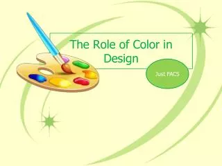
Color Selection in Web Design
Color Selection in Web Design. Web Design – Sec 4-4 Part or all of this lesson was adapted from the University of Washington’s “ Web Design & Development I ” Course materials. Objectives. The Student will Have a better understanding of effective use of color on the web.


Color Selection in Web Design
E N D
Presentation Transcript
Color Selection in Web Design Web Design – Sec 4-4 Part or all of this lesson was adapted from the University of Washington’s “Web Design & Development I” Course materials
Objectives • The Student will • Have a better understanding of effective use of color on the web. • Understand basic color theories and color schemes
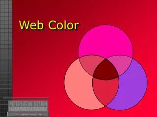
COLOR THEORY • Color Theory is a set of principles used to create harmonious color combinations. Color relationships can be visually represented with a color wheel — the color spectrum wrapped onto a circle:
Colors on the Web • When many people first start building their Web pages, they create pages in colors that they like. • It's very easy to set up a color scheme that clashes and is difficult for your readers to view for long periods or at all. • Create visuals that are intended to be read • Offering the viewer enough contrast between the background (paper or screen) and the text is important
Colors and Contrast • Text presentations ideally offer at least an 80% contrast between figure and ground. (Black text on a white background is ideal.) • If there is not enough contrast between figure and ground, a viewer will squint to view the text, causing eye fatigue. • Examples: Good: Bad: Some cause illusions: Black text on a white background Yellow text on a white background Blue text on a black background Red text on a blue background
The Color Wheel • A color circle, based on red, yellow and blue, is traditional in the field of art.
Primary ColorsRed, Yellow and Blue • In traditional color theory, these are the 3 colors that cannot be formed by any combination of other colors. • All other colors are derived from these 3 hues
SECONDARY COLORSGreen, orange and purple • These are the colors formed by mixing the primary colors.
TERTIARY COLORSYellow-orange, red-orange, red-purple,blue-purple, blue-green and yellow-green. • These are the colors formed by mixing a primary and a secondary color. That's why the hue is a two word name, such as blue-green, red-violet, and yellow-orange.
Classic Color Schemes • According to color theory, harmonious color combinations use • Any two colors opposite each other on the color wheel • Any three colors equally spaced around the color wheel forming a triangle • Any four colors forming a rectangle (actually, two pairs of colors opposite each other). • The harmonious color combinations are called color schemes
Color Schemes • Monochromatic Color Scheme • The monochromatic color scheme uses variations in lightness and saturation of a single color. This scheme looks clean and elegant. Monochromatic colors go well together, producing a soothing effect. The monochromatic scheme is very easy on the eyes, especially with blue or green hues.
Color Schemes • Analogous Color Scheme • The analogous color scheme uses colors that are adjacent to each other on the color wheel. One color is used as a dominant color while others are used to enrich the scheme. The analogous scheme is similar to the monochromatic, but offers more nuances.
Color Schemes • Complementary Color Scheme • The complementary color scheme consists of two colors that are opposite each other on the color wheel. This scheme looks best when you place a warm color against a cool color, for example, red versus green-blue. This scheme is intrinsically high-contrast.
Color Schemes • Triadic Color Scheme • The triadic color scheme uses three colors equally spaced around the color wheel. This scheme is popular among artists because it offers strong visual contrast while retaining harmony and color richness. The triadic scheme is not as contrasting as the complementary scheme, but it looks more balanced and harmonious.
Color Schemes • Tetradic (Double Complementary) Color Scheme • The tetradic (double complementary) scheme is the most varied because it uses two complementary color pairs. This scheme is hard to harmonize; if all four hues are used in equal amounts, the scheme may look unbalanced, so you should choose a color to be dominant or subdue the colors.
Examples • Monochromatic color scheme: • Pros: The monochromatic scheme is easy to manage, and always looks balanced and visually appealing. • Cons: This scheme lacks color contrast. It is not as vibrant as the complementary scheme.
Examples • Analogous color scheme: • Pros: The analogous color scheme is as easy to create as the monochromatic, but looks richer. • Cons: The analogous color scheme lacks color contrast. It is not as vibrant as the complementary scheme.
Examples • Complementary color scheme: • Pros: The complementary color scheme offers stronger contrast than any other color scheme, and draws maximum attention. • Cons: This scheme is harder to balance than monochromatic and analogous schemes.
Examples • Triadic color scheme: • Pros: The triadic color scheme offers high contrast while retaining harmony. • Cons: The triadic color scheme is not as contrasting as the complementary scheme.
Examples • Tetradic (double complementary) color scheme: • Pros: The tetradic scheme offers more color variety than any other scheme. • Cons: This scheme is the hardest scheme to balance.
Examples • A color scheme based on analogous colors: • A color scheme based on complementary colors:
Examples • A color scheme based on triadic colors:
Summary • Keep color theory and color schemes in mind when selecting colors for a web page. • Color schemes produce the most pleasing results
Rest of Today • Finish your External CSS and Navigation assignments! • Pick one of the following: • kindergarten teacher • medical clinic • landscape architect • bank • online bookstore • city government • Go to http://colorschemedesigner.com/ • Pick a color scheme that you think would be best for their web site • When you have a color scheme for them pick either “light page example” or “dark page example” and show the results to me. Be prepared to explain why you chose the color scheme you did.