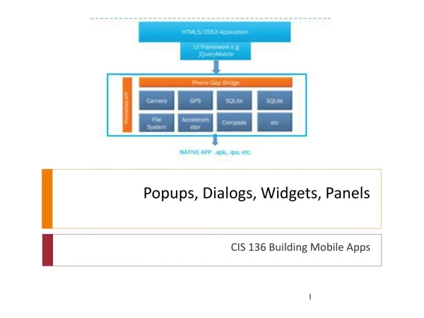
Popups, Dialogs, Widgets, Panels
460 likes | 484 Vues
Learn how to create and customize pop-ups and dialogs in your mobile app to display small text, photos, maps, and more. Explore different positioning and closing options.

Popups, Dialogs, Widgets, Panels
E N D
Presentation Transcript
Popups, Dialogs, Widgets, Panels CIS 136 Building Mobile Apps
Pop-Ups and Dialogs • Popups and dialogs are similar • they both overlay a part of a page with a small window • useful when you want to display small text, photos, maps, text or other content • Dialogs • have a button for the user to close the window • modal • Popups (like a screen tip) • the close button would be designed into the page view • May not be modal Example of a dialog
Dialogs • To create a dialog: • use an <a> element with the data-rel=“dialog" attribute • set the href of <a> to match the specified id of the page-view
Dialogs • The linked to page isn’t limited to the little “x” to close it • Can add other buttons to go to specific pages • Can use the data-rel=“back” attribute to go back to the previous page-view, dismissing the dialog
Pop-Ups • To create a popup, target a <div> in the same page-view: • use an <a> element with the data-rel="popup" attribute • add a <div> element with the data-role="popup" attribute to <div> • specify an id for <div> • set the href of <a> to match the specified id • The content inside <div> is the actual content that will pop up when a user clicks on the link. <a href="#myPopup" data-rel="popup" >Show Popup</a><div data-role="popup" id="myPopup"> <p>This is a simple popup.</p></div>
Positioning Pop-Ups • By default, popups will appear directly over the clicked element • To control the position of the popup, use the data-position-to attribute on the link that is used to open the popup. • There are three ways of positioning the popup: <a href="#myPopup1" data-rel="popup" class="ui-btn" data-position-to="window">Window</a><a href="#myPopup2" data-rel="popup" class="ui-btn" data-position-to="#demo">id="demo"</a><a href="#myPopup3" data-rel="popup" class="ui-btn" data-position-to="origin">Origin</a>
Closing Pop-Ups • By default, popups can be closed by pressing outside the popup box • If you do not want the popup to be closable by pressing outside the box, you can add the data-dismissible="false" attribute to the popup on the <div> tag • You can also add a close button to the popup, placed either right or left, on the link tag itself <div data-role="popup" id="myPopup" class="ui-content" data-dismissible="false" style="max-width:400px;"> <a href="#" data-rel="back" class="ui-btnui-btn-right">Close</a>
Pop-Up Arrows • To add an arrow to the popup's border, use the data-arrow attribute, and specify the value "l" (left), "t" (top), "r" (right) or "b" (bottom): <a href="#myPopup" data-rel="popup" class="ui-btn">Open Popup</a><div data-role="popup" id="myPopup" class="ui-content" data-arrow=“b"> <p>There is an arrow on my BOTTOM border.</p></div> I am a popup.There is an arrow on my BOTTOM border
Pop-Up Photos • Can display images in pop-ups <a href="#myPopup" data-rel="popup" data-position-to="window"><imgsrc="skaret.jpg" alt="Skaret View" style="width:200px;"></a><div data-role="popup" id="myPopup"> <imgsrc="skaret.jpg" style="width:800px;height:400px;" alt="Skaret View"></div>
Widgets Content formatting
Content Formatting • Widgets that render • Grids • Collapsible content blocks • Collapsible sets • Responsive Tables • Panels
Grids • Grids are one of the few features that do not use data attributes • work with grids by specifying CSS classes for the content • Grids come in four styles: • two-column • three-column • four-column • five-column • Best practices: • keep in mind your target audience • anything over two columns may be too narrow on a mobile phone • limit the columns to what you can see on a page view
Grids • Grids are: • 100% width • completely invisible (no borders or backgrounds) • don't have padding or margins • Used for content alignment
Grids • To create a grid, use a <div> or <section> element that uses the ui-grid-? class, where ? • will be either a, b, c, or d • ui-grid-a represents a two-column grid • ui-grid-b is a three-column grid • what will ui-grid-c create?
Grids • Next, within the <section> or <div> element • use a div for each "cell" of the content • the class for grid cells begin with ui-block-? • In a two-column grid, ui-block-awould be used for the first cell and ui-block-b for the next • In order to add more space between the content of the grid cells, • add a class to the main div that specifies ui-content
Grids • To lay out a page with three columns, set the class for the top-level <section> or <div> to “ui-grid-b” and set the class for the third column to ui-block-c To add more separation: <section class=“ui-grid-b ui-content”>
Grids • Grids do not have any concept of a row • But to create multiple rows in a grid, repeat the blocks • JQM knows to create a new row when it sees a block start over (as with the one marked ui-block-a).
Grids • Buttons in grids get a little amount of margin space on the right and left • Except for a full-width button • Use grid solo to align a single button with buttons in other grids • use a container with class ui-grid-solo and wrap the button in a div with class ui-block-a
Responsive Web Design • Responsive web design (RWD) • a design and technical approach • adapts the layout and interaction of a site or app to work optimally across a wide range of: • device resolutions • screen densities • interaction modes • The framework has a number of responsive widgets: • responsive grids • reflow tables and column chooser tables • Panels • JQM’s latest versions include support for responsive design
Responsive grids • Complex grids may not work depending on the size of the device • A four-column grid might be OK on a tablet, but not on a phone • It's not recommended to have many buttons with text on one row on small screens, because the text might get truncated
Responsive grids • Add the ui-responsive class to an existing grid to make it responsive on a smaller device • four-column layout now is a one-column layout instead because it stacked • on a tablet, it would display as the original four-column design
Collapsible Content Blocks • Blocks of content that can be collapsed and expanded • Provides a compact presentation of content • Uses a data-role="collapsible” attribute
Collapsible Content Blocks • in a <div> element • add data-role="collapsible", • include a title for the content, usually a header tag • the title will become a clickable banner to expand and collapse the content within it • Clicking on the + icon next to the title opens it, and can be clicked again to close it
Collapsible Content Blocks • By default, JQM will collapse and hide the content • to initialize the block as open instead of closed, add data-collapsed="false" to the initial div tag
Collapsible Content Blocks • You can theme the content of the area that is collapsed • Add a data-content-theme attribute, and data-iconpos attribute • specify a background color to give depth
Collapsible Content Blocks • By default collapsibles have an inset appearance • Make them full width without corner styling add the data-inset="false" attribute to the element.
Accordians • take multiple collapsible regions and combine them into one region called an accordion • Wrap multiple collapsible blocks in a new parent div tag, and use the data-role="collapsible-set" attribute to have the inner blocks be treated as one unit
Responsive Tables • Generally, tables consist of a large amount of data • This could take up an entire screen of a desktop browser • On a mobile browser, this can be even more condensed
Responsive Tables • to enable them to be responsive • use thead and tbodyblocks • add a data-role="table" to the core table block • add class ui-responsive becomes
Responsive Tables • JQM has another powerful feature • Can selectively filter the columns displayed to the user • Add data-mode="columntoggle" to a table • Add an ID attribute and value to the table
Responsive Tables • By default, the column toggle widget will not allow you to select any columns
Responsive Tables • To provide a list of columns, add a data-priority to each row header that you wish to make toggle-enabled • You do not need to select every column, nor do you need to provide any specific order
Panels • Panels sit on the left or right-hand side of a page and can be shown or hidden dynamically. • Because of the limited "real estate" on mobile devices, panels are a nice way to hide navigation or other content until the user requests it
Panels • add a new <div> block with a data-role of panel • this is inside the div that defines your page • this should be outside of the content region.
Panels • To create panels, two panels are defined, one above and one below the content div. • both have an ID • inside the content div are two links—one for the left-hand side panel and one for the right-hand side panel.
Panels • Panels are placed on the left-hand side by default • to place one on the right-hand side, add the data-position attribute.
Panels • Closing panels • By default a panel will be closed if the user clicks anywhere outside the panel • Panels will also be closed if the user swipes • But because a user may not know this, it makes sense to also provide a manual way to close the panel, using a link with a data-rel value of close • To control the close behavior of panels use data-swipeclose="false" and data-dismissable="false“ on the panel • data-swipeclose="false” disables the swipe-to-close behavior • data-dismissable="false" prevents the panel from closing by clicking outside the panel.
Panels • Panels are displayed in one of three ways and can be customized using the data-display attribute • The default value is reveal which pushes the content away by moving the main page content to the side revealing the panel • overlay renders the panel on top of the main page content • push acts as if the panel is pushing the content to the side