Download
1 / 24
240 likes | 256 Vues
This article explains the concept of Principal Component Analysis (PCA) and its application in reducing redundant or irrelevant features in a dataset to improve accuracy and efficiency. The article includes examples of applying PCA to various datasets.

E N D
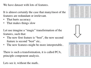
We have dataset with lots of features. • It is almost certainly the case that many/most of the features are redundant or irrelevant. • That hurts accuracy • That makes things slow • Let use imagine a “magic” transformation of the features, such that: • The new first feature is “best”, the new second feature is second “best” etc.. • The new features might be more interpretable.. • There is such a transformation, it is called PCA, principle component analysis. • Lets see it, without the math..
Here is a small dataset of opponents we have to fight. Each data object is represented by its X-Y location in 2D space. A randomly chosen object is show in orange. weight height
Let us z-normalize the data… Each data object is still represented by its X-Y location in 2D space
Principal Components Analysis (PCA) PC1 Let us rotate the axis to find the highest variance
Principal Components Analysis (PCA) PC1 PC2 The idea is to rotate the axes so that the new axes (also called the principal components, i.e., PCs for short) are such that the variance of the data on each axis goes down from axis to axis. The first new axis is called the first principal component (PC1) and it is in the direction of the greatest variance in the data. Each new axis is constructed orthogonal to the previous ones and along the direction with the largest remaining variance.
Principal Components Analysis (PCA) PC1 PC2 Each data object is still represented by its location in 2D space. However, instead of X-Y space, we are now in PC1-PC2 space. Note that for our orange example, the value in PCI is large, and in PC2 is small. This is true on average for all data points. Moreover, it is true by definition, this is what PCA does! Scree plot
Principal Components Analysis (PCA) PC1 PC2 We can project the data onto just the PC1 axis
Principal Components Analysis (PCA) PC1 PC2 We can project the data onto just the PC1 axis
Principal Components Analysis (PCA) PC1 We can project the data onto just the PC1 axis This means that PC2 no longer exist This is a general trick. Starting with any N dimensions, we can do PCA, and keep just n dimensions, n <=N, as use the n dimensions for clustering, classifying, indexing, plotting etc. BTW PCA obeys the lower bounding lemma
Lets do PCA again, this time going from 3D to 2D “Planets” of the Solar System http://pds.jpl.nasa.gov/planets/ [columns] distance diameter density "Mercury" 0.387 4878 5.42 (black) "Venus" 0.723 12104 5.25 (black) "Earth" 1.000 12756 5.52 (black) "Mars" 1.524 6787 3.94 (black) "Jupiter" 5.203 142800 1.314 (blue) "Saturn" 9.539 120660 0.69 (blue) "Uranus" 19.18 51118 1.29 (blue) "Neptune" 30.06 49528 1.64 (blue) "Pluto" 39.53 2300 2.03 (blue) [logarithm] y y y
The planets in 3D 6 5 4 3 2 1 0 15 40 30 10 20 5 4 10 x 10 0 0
Projection of planet data onto the first two PCs. 97% of the variance is captured
Projection of planet data onto the first two PCs. 97% of the variance is captured diameter density distance The red arrows show the projection of the original attributes in the PC coordinate system. The arrows point in the direction of increasing values of the original attribute.
[title] Countries of the World [note] 2004 data [columns] population "average income" area "United States" 292.6 38600 9809431 (blue) "China" 1309 4910 9556100 (green) "Japan" 127.8 27400 377801 (green) "India" 1084 2850 3203975 (green) "Germany" 82.75 26600 356955 (red) "United Kingdom" 59.77 26700 244101 (red) "France" 60.09 26500 547026 (red) "Italy" 57.24 26500 301277 (red) "Brazil" 183.3 7820 8511996 (gray) "Russia" 144.2 8620 17075400 (red) "Mexico" 105.8 9170 1967183 (blue) "Canada" 32.09 29500 9970610 (blue) "Spain" 40.97 22400 504750 (red) "South Korea" 48.02 18800 99016 (green) "Indonesia" 230.9 3090 1948732 (green) "Australia" 20.07 27900 7682300 (magenta) "South Africa" 45.17 12200 1220662 (black) "Turkey" 71.54 6800 779452 (green) "Netherlands" 16.32 29800 41640 (red) "Argentina" 38.64 12300 2780400 (gray) [logarithm] y y y
Using any two of {population, average income, area} does not give very intuitive results, so lets try two PC (next slide)
Lets do PCA again, this time going from 25D to 2D The 26 letters in a 5x5 grid a11 a12 a13 a14 a15 a21 a22 a23 a24 a25 a31 a32 a33 a34 a35 a41 a42 a43 a44 a45 a51 a52 a53 a54 a55 "A" 0 1 1 1 0 1 0 0 0 1 1 1 1 1 1 1 0 0 0 1 1 0 0 0 1 "B" 1 1 1 1 0 1 0 0 0 1 1 1 1 1 0 1 0 0 0 1 1 1 1 1 0 "C" 0 1 1 1 1 1 0 0 0 0 1 0 0 0 0 1 0 0 0 0 0 1 1 1 1 "D" 1 1 1 1 0 1 0 0 0 1 1 0 0 0 1 1 0 0 0 1 1 1 1 1 0 "E" 1 1 1 1 1 1 0 0 0 0 1 1 1 0 0 1 0 0 0 0 1 1 1 1 1 "F" 1 1 1 1 1 1 0 0 0 0 1 1 1 0 0 1 0 0 0 0 1 0 0 0 0 "G" 0 1 1 1 1 1 0 0 0 0 1 0 1 1 1 1 0 0 0 1 0 1 1 1 0 "H" 1 0 0 0 1 1 0 0 0 1 1 1 1 1 1 1 0 0 0 1 1 0 0 0 1 "I" 0 0 1 0 0 0 0 1 0 0 0 0 1 0 0 0 0 1 0 0 0 0 1 0 0 "J" 0 0 0 0 1 0 0 0 0 1 0 0 0 0 1 1 0 0 0 1 0 1 1 1 0 "K" 1 0 0 0 1 1 0 0 1 0 1 1 1 0 0 1 0 0 1 0 1 0 0 0 1 "L" 1 0 0 0 0 1 0 0 0 0 1 0 0 0 0 1 0 0 0 0 1 1 1 1 1 "M" 1 0 0 0 1 1 1 0 1 1 1 0 1 0 1 1 0 0 0 1 1 0 0 0 1 "N" 1 0 0 0 1 1 1 0 0 1 1 0 1 0 1 1 0 0 1 1 1 0 0 0 1 "O" 0 1 1 1 0 1 0 0 0 1 1 0 0 0 1 1 0 0 0 1 0 1 1 1 0 "P" 1 1 1 1 0 1 0 0 0 1 1 1 1 1 0 1 0 0 0 0 1 0 0 0 0 "Q" 0 1 1 1 0 1 0 0 0 1 1 0 1 0 1 1 0 0 1 0 0 1 1 0 1 "R" 1 1 1 1 0 1 0 0 0 1 1 1 1 1 0 1 0 0 0 1 1 0 0 0 1 "S" 0 1 1 1 1 1 0 0 0 0 0 1 1 1 0 0 0 0 0 1 1 1 1 1 0 "T" 1 1 1 1 1 0 0 1 0 0 0 0 1 0 0 0 0 1 0 0 0 0 1 0 0 "U" 1 0 0 0 1 1 0 0 0 1 1 0 0 0 1 1 0 0 0 1 0 1 1 1 0 "V" 1 0 0 0 1 1 0 0 0 1 1 0 0 0 1 0 1 0 1 0 0 0 1 0 0 "W" 1 0 0 0 1 1 0 0 0 1 1 0 1 0 1 1 1 0 1 1 1 0 0 0 1 "X" 1 0 0 0 1 0 1 0 1 0 0 0 1 0 0 0 1 0 1 0 1 0 0 0 1 "Y" 1 0 0 0 1 0 1 0 1 0 0 0 1 0 0 0 0 1 0 0 0 0 1 0 0 "Z" 1 1 1 1 1 0 0 0 1 0 0 0 1 0 0 0 1 0 0 0 1 1 1 1 1
A and R are similar O and G are somewhat similar M and W are similar X and O are about as far apart as you can get 44% of the variance is captured
In this application, the principal components can be viewed as filters that are applied to the bitmap to extract a feature. Here are images of some of the filters. White is neutral, blue means a positive contribution and red means a negative contribution.
Lets do PCA, this time going from 8D to 2D 1.06 9.2 151 54.4 1.6 9077 0.0 0.628 Arizona 0.89 10.3 202 57.9 2.2 5088 25.3 1.555 Boston 1.43 15.4 113 53.0 3.4 9212 0.0 1.058 Central 1.02 11.2 168 56.0 0.3 6423 34.3 0.700 Common 1.49 8.8 192 51.2 1.0 3300 15.6 2.044 Consolid 1.32 13.5 111 60.0 -2.2 11127 22.5 1.241 Florida 1.22 12.2 175 67.6 2.2 7642 0.0 1.652 Hawaiian 1.10 9.2 245 57.0 3.3 13082 0.0 0.309 Idaho 1.34 13.0 168 60.4 7.2 8406 0.0 0.862 Kentucky 1.12 12.4 197 53.0 2.7 6455 39.2 0.623 Madison 0.75 7.5 173 51.5 6.5 17441 0.0 0.768 Nevada 1.13 10.9 178 62.0 3.7 6154 0.0 1.897 NewEngla 1.15 12.7 199 53.7 6.4 7179 50.2 0.527 Northern 1.09 12.0 96 49.8 1.4 9673 0.0 0.588 Oklahoma 0.96 7.6 164 62.2 -0.1 6468 0.9 1.400 Pacific 1.16 9.9 252 56.0 9.2 15991 0.0 0.620 Puget 0.76 6.4 136 61.9 9.0 5714 8.3 1.920 SanDiego 1.05 12.6 150 56.7 2.7 10140 0.0 1.108 Southern 1.16 11.7 104 54.0 -2.1 13507 0.0 0.636 Texas 1.20 11.8 148 59.9 3.5 7287 41.1 0.702 Wisconsi 1.04 8.6 204 61.0 3.5 6650 0.0 2.116 United 1.07 9.3 174 54.3 5.9 10093 26.6 1.306 Virginia The data set gives corporate data on 22 US public utilities. Eight measurements on each utility as follows:X1: Fixed-charge covering ratio (income/debt) X2: Rate of return on capital X3: Cost per KW capacity in place X4: Annual Load Factor X5: Peak KWH demand growth from 1974 to 1975 X6: Sales (KWH use per year) X7: Percent Nuclear X8: Total fuel costs (cents per KWH) The task for this example is to form groups (clusters) of similar utilities. For example, clustering would be useful is a study to predict the cost impact of deregulation.
An experiment by Google Take millions of news stories, creating a very high dimensional dataset, project the names places into just the first two PCA.
An experiment by Aleks Jakulin Take Y chromosome data project it into just the first two PCA. (here the colors are added by hand) The human Y chromosome is composed of about 50 million base pairs. DNA in the Y chromosome is passed from father to son, and Y-DNA analysis may thus be used in genealogical research.