Download
1 / 24
240 likes | 404 Vues
How to promote the use of InfoVis?. Gennady Andrienko and Natalia Andrienko Fraunhofer Institute IAIS, Sankt Augustin, Germany http://www.ais.fraunhofer.de/and. Prologue. Visualisation can stimulate insight into data and underlying phenomena

E N D
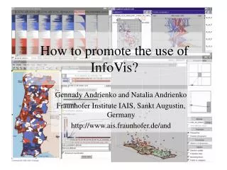
How to promote the use of InfoVis? Gennady Andrienko and Natalia Andrienko Fraunhofer Institute IAIS, Sankt Augustin, Germany http://www.ais.fraunhofer.de/and
Prologue • Visualisation can stimulate insight into data and underlying phenomena • Many positive examples; see “Graphic Discovery” by H.Wainer, books from E.Tufte, … • But… there are not many practical applications • One of the reasons is that very few potential users know the ideas and methods of InfoVis • We tried to promote the use of InfoVis by educating a group of domain specialists… • …and found that the lack of education is not the only and not the main problem
Main Obstacles to the Wide Use of InfoVis • Visual analysis of complex data is an inherently complex process • Requires multiple views and complementary tools, which are difficult to master, to choose, and to combine • Visual analysis brings no material results but only ideas in analyst’s mind • These ideas are hard to capture, represent, and communicate • The work is hard to report, to trace, and to evaluate • The results have the flavour of subjectivity and do not produce a solid impression • cf. results from using statistical methods
Data Complexities • Multi-dimensionality • e.g. time space temperature • Multiple attributes • e.g. time space (temperature, wind, precipitation, …) • Large data volume • e.g. (ti, si, tempi, windi, preci, …); i = 1, 2, …, 1 000 000 • Complex, heterogeneous nature • e.g. geographical space: land, water, mountains, cities, … • Outliers, discontinuities, … • Consequence: visual analysis of real data may be not so easy and elegant as in well-chosen examples in the literature…
Our Experiment Teaching by example: • An experiment with domain specialists • Using a non-trivial dataset from their domain • We explored the data by means of (geo)visualisation tools • We made an illustrated report about the procedure and the findings (a few excerpts follow) • The domain experts were asked to read the report (not to use the tools) and give feedback
The Data • Large volume: 6169 spatially-referenced time series • Dimensions: Space Time • Many missing values • Lack of spatial and temporal smoothness
General Procedure • See the whole • Space + Time 2 complementary views • Evolution of spatial patterns in time • Distribution of temporal behaviours in space • Divide and focus • Data are complex Have to be explored by slices and subsets (object groups, countries, years, …) • Attend to particulars • Detect outliers, strange behaviours, …
See the Whole: Handle Large Data Volumes • Approach: data aggregation • Task 1: Explore evolution of spatial patterns • Appropriate data transformation: aggregate by small space compartments (regular grid); various aggregates (mean, max) • Gain: no symbol overlapping
Explore Evolution of Spatial Patterns • Animated map • Map sequence • Observations: • Persistently high values in Poland • Improvement in Belarus • Mosaic distribution in most countries: great differences between close locations • Outliers
Explore Spatial Distribution of Temporal Behaviours • Are behaviours in neighbouring places similar? • Step 1. Smoothing supports revealing general patterns and disregarding fluctuations and outliers(we shall look at outliers later)
Are behaviours in neighbouring places similar? Step 2. Temporal comparison (e.g. with particular year, mean for a period) helps to disregard absolute differences in values and thus focus on behaviours Explore Spatial Distribution of Temporal Behaviours Observation: no strong similarity between neighbouring places
Types of particulars (examples): Extreme values Extreme changes High variability … Questions: When? Where? What is around? Why?(a question for further, in-depth analysis; domain knowledge is essential) Attend to Particulars
Attend to Particulars: Extreme Changes • Transform the time graph to show changes • Select extreme changes in a specific year (here 2003)
Tools Used • Visualisation on thematic maps, time graphs, other non-cartographic displays • Aggregation: reduce data volume and symbol overlapping • Filtering: divide and focus (select subsets) • Brushing: see corresponding data on different displays • Data transformation: smoothing, computing changes, normalisation etc.
Reaction of the Audience • It is too complex! • At the same time, it cannot compete with in-depth scientific evaluation! (i.e. by means of statistics) • We have already good tools for analysis! (multivariate statistics, spatial statistics, …) • Better give us simple tools for reporting and presenting our data to external world!
More about this experiment… • Gennady Andrienko, Natalia Andrienko, Richard Fischer, Volker Mues and Andreas Schuck,Reactions to geovisualization: an experience from a European project,International Journal of Geographical Information Science, 2006, v.20 (10), pp. 1149-1171
It is too complex! A Usability Problem? • The tools are complex to understand and difficult to use? • No, each tool is quite manageable (users’ opinion) • The tools are too numerous and diverse; they can be combined in many ways • Just reduce the number of tools? But none of them seems to be excessive! (users’ opinion) • How can we know when to apply what? (users’ question)
It is too complex! Visual Analysis Is Inherently Complex! • View data from various perspectives • e.g. temporal variation of spatial behaviour vs. spatial variation of temporal behaviour • View data at various scales • from “see the whole” to “attend to particulars” • “See in relation” (make numerous comparisons) • Decompose and synthesise • Requires multiple diverse tools
It is too complex! A Possible Solution:Intelligent Tools • “Ostensible simplicity”: be powerful and flexible but appear light and simple • Find the minimal tool combination sufficient for given data and tasks; hide unnecessary tasks • Theoretical background required • Automate whatever possible • User guidance: be able to guide inexperienced users • Define generic procedures of visual analysis • Find good ways to provide guidance (not annoying!) • “Incremental intelligence”: be able to learn from experienced users • Store analysis scenarios; recognise similar cases; replay
It cannot compete with in-depth scientific evaluation! Lack of Depth and Rigor • Main results are ideas in mind subjectivity • The analysis procedure is difficult to trace and to check • Risk of misinterpretation of data • A supporting observation: many users feel comfortable with the first (default) visualisation they get and do not try to look at the data from a different perspective (Chen 2005)
It cannot compete with in-depth scientific evaluation! Needed: Synergy with Statistics • Integrate visual tools for hypothesis generation with confirmatory statistics for hypothesis testing • Can users of visualization tools be prompted to verify their observations and hypotheses? • Can this be done automatically? • Requires finding a way to capture user’s observations and hypotheses in computer-interpretable form
It cannot compete with in-depth scientific evaluation! Needed: Externalisation of Ideas • Help the users to put their observations and hypotheses in explicit form • Preferably, allowing computer processing • Possibility to trace and check the analysis • Supports decomposition of complex problems and synthesis of composite patterns and models • Possibility to report and to communicate Better give us simple tools for reporting and presenting our data to external world!
Current Approaches • Snapshots and annotation (e.g. ManyEyes) • Not easily applicable to multiple linked displays • Not all patterns are directly visible; some appear in user’s mind as a result of interaction • Graph-based tools for knowledge representation and management: mind maps, argumentation maps, storyboards, … • Too generic; no link to data and to data displays • Seems reasonable to combine…
Conclusion • Complexity • Subjectivity • Lack of explicit results impede wide use of exploratory and analytical visualisation • The InfoVis community should put serious joint effort to solve these problems