Download
1 / 16
160 likes | 376 Vues
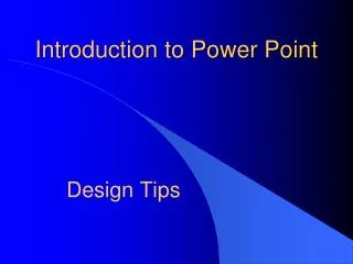
Introduction to Power Point. Design Tips. A. B. Make it Big. 12 Point Size 16 Point Size 20 Point Size 24 Point Size 32 Point Size 40 Point Size 48 Point Size. C. Font Types. Use a basic font like Arial- Bold -Clear Do not mix fonts-Sans serif Underlines may be used for hyperlinks

E N D
Introduction to Power Point Design Tips
A B Make it Big • 12 Point Size • 16 Point Size • 20 Point Size • 24 Point Size • 32 Point Size • 40 Point Size • 48 Point Size C
Font Types • Use a basic font like Arial-Bold-Clear • Do not mix fonts-Sans serif • Underlines may be used for hyperlinks • Arial 28 Point Size-italics hard to read • Bodoni MT Poster 24 Point Size • Toomany Font Styles • French Script MT 24 Point Size
Font Colors Use High Color Contrast TEXT IN UPPERCASE CAN CAUSE EYE STRAIN Red and Blue is hard on the retina This is an example of high contrast Italics are hard to read
Draw Attention use Bold • Use Underline to draw attention • Mix upper and lower case • Colorto draw attention • Italics to draw attention
Word Art • Can be effective • Use sparingly Keep it simple
Resizing graphics Don’t distract Pictures and text look good together Too many “cute” pictures are distracting. Relate to the topic-Be creative! Image Color and Size
Difficult topics • Explains how email works • Visual learners
6 X 7 • No more than six lines on each slide • A maximum of 7-10 words.
Don’t use too many words!!! Paragraphs of text are too distracting and ineffective. Use bulleted items that are short and to the point. When you use too much text your audience loses interest and remember the point of a power point presentation to provide information. If your audience can’t read the information, it is ineffective. So use meaningful points of interest. Good luck!
Don’t use too many words!!! • Paragraphs of text are too distracting • Use bulleted items that are to the point. • Too much text your audience loses interest. • Use meaningful points of interest.
Too many things going on! Too much information. Too many things to see all at once. Use bulleted items. Have items enter the slide one by one
This is much better • Too much information • Too many things to see all at once • Use bulleted items • Have items enter the slide one by one Much Simpler
Animations • How the text/graphic act on the slides • Example of Entrance • Keep them simple/subtle • Example of Emphasis • Don’t combine too many • Example of Exit
Transitions • Movement from slide to slide • Keep it simple/subtle
Keep It Simple • Big Fonts • Don’t over crowd • Don’t use too many words! • Coordinate background and text colors • Pace your slide show • Keep it simple!!!!!