Evaluation: Domino’s website
The current design of Domino's website suffers from inconsistencies and lacks user-friendly features. Key issues include a non-consistent menu bar, limited feedback mechanisms, and an inconvenient layout for nutritional information. Users are frustrated with the inability to order takeout without specifying a home address. To improve the experience, I propose a redesign of the menu for consistency, along with embedding price and nutritional information within the order-building process. This will provide users with immediate feedback, helping them manage their budget and dietary choices effectively.

Evaluation: Domino’s website
E N D
Presentation Transcript
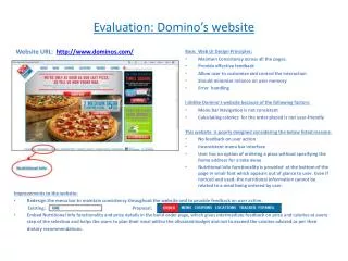
Evaluation: Domino’s website Basic Web UI Design Principles: Maintain Consistency across all the pages. Provide effective feedback Allow user to customize and control the interaction Should minimize reliance on user memory Error handling I dislike Domino’s website because of the following factors: Menu bar Navigation is not consistent Calculating calories for the order placed is not user-friendly This website is poorly designed considering the below listed reasons: No feedback on user action Inconsistent menu bar interface User has no option of ordering a pizza without specifying the home address for a take away. Nutritional Info functionality is provided at the bottom of the page in small font which appears out of glance to user. Even if noticed and used, the nutritional information cannot be related to a meal being ordered by user. Website URL: http://www.dominos.com/ Improvements to the website: • Redesign the menu bar to maintain consistency throughout the website and to provide feedback on user action. Existing: Proposal: • Embed Nutritional Info functionality and price details in the build order page, which gives intermediate feedback on price and calories at every step of the selection and helps the users to plan their meal within the allocated budget and not to exceed the calories advised as per their dietary recommendations.