POWER POINT
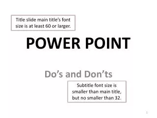
Title slide main title’s font size is at least 60 or larger. POWER POINT. Do’s and Don’ts. Subtitle font size is smaller than main title, but no smaller than 32. TEXT. Main titles font size on other slide no smaller than 48.

POWER POINT
E N D
Presentation Transcript
Title slide main title’s font size is at least 60 or larger. POWER POINT Do’s and Don’ts Subtitle font size is smaller than main title, but no smaller than 32.
TEXT Main titles font size on other slide no smaller than 48 A power point presentation is a tool designed to assist the presenter. It is not to contain every word that is to be spoken. It is not to be something that the presenter reads directly from. Power point is a visual aid that contains key points and key visuals that are related to the topic of the presentation. The saying “Less is More” is very true when adding text in power point. The biggest mistake people make in school is letting students use power point to take the place of a research paper and letting the kid ramble on and on. Or worse yet, the student might just copy and paste a lot of text on a slide to read while they are presenting. OMG, how boring can that be. Limit text!
TEXT • Tool • Assist • Key points only • Visual elements related • Less is More • 6 X 6 rule is BEST! Secondary text boxes font size at least 24, but smaller than title on slide.
#1 Choice 6 x 6 Text Rule • 6 lines of 6 words • 36 words/slide • Text box = font size at least 24 • Font style = clear, crisp • Avoid underlining a lot of text
2nd & 3rd RULES 2nd – 5 X 5 3rd – 7 X 7 7 lines of 7 words 49 words/slide • 5 lines of 5 words • 25 words/slide Less is More Idea!
FONT STYLES Non-Cursive - YES! NOT Cursive - NO! Examples of some Vivvali Kunstler Curlz Mt Edwarduab Blackadder Itc Brush Script MT Examples of some • Cabria • Century Gothic • Tahomo • Verdana • Arial • Times New Roman FYI: The font sizes are all at 24. Notice that they all don’t look the same size?
“NO” FONTS • A power point presentation is a tool designed to assist the presenter. It is not to contain every word that is to be spoken. • It is not to be something that the presenter reads directly from. • Power point is a visual aid that contains key points and key visuals that are related to the topic of the presentation. • The saying “Less is More” is very true when adding text in power points. • The biggest mistake people make in school is letting students use power point to take the place of a research paper and letting the kid ramble on and on. • Or worse yet, the student might just copy and paste a lot of text on a slide to read while they are presenting. OMG, how boring can that be.
“YES” FONTS • A power point presentation is a tool designed to assist the presenter. It is not to contain every word that is to be spoken. • It is not to be something that the presenter reads directly from. • Power point is a visual aid that contains key points and key visuals that are related to the topic of the presentation. • The saying “Less is More” is very true when adding text in power points. • The biggest mistake people make in school is letting students use power point to take the place of a research paper and letting the kid ramble on and on. • Or worse yet, the student might just copy and paste a lot of text on a slide to read while they are presenting. OMG, how boring can that be.
“1-2 FONT RULE” Best is ALL text same font! • Titles/Subtitles = Same font • Text &Citation = Same font • Citations font size = 4 to 8 • Hyperlinked under image BUT
IMAGES/SHAPES Learn to balance your slides! • Limit to 1 to 3 per slide • Support/relate to topic • Citations http://tinyurl.com/myg7lky
IMAGES/SHAPES • Limit to 1 to 3 per slide • Support/relate to topic • Citations DO NOT Clutter Cover up Overload one side of slide Balance! Organize! http://tinyurl.com/myg7lky
SPELL CHECK • Review Ribbon to Spelling button Don’t assume Spell Check and you are write. At times we all think we are grate at spelling.
COLOR http://blog.gcflearnfree.org/2011/01/25/simple-dos-and-donts-for-better-powerpoint-presentations/
TEXT OVERLOAD http://blog.gcflearnfree.org/2011/01/25/simple-dos-and-donts-for-better-powerpoint-presentations/
DESIGN THEMES • Simple and clear • One theme per show • Review • Does it work? • Is it the look wanted?
TRANSITIONS ANIMATIONS • Less is more! • Yes, use them. • Consistency • Emphasis • Not to show off On next slide, click 8 x’s to see all the animations.
WANT A GUIDE? In the entire show… • Same transitions b/t ALL slides • Title & subtitles • Text • Images/Shapes WordArt Use the same 3 animations on all slides. OR “1-3 Movement Rule”