
gonyea |
gonyea |. complicated doesn’t make it good *from A Book About Design by Mark Gonyea. DESIGN IS ALL ABOUT THE PERCEPTION OF SIZE, SHAPE AND COLOR. gonyea |. chapter 1. ALL OR NOTHING. gonyea |. Take the two shapes below. They relate to each other in every way. gonyea |.

gonyea |
E N D
Presentation Transcript
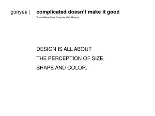
gonyea | complicated doesn’t make it good *from A Book About Design by Mark Gonyea DESIGN IS ALL ABOUT THE PERCEPTION OF SIZE, SHAPE AND COLOR.
gonyea | chapter 1 ALL OR NOTHING
gonyea | Take the two shapes below. They relate to each other in every way.
gonyea | Change the size of one and you lessen the impact of the other.
gonyea | Unless… you do something to draw attention to it again.
gonyea | And so on…
gonyea | …and so on…
gonyea | …and so on. It’s all or nothing. You can’t change one piece without affecting all the other pieces.
gonyea | chapter 2 THE BOX
gonyea | Take a look at the square below. Imagine drawing two straight lines that intersect only once inside the square.
gonyea | Did your lines look something like this?
gonyea | Or this?
gonyea | Straight lines can indicate strength and structure.
gonyea | Diagonal lines can indicate speed and movement.
gonyea | chapter 3 1:3:9
gonyea | 1:3:9 is a ratio. It can also be a strong graphic tool.
gonyea | The largest square is about 3 times as big as the second largest square, which is about 3 times as big as the smallest square.
gonyea | This makes the largest square the most important piece on the page.
gonyea | Apply this idea to a whole page and it might look something like this…
gonyea | …and so on…
gonyea | …and so on.
gonyea | chapter 4 CAN YOU SEE ME NOW?
gonyea | What is contrast? I’m thinking of a number between 1 and 10. Can you tell what it is?
gonyea | No? How about now?
gonyea | That’s contrast!
gonyea | chapter 5 LETTERS ARE SHAPES TOO
gonyea | The letter A. A is for Angles.
gonyea | The letter H. H is for Horizontal (and vertical) lines.
gonyea | The letter T. T is for Three (as in 1:3:9).
gonyea | The letter S. S is for curves. (I know, C should be for Curves but S looks better!)
gonyea | chapter 6 COLOR SCHMOLOR
gonyea | There are warm colors.
gonyea | There are cool colors.
gonyea | Warm colors are aggressive and advance.
gonyea | Cool colors are passive and retreat.
gonyea | chapter 7 DO I LOOK FAT ON THIS SIDE?
gonyea | The next page is unbalanced. The green square gets all the attention because it’s the only piece there…