The Worst Slide Deck Ever
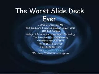
The Worst Slide Deck Ever. Joshua B. Gross, BA, MS PhD Candidate, Expected Graduation May, 2008 311B IST Building College of Information Sciences and Technology The Pennsylvania State University University Park, PA 16802 Phone: (814) 865-3859 Fax: (814) 863-1122 Email: jgross@ist.psu.edu

The Worst Slide Deck Ever
E N D
Presentation Transcript
The Worst Slide Deck Ever Joshua B. Gross, BA, MS PhD Candidate, Expected Graduation May, 2008 311B IST Building College of Information Sciences and Technology The Pennsylvania State University University Park, PA 16802 Phone: (814) 865-3859 Fax: (814) 863-1122 Email: jgross@ist.psu.edu Web: http://hci.ist.psu.edu/~jgross
An Inappropriate Talk Overview • Detailed explanation of some of my work • Some background, but no context • Lots and lots of data • If you can’t do a good job, you can at least confuse people • Conclusions that do not follow from the work
Requisite Prior Knowledge for All CHI Attendees • In order to understand my talk, you must know about • Usability Engineering • Web Design • Ecological Psychology and Affordance Theory • Activity Theory from Vygotsky to present • Neurophysiology • Geldard’s homunculus • My prior work • My advisor’s prior work • Et cetera • I will not explain any of these
Talk Overview Here I’ll include my entire abstract: Research into presentations at CHI and other conferences indicates that some people do a much better job of presenting their paper than others. While the slide deck isn’t the key to a great paper, a good slide deck is often the hallmark of a good paper. One of the most common mistakes is to put too much information on one slide. Now I’ll say that I know you can’t read this much information, but it’s really crucial to the rest of my presentation. Or I’ll read the slide to you - that’s fun for everyone!
What’s Wrong? • Too much data • Unreadable • Poor chart choice • Legend doesn’t help • Can’t read the titles unless you use a white background • Isn’t this a horrible background?
One Point (and a Non Sequitor at That) • Participatory design is the only correct solution!
Latin and Other Foreign Languages • While the argument may seem, in this case, post hoc ergo propter hoc, in reality res ipsa loquitur • Latin phrases are another good way to confuse your audience • Probably safe exceptions: • Et al. • Per se • Etc. or et cetera

