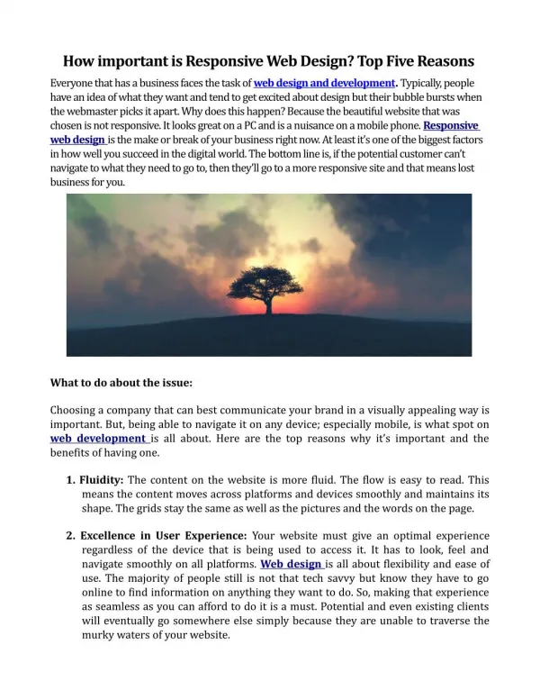
How responsive web design is useful for your website
This topic focuses on the key aspects of responsive web design and how they work together to provide an exceptional experience with online services. The use of responsive web design ensures that websites are viewed as best on each devices from desktops to mobile screen. The design makes use of CSS media queries, pictures, and a flexible layout to enable the content to be adjusted to the screen size and resolution. In addition to improving the user experience overall, this approach improves viewing and even navigating the website.


How responsive web design is useful for your website
E N D
Presentation Transcript
HOW RESPONSIVE WEB-DESIGN IS USEFUL FOR YOUR WEBSITE ?? Data-Security A responsive design ensures user data is protected and the website is safe on all devices. Mobile optimization improves vulnerability defense. Interface A responsive interface improves accessibility by adjusting to any screen size. Device consistency increases user comfort and familiarity. User Experience A responsive web design provides a seamless and user-friendly experience on each device. Users benefit from quicker load times and improved interactions on any screen. Usability A responsive design improves usability by adapting layouts to various devices. It guarantees that all users can easily navigate and interact. Adaptability A Responsive web design provide excellent viewing by adjusting to different screen sizes and orientations. This adaptability guarantees a uniform experience on all devices. Web-Based Navigation A smooth experience relies heavily on effective online navigation. Navigation is made simple by touch-friendly features and streamlined menus. Bernum technologies, a web design company in Toronto use all these responsive web design methods during their website optimization. www.bernum.ca