Download
1 / 3
30 likes | 269 Vues
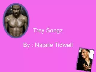
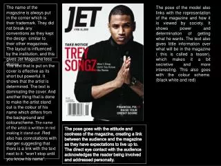
The name of the magazine is always put in the corner which is their trademark. They did not break any conventions as they kept the design similar to their other magazines. The layout is influenced by the institution, and this gives Jet Magazine less choice.

E N D
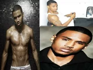
The name of the magazine is always put in the corner which is their trademark. They did not break any conventions as they kept the design similar to their other magazines. The layout is influenced by the institution, and this gives Jet Magazine less choice. The pose of the model also links with the representation of the magazine and how it is viewed by society. It shows power and determination of getting what he wants. The text also gives little information over what will be in the magazine ( this is called a teaser), which makes it a bit secretive and more interesting. This also goes with the colour scheme. (black white and red) The text that is put on the cover is effective as its short but powerful. It shows that the artist is determined. The text is dominating the cover. And another thing that is done to make the artist stand out is the colour of his name which differs from the background and colourscheme. The name of the artist is written in red making it stand out .Red also has connotations with danger suggesting that there is a link with the text next to it: “won’t stop until you know his name”. The pose goes with the attitude and coolness of the magazine, creating a link between the audience and the magazine as they have expectations to live up to. The direct eye contact with the audience acknowledges the reader being involved and addressed personally.
Trey Songz JET Magazine A. Johnson Publications The Trey Songz JET magazine, was launched as an experiment as this was the first version that would unveil the new look of Jet Magazine. The new look would include their new logo, new design and lay-out, new sections and features. “As a world-class media company, we will solidify Jet’s position as an innovator and leader in the African-American marketplace by offering expanded content that will entertain, inform and extend our readership footprint of the brand in a smart way,” said Linda Johnson Rice, chairman and CEO. “We will continue to build our communication platforms to engage our audiences and address evolving consumer needs.” Trey Songz being quite a new and young or better said an artist that goes with the modern image of R&B and Hip Hop, was used to unveil Jet’s new look with a purpose. The magazine used an upcoming artist that would show the new ness of the whole look, I believe that this was done so that people would show interest in the whole new image of the magazine. People would show more interest in something that was new and out of the usual than to something that was being played safe. Jet took a huge risk by doing this as it could have gone wrong due to the lack of fame of Trey Songz around that time. When choosing an artists to represent a magazine, you need to look at what the magazine will be about, so that the association of the person on the cover can make sence with the context of the magazine.
The colours used are quite predominant, in the sense that they work together effectively in attracting the audience. The fact that the model is also wearing a grey suite shows the relations between him and the magazine cover. The magazine’s presented is quite luxurious and rich, this is shown by the use of Gold which connotates with wealth. In addition it reflects the target audience. Photograph: The model’s body frame posture connotes a position of power and authority. This is also supported by the costume of the model as wearing a suite usually suggests you are of high status. This reflects the image that the magazine is portraying to their audience of them being a well produced magazine. The stereotypes of africanamerican people being less wealthy has been broken by this magazine as the artist is african American but portrayed as wealthy and good presented. Mise en scene: The overall look of the magazine exists of different techniques such as overlapping and the ‘Z’ pattern to direct the audience to significant points on the cover, in the wanted order. The font size and colour makes it stand out meaning that people are attracted to it straight away. There is also a variety of fonts which keeps people interested rather than bored. Apart from the name of the artist which is quite large , the text is fairly small, which makes the photography of the artist stand out even more. This also suggests the importance of the artist again. JET Magazine A. Johnson Publications. This edition used also a quite sophisticated actor, which would help build a bond of trust between both the reader and the magazine. Laz is a trusted, well presented and known artist so this was a good way of making a link between all those good qualities and the magazine, this would then encourage both fans and previous buyers to continue or start purchasing the magazine.