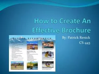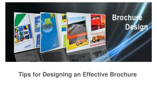
Creating an Effective Brochure
Creating an Effective Brochure. By Zach McDaniel. Introduction. What is visual hierarchy? The concept of visual hierarchy is pretty simple. By using color, contrast, alignment, size, and solid readability to draw attention to our most important elements we are using visual hierarchy.

Creating an Effective Brochure
E N D
Presentation Transcript
Creating an Effective Brochure By Zach McDaniel
Introduction • What is visual hierarchy? • The concept of visual hierarchy is pretty simple. By using color, contrast, alignment, size, and solid readability to draw attention to our most important elements we are using visual hierarchy. • It is important to use this concept because it allows us to communicate visual importance. We want our most important messages in our brochure to be the most noticeable. So how can we do that?
Font • Making an appropriate font selection for the message is important. • For example, a large, bold, all-caps font is highly visible. • More attractive font can be more attention grabbing but also harder to read. This can mean that the reader could skip over this fancy font and miss the point of your message. • Elements of font include the type, size, weight, letter spacing, and line spacing. They are all important aspects to consider because they affect the look and tone of your message.
Font Example This is a great use of color and alignment of the text to illustrate the point of needing more bone marrow donors. Credit to smashingmagazine.com for the image
Graphics • For many brochures to be effective, it’s graphics have to be noticeable and have a clear message in them. There are several elements to consider when adding graphics to your brochure: • Size, often times the larger the object, the more attention it is going to get, so a good practice is to make the most important part the largest as well. • Color can act as an organizational tool or a moody tool. Strong, contrasting colors can draw attention to a particular area, or it can be used to set the mood of the page or a particular message on the page. • Graphics provide a visual interpretation of your message and can often provide a clearer explanation of your message as opposed to a block of text.
Graphics Example Credit to tutsplus.com for the image. Spectra is a news website that uses colors to indicate what category a particular news story is in. This can make it very simple to find the category you are looking for.
Contrast/Alignment • Placing two very different things right next to each other can cause a strong contrast which attracts the readers eyes. This can be a good thing if that’s where you want your readers eyes to go, or it can be bad if it distracts them from what your point is. • Contrast and alignment organize individual thoughts or groups of thoughts on your page. • Can show the beginning and end between two separate elements on the same page. • Best to avoid using a lot of contrast in your brochure because too much can look sloppy.
Alignment/Contrast Example Credit to iastate.edu for the image. In this image, the contrast is clear between the blue bar, middle tan color, and the bottom red bar. The blue bar appears to be the title bar, which allows us to easily identify what the page is about. The three sections contain different information, but thanks to the contrasting colors we can easily progress through all three.
Bullets • Bullets and numbered lists have very simple uses. They are used to help simplify and organize information. • An easy mistake to make is to add huge blocks of text around our graphics, etc. This is where the bullets come in handy, we use them to communicate the large block of text in a much clearer way. • Bullets can be used to summarize main points as well. We use bullets when the information doesn’t flow into the next piece. • We use numbered list to create a logical flow of info.
Bullets Example This is a pretty basic example but does the job. Instead of making a listing for the bedroom and describing the features in paragraph form, we can easily tell the reader the features using bullets.
Spacing • Spacing is a simple way to improve the effectiveness of our brochures. Its an invisible factor that can vastly help reduce visual clutter and enhance elements such as graphics. Credit Printaholic.com for the image. This example explains itself. There is way too much going on here. No spacing is just the beginning of the issues with this brochure.
Legibility/Readability • Readability is best explained as the ease with which something is understood when read. • Readability is important because our readers need to be able to understand what they just read. Seems simple, but many times we are too wordy and actually confuse the reader with our long winded explanations. • Legibility is the ease with which text and graphics can be explained. • Legibility is how easy the connection is made between what the reader sees on screen and the message we are trying to convey in our brochure. We can have the best text and graphics ever, but its all for nothing if the reader doesn’t get the point of the text or graphic.
Summary • When creating an effective brochure the elements you need to consider are font, graphics, contrast/alignment, bullet/numbered lists, spacing, and readability/legibility. • These elements are all important and make a brochure and the message within the brochure stand out. • These elements also make it very easy for the reader, at a glance, to understand what the point of the brochure is and what is important to take away from what they read.