My Very Bad Presentation
Learn about 7 bad PowerPoint practices and how to avoid them to keep your audience engaged and deliver effective presentations. Discover tips on content, delivery, and visual design improvements.
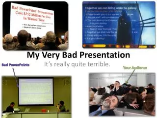

My Very Bad Presentation
E N D
Presentation Transcript
My Very Bad Presentation Bad PowerPoints Your Audience It’s really quite terrible.
Bad Idea 1: Reading From The Slide • I am reading directly from the slide. The information is clearly important, but I do not know it very well or am lazy, so instead of adding extra information from note cards, I will patronizingly read to you what you can clearly already see. • I should have made some note cards, or a sheet of notes to add on to what’s on the slide.
Bad Idea 2: Talking to the Screen • Do you like my back? It’s probably all you can see, because I am facing the screen instead of the audience. • My voice projects directly into the white board, so you mostly hear me muttering. • I’m probably following Bad Idea 1 as well, since I need to look at the screen. • I really ought to turn around, get my face out of my notes, and talk to you kind people.
Bad Idea 3: Too Much Text • I found a whole lot of information on this topic, but I didn’t take the time to understand it very well or ask for help in understanding it. • Instead of breaking the topic down into a few key points, I’ve just put everything I can possibly find on the subject and put it all on this slide. • You will have to squint to see everything, because the text will be very tiny. This necessary for me to fit all of my “research” into the slide. • By the way, this also is a good way to show that I’ve copy and pasted a big block of text from Wikipedia or somewhere else on the Internet. I clearly didn’t write all of this. You can tell by the way I’m either • A. Reading directly from the slide, or • B. Struggling to figure out which parts of this are important enough to tell you. • I hope you like writing a lot, because I probably can’t tell you which parts of this are important enough to write down. If I knew that, would I have put all of this text on here? I probably would not have. • Aliquamrhoncusnequesedodioultriciesvarius. In molestiearcu vitae lectusultricesmattisposueremetusfacilisis. Pellentesquemolestieipsum id mi laoreet a laoreetmassavarius. Maurisarcusem, rutrumegetfeugiat non, mattis at leo. Praesentnislmassa, dapibuseuiaculisnec, luctus et risus. Aliquam non eratlectus, a tempus arcu. Nullaullamcorperrisuslorem, et placeraterat. Utmollisbibendumpellentesque. Suspendissepulvinar magna variusrisusfermentum a vulputateipsumfermentum. Pellentesque id erosmassa, ac pellentesquevelit. Sed in neque ac maurisultriciesaccumsan. Quisqueorciligula, euismodegestasdignissim tempus, egestassedtortor. Curabiturfermentumlaciniaodionecviverra. Etiammollisviverra lacus, viverravenenatisfelisfacilisisviverra. • Vivamusegestas, urnanecfringillalaoreet, tortor lacus porttitortortor, egestaslacinia lacus purus non lectus. Nam commodofermentumelit in sodales. Maecenas imperdietmetustellus, in fermentumsapien. Phaselluseuismodvariusvarius. Doneccondimentum, purusnecmalesuadagravida, elitsapiensuscipitorci, in ultrices lacus tellus at dui. Pellentesque habitant morbitristiquesenectus et netus et malesuada fames ac turpisegestas. Duis dictum laoreetrutrum. Nullaconsectetur lacus ut dolor laoreet non ornarevelitmalesuada. Nuncfringillametusmollisturpispretium dictum rhoncusodioporta. • In all seriousness, I should have actually read this text, found the important bits, and put it into outline form.
Bad Idea 4: Too Much Going On • I am demonstrating my knowledge of PowerPoint by adding all I know about animation and sound. • This will distract you and make the information impossible to read, but at least you’ll laugh. • I bet Mr. Bates won’t be laughing, though. • And if he is, it’s because of how low my grade is. • If my animations & sound distract from the information rather than add to it, I should just take them off. • And if I ask Mr. Bates, he will surely let me know whether it’s a good idea or not. Wow, that was annoying.
Bad Idea 5: Bad Color Scheme • Ow, my eyes hurt. • This color scheme is very pretty, but it’s like looking into the sun. • You should probably all be wearing safety goggles. • Next time, I’ll stick to an easier to read color scheme.
Bad Idea 5b: Equally Bad Color Scheme • Navy and maroon on black? Perfect! • This is the opposite problem of the previous color scheme. • Make sure to use contrasting shades.
Bad Idea 6: Photo Background • This picture looks pretty cool, and it’s quite important. So is the text on top of it. • Unfortunately, there’s either not really a good color to put on top of it, or I was lazy and just picked black. • Either way, you can’t read the words very well, or really see the picture. • I probably should have picked a smaller picture and put it next to the text.
Bad Idea 7: Unnecessary Picture • I thought this animation was funny, so I put it in and made up some excuse to include it. • Ex.: The Egyptians had pet cats? We’ll go with it. • It instead is distracting & annoying. • It’d be a better idea to leave out silly animations and pictures altogether.
Bad Idea 8: Too Many Pictures • Wow, I found a lot of cool pics for my topic! • I’m going to use all of them right now. • Can you hear me over all the pictures? • Maybe I should just pick one or two per slide instead.
Bad Idea 9: Copy, Paste, Done • Supporters and critics generally agree[2][3][4] that the ease of use of presentation software can save a lot of time for people who otherwise would have used other types of visual aid—hand-drawn or mechanically typeset slides, blackboards or whiteboards, or overhead projections. As PowerPoint's style, animation, and multimedia abilities have become more sophisticated, and as the application has generally made it easier to produce presentations (even to the point of having an "AutoContent Wizard" suggesting a structure for a presentation), the difference in needs and desires of presenters and audiences has become more noticeable. • The text over there was clearly copied and pasted from Wikipedia. Since I’m not using my own words, I’m plagiarizing, a.k.a. stealing. • You could probably copy any of those phrases into Google and find out exactly where I copied it from. • The embedded hyperlinks there don’t help my case either. • When I get caught, I’ll probably get a zero due to plagiarism. • Paraphrasing or putting the text into my own words would have been a much better idea.
Bad Idea 10: Boring Slide • Snore. Less is more, but this is just plain boring. • The focus of a PowerPoint should be the content and not the presentation, but having plain black & white text can actually distract from the information. • If I can’t figure out my own design for a slide, I could at least use one of the standard designs that comes with PowerPoint.
Bad Idea 11: No Editing • can you fin dthe errors in this sentense. Spellcheck probably culd, but i didn’t bother to ues it. • Ihopeyuo can read wellbecauseyoull have to figure oath wat I am tyring too say. • Hit F7. It will run spell check. If you don’t have spell check, get a dictionary and your grammar book.
Bad Idea 12: Presenting Before Checking the File • What happened to the cool font I had? • I thought I had a music file embedded, but it’s gone now… • Oh no! My text is spilling off of the page! This will surely harm my presentation, and grade. • Next time, I’ll make sure to try my presentation on Mr. Bates’ projector before it’s time to present to make sure everything is formatted right.
Bad Idea 13: Improper Citation • Sources cited • Google • Wikipedia.org • Encyclopedia Britannica • I didn’t really bother to see how to properly cite sources, so I just threw down some websites and stuff without the right formatting • I used a search engine as a source, which it isn’t • I also used Wikipedia, which isn’t authoritative • I should have read the info sheet on MLA citation, or at least used a website like EasyBib.com
Bad Idea 14: No Rehearsal • That guy over there? Don’t know him. • And if I do, I forget his name. • There’s a lot of words here that I can’t pronounce. Maybe if I ask Mr. Bates to do it for me? • No, he won’t budge. I’ll just make something up. • I’m going to stall a lot, or unintentionally add about a dozen of the following per line: • Uh • Like • Um • Next time, I will actually practice presenting aloud, even if it’s to an empty chair.