Download
1 / 53
530 likes | 547 Vues
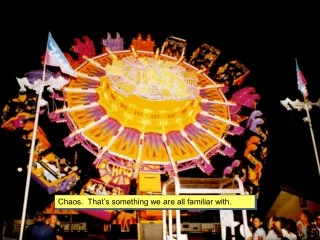
We spent last week trying to recognize the need for something unique, but familiar.

E N D
We spent last week trying to recognize the need for something unique, but familiar.
Recognize our own knowledge level and limitation with: fonts, text & writing; graphics and artistic creations; photography; page layout; audio content development and production; video content development and production – ‘multimedia’ Understanding what appeals to people, and that we all have different reasons for doing different things: life cycles, demographics, experiences, personal characteristics…
Your site’s look and assets • Text for the pages – speculative copy • Needs analysis & treatment • Wireframes • Starting to plan for audio, image and video content • Starting to plan for graphics content
Content this week • Needs analysis and treatment • One page Résumé to go on your site • Wireframes to plan the look • ‘audio explanations’ – short ‘about me’ ‘click here to learn more’ ‘why this is interesting’ – speculative, but start focusing on final
Chapter 1: Understanding what the media are today versus what the media were: Multimedia Foundations Chapter 2: Understanding computer technology Chapter 3: Understanding creativity, the communication process and how we connect with an audience / users: Planning & Evaluation Chapter 4…Elements and issues of Design:
But we’ll move around a bit differently than the structure of the book… HTML, CSS and JavaScript ‘Web Page Assets’ – the ‘copy’ that goes on the pages, the still images, the fonts, the graphics, the audio content, the video content, the documents, etc. So we move after Chap. 4 to Chap. 8 (Text), Chap. 10 (Photography), then Chap. 5 (Page Layout)
Seeing and perceiving are two different things. Design is the method of putting form and content together. Design, just as art, has multiple definitions; there is no single definition. Design can be art. Design can be aesthetics. Design is so simple, that’s why it is so complicated. As we have said: come up with an idea, write up a Treatment, then start to visualize it with Wireframes
The congressional lawmakers who penned the Bill of Rights provided the content for this illustration of the First Amendment. A graphic designer created its form. Source: Courtesy of the Freedom Forum. Content and Form
Content and Form Form is this what? Your Name
Content and Form Content &form are complementary components of a visual design. Both are required for success. Without good content, even the best designs and visual treatments fall flat. “Content is king” “Eye candy” describes something that is visually appealing but lacking in substantive value.
Content and Form Many tools at our fingertips that we can use to create an eye-catching first impression. -- the WOW factor, or hook, BUT… May get attention -- without meaningful content, people lose interest and move on. (radio commercial) No substitute for a good message, and in the absence of a compelling story or idea, good designs are nothing more than eye candy.
Aesthetics • We make perceptual judgments about visual beauty every day • In professional design, there are industry-specific rules and guidelines – applied aesthetics • Learning these guidelines is important – design choices influence choices made during production • Having an aesthetic framework draws you away from unfounded sensibilities and towards informed observations
A visual communicator’s job is to fill empty space with meaningful content that communicates a message.
Creating a radio commercial • Do you know the style, have the creative understanding, know what are good aesthetics, what is good form? • Apply same to other elements of multimedia • Most of you don’t – despite the classes you have already taken
How skilled are you at… • Drawing, art? • Photography? • Graphic Design? • Videography?
The Field of View A camera sees only what the photographer wants it to see. Not just the technical skills – that’s vocational school. Do you understand the theory and have skill with the art? ‘Cropping the image’ / visualization / ‘Niagara Falls’
Can you mentally then physically lay things out on the grid, properly? Our images are based on a grid of square ‘dots’
Can you place the subject versus the white space correctly in the frame?
Elements of Design Principles of Design Color Dot Form Line Pattern Shape Space Texture Unity: Alignment, Proximity, Similarity and Repetition Emphasis: Contrast, Color, Depth and Proportion Perceptual Forces: Balance, Continuation, Figure-Ground and Psychological Closure
Composing with DOTS… “The whole is greater than the sum of its parts…”
Lines add energy Lines guide the eye
The element of form… How is the illusion of the 3rd dimension achieved here in a two-dimensional image?
Lighting, Texture, Pattern, and Color …are used in these images to achieve a desired effect or mood.
Observe how the designer of this layout for the U.S. Coast Guard website incorporated the laws of proximity, alignment, similarity, and repetition to achieve unity.
How are the principles of similarity and repetition put to use in these branded logos created to promote two related programs?
Proximity, alignment, similarity, and repetition… can you see it?
Balance / symmetrical & asymmetrical Proportionality… Depth
The portion of an image where no visual content exists. Negative space / white space
A continuous visual line that’s created by the real or apparent movement of subjects within the frame. Motion Vector
A cinematic technique that involves tilting the camera so the horizon is not parallel to the bottom of the frame. Dutch Tilt
The x-axis refers to the ____ plane from left to right, or width. The y-axis refers to the ______ plane from bottom to top, or height. The z-axis is _______ to the x- and y- axes and represents ___________. Horizontal / vertical / perpendicular / depth
A method of achieving compositional balance, whereby equilibrium is achieved using objects of similar shape, color, and size, equally weighted on opposite sides of the frame. Symmetrical Balance
A compositional tool for producing visually appealing images using asymmetrical balance by conceptually dividing up the design space into thirds both horizontally and vertically. Rule of Thirds
The portion of an image where visual elements reside (lines, shapes,forms, etc.). Positive Space
A continuous visual line that’s created by an object or subject that points conspicuously in a given direction. Index Vector
The color shade of an object as a single point on the color spectrum. We refer to colors most often by this. Hue (red, green, blue, etc.)
A method of printing photographs in newspapers, formed with black dots of various shades of gray. Halftone Image
A colorless image or object containing only variations of white and black. Grayscale
A boundary that defines the inclusive area of a design space where visual elements reside. frame
____ is the tangible essence of a work: the stories, ideas, and information that we exchange with others, while ____is the manner in which content is designed, packaged, and delivered for consumption. Content / form
The combination and arrangement of visual elements in an artistic form. composition