
Pairwise Plots of Phenology Traits Across Years and Environments in the Mapping Population
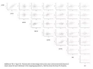
This figure presents pairwise plots illustrating the phenology traits measured across different years and environments within the mapping population. Each point represents the mean values for individual traits, enabling the assessment of relationships and trends. The red line indicates the linear fit of the data points, highlighting potential correlations among phenological traits. This analysis provides insights into how environmental variations impact phenology, which is crucial for understanding plant behavior and adaptation.

Pairwise Plots of Phenology Traits Across Years and Environments in the Mapping Population
E N D
Presentation Transcript
LSF09 LSF10 BBF09 BBF10 GCF09 GCF08 BBI Additionalfile 1: FigureS1. Pairwiseplotsof phenology traitsacrossyears and environmentsbased on meanvalues for eachindividual in the mapping population S1. Red line show the linear fit ofpoints. GCI