Climate Change Projections for San Diego: Temperature and Precipitation Trends by 2050
This presentation explores climate change impacts on San Diego County's temperature and precipitation using historical data and future projections. It details temperature patterns as measured at Lindbergh Field and compares RCP scenarios for 2050. Key findings include a potential 10% decrease in the number of wet days and a 15% increase in precipitation on heavy rainfall days. Analysis incorporates data from 25 global climate models and highlights important trends concerning atmospheric CO2 levels and their relation to local weather patterns.

Climate Change Projections for San Diego: Temperature and Precipitation Trends by 2050
E N D
Presentation Transcript
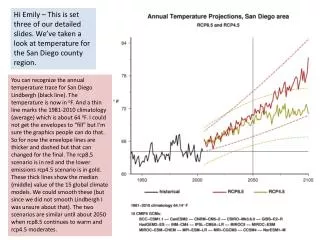
Hi Emily – This is set three of our detailed slides. We’ve taken a look at temperature for the San Diego county region. You can recognize the annual temperature trace for San Diego Lindbergh (black line). The temperature is now in oF. And a thin line marks the 1981-2010 climatology (average) which is about 64 oF. I could not get the envelopes to “fill” but I’m sure the graphics people can do that. So for now the envelope lines are thicker and dashed but that can changed for the final. The rcp8.5 scenario is in red and the lower emissions rcp4.5 scenario is in gold. These thick lines show the median (middle) value of the 15 global climate models. We could smooth these (but since we did not smooth Lindbergh I was unsure about that). The two scenarios are similar until about 2050 when rcp8.5 continues to warm and rcp4.5 moderates.
The historical data comes from the Carbon Dioxide Information Analysis Center. We see the atmospheric concentration of CO2 (lines) and the carbon emissions (gigatons of carbon; bars). The bars show the values at the decade year (they are not averages over a decade). We show the pre-industrial CO2 concentration as a diamond (280) and the latest SIO seasonally-adjusted value from Mauna Loa (397). RCP stands for Representative Concentration Pathways. 8.5 and 4.5 mean the number of Watts per square meter by 2100 due to anthropogenic activities.
We’ve recently looked at the historical temperature -- we can look at the precipitation for the same select 8 sites. The green bars show water year total precipitation (in cm; water year runs from Oct 1 to Sep 30). The left-side y-axis is for the green bars – showing the water year precipitation. There are small black dots. These are for the heaviest one-day precipitation totals for that water year (in cm; scaled by the right-side y-axis).
Taking a closer look at the annual precipitation for San Diego Lindbergh. We normally see about 9 inches of rainfall a year (22cm). A very heavy precipitation day would be about 2.7 inches (7 cm).
A wet day is defined by one having at least 1 mm of precipitation (equivalent to what the National Weather Service calls a trace amount). In the slides Sasha has sent of the work Suraj has done you see he uses this value to define a precipitation frequency. At San Diego Lindbergh we often see about 20 precipitation days a year (less than a month). A year with many precipitating days would have over 40 days. Suraj has examined 25 CMIP5 models looking at the grid square encompassing the San Diego county region. This would be a very large area (roughly 200km square). Thus we don’t expect the agreement with just one observation site to be excellent as the models represent a broad region. However we see more rainy days in the models as compared to observations (see blue line for the model historical period). The blue (and red) lines show the median value of the 25 models. We hope to eventually use the downscaled data in a similar plot (and the results will be more representative of San Diego Lindbergh as they will cover just a 12km square region). The future scenario Suraj is mapping here is the RCP8.5 scenario. By 2050 we have about 5 fewer precipitating days.
A quick look at the San Diego Lindbergh observations for amount of precipitation on the wettest day of the water year shows a high value would be about 7cm (70mm). Suraj shows a similar look from the 25 global climate models with the grid cell (roughly 200sq km) in the San Diego county region. The blue and red lines show the median value of the 25 models. The models have about 30 mm as a heavy precipitation day (less than half of our Lindbergh observations). However since the model represents a big region (including deserts) we don’t find this to be unreasonable. We see an increase in the model RCP8.5 simulations showing wet days having more precipitation – increasing to around 35mm by 2050.
By 2050 we see approximately a 10% decrease in the number of wet days and we see and a 15% increase in the amount of precipitation that falls on a very wet day. The table below compares specifics for San Diego Lindbergh water year 2013 and one of the global climate models (CNRM CM5) for water year 2050. The top 4 rows show the number of days in specific precipitation ranges (in mm). The next lines compare the total number of wet days and the wettest day. We hope to repeat this with the downscaled data. 2050 2013

