The seven deadly ICT sins
210 likes | 387 Vues
The seven deadly ICT sins. Thou shall not use word art. Word art tends to be used for titles by most students. The problem is that most students do not think about how it fits in with their design. Word art titles!. Piggott cakes !. Tuesday and Wednesday. Only 20p.

The seven deadly ICT sins
E N D
Presentation Transcript
Thou shall not use word art • Word art tends to be used for titles by most students. • The problem is that most students do not think about how it fits in with their design. Word art titles!
Piggott cakes! Tuesday and Wednesday Only 20p
What is wrong with word art? • Word art tends to used to make work look “pretty” • However they also make the work look cluttered, basic and childish. • If used you should NEVER use more than one style. • It is suitable for child audiences but even then you should never use more than one style.
Thou shall not poor quality images • Images can make or break your work. • Using small, low quality images will make your work look low quality • Images should always fit in with the chosen audience and should share a theme with each other.
Piggott cakes! Tuesday and Wednesday Only 20p
Pixels and images • Images are stored in pixels. They have a width and a height. • The bigger these numbers are tends to reflect a higher quality image. 1400 x 2000 (cropped and resized) 30 x 30
Why not use poor quality images? • Images are normally a major focus when people look at your work. • If these images are of a low quality then the person looking at your work will automatically start to form a negative opinion of your work. • It also shows a lack of care in the work which means people are less likely to take it seriously.
Thou shall not use clashing backgrounds • Backgrounds should never clash with the writing or images which are on top of them. • Clashing or busy backgrounds make the rest of the work hard to access. • The background should never distract the reader from the rest of the work. Hi How are you?
Piggott cakes! Tuesday and Wednesday Only 20p
What makes a good background? • Single colours and subtle patterns make the best backgrounds. • Notice that the background of this presentation is just white. Simple but it works! • Consider the next background
The background uses gradient fills and simple patterns. • The colours used are ALL very similar. No high contrast colours makes the pattern and gradient blend in. • The simple swirl patterns make the background interesting without getting in the way of the text.
Thou shall not be too busy • KISS! • Keep it simple stupid! • When there is too much on a page at once the eye has trouble picking out what is important. • Busy designs tend not to be good designs!
Thou shall not change styles • Changing styles over pieces of related work will prevent the reader from linking them together. • All professional products have a brand which has been carefully considered • To be simple but effective • To appeal to the target audience • Follow all of the previous design rules
What does a brand contain? • A colour scheme • All text, headings, backgrounds and logos all will use the same colours • A font scheme • All text and headings will use the same fonts • A logo • All work will have a logo on it. The logo should be small and simple • A clear sense of audience and purpose • Who is the brand aimed at? What is it trying to do?
Thou shall not be dull • Work which is functional but not exciting tends to be skipped over by people. • It is important that you should not break the previous rules when trying to make your work exciting.
Thou shall not fire and forget • If you produce work without checking it over then you are very unlikely to produce a high quality product. • When work is not evaluated (critically) and improvements made then some major problems may enter into the final product. • ICT work is never really finished. There is always something which can be improved.
How to evaluate? • Always consider – • Who? Who is the work for? • What? What have they asked you to make? • Why? Why do they need it? • When looking over your work you must see if it matches the who, what and why. • Put yourself in the target audiences shoes. How would they view your work? • Remember the only way to produce a high quality product is to evaluate it regularly.
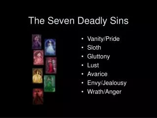
The seven deadly sins • Thou shall not use word art • Thou shall not use poor quality images • Thou shall not use clashing backgrounds • Thou shall not be too busy • Thou shall not change styles • Thou shall not be dull • Thou shall not fire and forget