Download
1 / 5
50 likes | 122 Vues
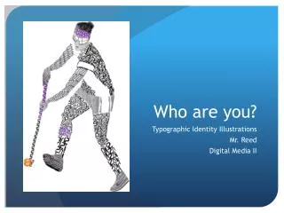
Explore transforming typography in Photoshop to create an original typographic illustration reflecting personal identity. Utilize design principles, color theory, and letterforms to enhance depth and detail. Experiment with fonts and composition for balanced imagery.

E N D
Who are you? Typographic Identity Illustrations Mr. Reed Digital Media II
Goals/Objectives • Refresh their skills on transforming typography in Photoshop • Create their own original image through drawing/building/photography to build a typographic illustration about who you are as a person (identity) • Use the design principles in order to create a successful image focusing on contrast and proximity • Use color theory and value in order to represent depth • Study letterforms for shape and distinguishing details
Process • Brainstorm images that may be successful as a typographic work of art. Be mindful to think about composition on a small 8.5 x 11 inch page. What will work well that has a balance of not too much and not too little detail? • Start by exploring different fonts accessible on Photoshop or on the internet. • You may use as many fonts or styles of fonts that you would like to (Garamond, Arial, Arial bold, Candara, etc.). You may also just stick to one if it lends itself to your imagery. • Color may be used or it can be in black and white for greater impact (shades of black may be used). • Use your chosen fonts and letterforms to design your image.
Reminders • Color or lack of color should be intentional and chosen for a specific reason. • The same goes for the fonts chosen. • Overlapping or changes in opacity will help in creating depth and shadows. • Take your time but be aware of time management if that makes sense. Quality of work shows through patience and decisive actions.