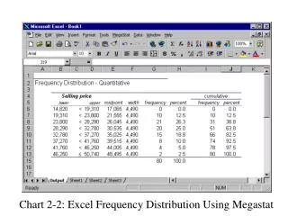
Chart 2-2: Excel Frequency Distribution Using Megastat
120 likes | 1.32k Vues
Chart 2-2: Excel Frequency Distribution Using Megastat. Click on Megastat. Select Frequency Distribution. Select Quantitative, hit Enter. Deselect Histogram and click OK. In the InputRange field, enter the data location. Select Equal Width Interval, and use 4490 as the interval.

Chart 2-2: Excel Frequency Distribution Using Megastat
E N D
Presentation Transcript
Chart 2-2: Excel Frequency Distribution Using Megastat Click on Megastat Select Frequency Distribution Select Quantitative, hit Enter Deselect Histogram and click OK In the InputRange field, enter the data location Select Equal Width Interval, and use 4490 as the interval. Use 19310 as the lower boundary of the first interval
Chart 2-4: Minitab Stem-and-Leaf Display Select Graph Select Stem-and-Leaf Enter the location of the data in the variable field Enter 10 in the Increment field Click OK
Chart 2-8: Excel Histogram In this column, enter the upper limit of each class Label the next column Bin Enter data in first column of worksheet Click on Tools Click on Data Analysis Select Histogram and click OK Click at any rectangle and then right-click the mouse Click Format Data Series; select Options Reduce the graph width to zero. Enter the location of data in the Input Range Enter the location of bin data Check Labels box Check chart output
Chart 2-9: Minitab Histogram Select Graph under “For each” Select bar under “Display” Click the radio button Select MidPoints / CutPoints Enter upper limit of each class in the Midpoint/CutPoint positions box Click OK Click OK Select Histogram Click Options… Select Graph Type the variable in box 1 of Graph variable
Chart 2-13: Excel Bar Chart Enter the location of data in the Data range field Click Series Enter Students in the Name field Click Next In Chart title, type Bar Graph of Student Enrollment Click Next Click Finish In Category (X) axis box, type Students Enrolled Click Chart Wizard Click Next Select Chart Type
Chart 2-14: Excel Clustered Bar Chart Enter the location of data in the Data range field Type 2001 in the name field Click Finish Click Next In the Chart title field, enter Enrollment in 2000 and 2001 Click Series Select Chart Type: Column Click “As new sheet” Click Chart Wizard Click Next In the Category (X) axis field, type Program In the Category (Y) axis field, type students Click Next
Chart 2-15: Excel Stacked Bar Chart In the Chart title field, type Stacked Bar Chart of Enrollment in 2000 and 2001 Click Series 1 and type 2000 in the Name field. Click Series 2 and type 2001 in the Name field. Type Programs in Category (x) axis field and Enrollment in the Value (y) field. Click Finish Click Series Click Chart Wizard Click on Data Label Click Next Click the Show value radio button Click Next Enter location data in the Data range field. Select chart subtype Stacked Column
Chart 2-16: Excel Pie Chart Enter location of data in the Data range field. Click Next Click radio button, As new sheet. Click Finish Click Chart Wizard Click Titles and enter Student Enrollment in the Chart title field. Click Data Labels Click Next Click the Show value radio button Select Pie Click Next
Chart 2-17: Minitab Pie Chart Click Title box and type Enrollment in Different Programs Click Chart table radio button Select Pie Chart Click Categories and insert cell number Click Frequency and type in cell number Select Graph Click OK
Chart 2-18: Excel Line Chart Enter Genetically Modified Food in the Name field Select years and enter in Category (x) field Click Chart Wizard Click Next Click Series Enter Genetically Modified Food in the Chart title field. Enter $billion in the Value (y) field Enter Years (1996 to 2000) in the Value (x) field Click the radio button, As new sheet. Click Next Enter the data location in the Data range field Select Line with Markers Displayed at Each Data Value