Download

1 / 29
290 likes | 432 Vues
Expectations of a data table and Graph. Data Table. Place to Record and Organize data Read Procedure to Determine Parameters Initial Column is Independent Variable – Label! Set information prior to experiment “X” Axis Subsequent Columns are Dependent Variable-Label!

E N D
Data Table • Place to Record and Organize data • Read Procedure to Determine Parameters • Initial Column is Independent Variable – Label! • Set information prior to experiment • “X” Axis • Subsequent Columns are Dependent Variable-Label! • “Depends” on outcome of experiment • “Y” Axis 2 4 5
Now Graph it! Number of Fish Caught per Day on Three Day Fishing Trip 1 2 3 4 5 Number of Fish Caught Day1 Day 2 Day 3 Number of Days Fishing
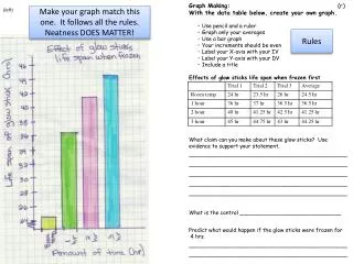
ALL Graphs SHOuld… • Neat, legible writing • Includes all words and numbers • Lines Drawn with a Ruler! • Title of Graph • Reflects information displayed • Key to Explain Data • Explains colors or shading used • Use Graph (or Lined) Paper • Use a Ruler for ALL Lines Drawn • Includes Data Tables and Graphs
Graphs with “X” and “Y” axis • Title “X” Axis which is Independent Variable • Set information prior to experiment • Time, Date... • Title “Y” axis which is Dependant Variable • “Depends” on outcome of experiment • Quantity or amount... • Label units of “X” and “Y” axis • Centimeters? Days? Months? Hours?
Which Graph Do I Use? Circle Graph Histogram Bar Graph Line Graph
Line Graphs • Display data or information that changes continuously over time • Shows overall trends in data over time • Use different colors for each line
Line Graph Example Monthly Days On Market For County Days on Market Months
Bar graphs • Compare quantities in different categories or groups • See relationships quickly • Each bar MUST be equal in width/units • Change in scale may alter visual perception of data • Color or shade each bar
Bar Graph Example Visitor Time in Minutes Median Times in Minutes Exhibits in Museum
Histograms • Looks Similar to Bar Graph • Plot quantitative data with ranges of data grouped into “bins or intervals” • Examples: Weights or Heights of population • Examples: Number of Visitors in Continuous Time Period • Each bar MUST be equal in width/units • Bars Must be Continuous and Stay in Order!
Histogram Example Percentage of People Visiting Museum within a 10 Minute Span over Total 80 Minutes Percent of Total Visitor Time in Minutes
Circle Graphs OR “Pie Charts” • Shows quick picture of data based on percentage of 100 • Data ordered from greatest to least in clockwise direction • All sections added together MUST equal 100% • Color/shade each section differently
Let’s practice! Suppose I offered to buy donuts for six people and three said they wanted chocolate covered, two said plain and one said with icing sugar. • Create a Data table • Create an Appropriate Graph
Does Your Table Look like this? What type of graph would you use? Bar Graph What is the “X” axis? The “y” axis?
Does Your Graph Look Like this? Types of Donuts Chosen by Six People Number of Donuts per Donut Type 1 2 3 4 5 6 Chocolate Plain Icing Sugar Donut Choices of People Interviewed
What calculations are needed to make a circle graph? • 1 out of 6 people ordered Icing Sugar • 1 divided by 6 = .17 x 100 = 17% • 2 out of 6 people total ordered Plain • 2 divided by 6 = .33 x 100 = 33% • 3 out of 6 people total ordered Chocolate • 3 divided by 6 = .50 x 100 = 50% ADD 17% + 33% + 50% = 100%
Let’s practice! • The number of sneakers sold by brand for the past month are as follows: Addidas = 25; New Balance = 18; Nike = 32; Reebok = 15; Other = 10 • Create a Data table • Create an Appropriate Graph
Does your Data table look like this? What is the Independent Variable? Brands of Sneakers What is the Dependent Variable? Numbers of Sneakers Sold
Does your Graph look like this? Number of Shoe Sales this Month by Brand Name Numbers of Shoes Sales Addidas New Balance Nike Reebok Other Brands of Shoes
Does your Graph look like this? Number of Shoe Sales this Month by Brand Name Numbers of Shoes Sales Addidas New Balance Nike Reebok Other Brands of Shoes
Review the data table now – notice the calculations added Do the calculations change the type of graph used?
Let’s practice! • Students polled in a classroom showed varying heights: • 5 students between 4’-5’ tall • 16 students between 5’ and 6’ tall • 4 students between 6’ and 7‘ tall • Create a Data table • Create an Appropriate Graph
Let’s practice! Heights of All Students in Class 2 4 6 8 10 12 14 16 18 20 22 24 26 28 30 Number of Students 1’ 2’ 3’ 4’ 5’ 6’ 7’ Heights of Students in Feet
Summary! • What are the similarities and differences between bar graphs and histograms? • Describe when a circle graph would be used to present data collected. • Which variable - independent or dependent - depicts the “x” axis and “y” axis? • Describe all features every graph must include.