Download
1 / 11
120 likes | 704 Vues
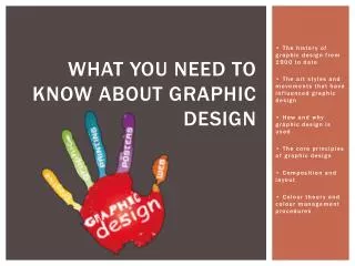
What you need to know about graphic design. • The history of graphic design from 1900 to date • The art styles and movements that have influenced graphic design • How and why graphic design is used • The core principles of graphic design • C omposition and layout

E N D
What you need to know about graphic design • The history of graphic design from 1900 to date • The art styles and movements that have influenced graphic design • How and why graphic design is used • The core principles of graphic design • Composition and layout • Colour theory and colour management procedures
The history of graphic design from 1900 to date • 1900-1950: Art Nouveau, Art Deco, Bauhaus and De Stijlwere some of the popular art movements in this era. • Events going on during this time were: The Titanic sunk, World War I was happening, the great depression happened around the 1930’s and World War II begun at the end of this era. • Popular graphic design artists included: Beggarstaffs (art deco), Edward Penfield (Art Nouveau), Gustav Klimt (New objectivity), Alexander Rodchenko (Contrustivism) and ForunatoDepero (Futurism) • 1950-2000’s: The Psychedelic, Graffiti and street art, Pop Art and Postmodernism were popular art movements within this particular era. • Events going on during this time were: Colour TV was invented, Vietnam War begun in 1965, the first Macintosh was introduced (1984), the Cold war ends and the Internet was invented. • Popular Graphic design artists included: Banksy (graffiti and street art), Max Bill (international typographic style) and April Greiman (Postmodernism) Reference:Jan Rosicky. (2011). Graphic Design Timeline. Available: http://gdh.2rsolutions.cz/. Last accessed 7th Feb 2014.
The art styles and movements that have influenced graphic design • Art Deco: • Style: Geometric/angular shapes, chrome, glass, shiny fabrics and mirror tiles, stylised images e.g. cars, nature motifs (shells and flowers), theatrical contrasts. • Influences: Cubism- experimenting with space, angels and geometry, art nouveau- deco copied nature motifs but discarded it’s long flowing shapes and replaced them with bolder materials. • Popular people from the movement: Eileen Gray, Raymond Templier, Clarice Cliff and Rene Lalique. • Reference: N/A. (2012). Period Style. Available: http://www.bbc.co.uk/homes/design/period_index.shtml. Last accessed 7th Feb 2014. • Art Nouveau: • Style: Curvy lines, Whiplash lines, Vertical lines and height, Stylised flowers, the ‘female form’ and exotic woods, glass and stones. • Influences: Arts and crafts movement- They shared the same belief in quality materials and craftmanship. More influences: Rococo style and Botanical research. • Popular people from the movement: Charles Rennie Macintosh, Alphonse Mucha, Victor Horta and Emile Galle. • Reference:N/A. (2012). Period Style. Available: http://www.bbc.co.uk/homes/design/period_index.shtml. Last accessed 7th Feb 2014. • Graffiti and street art: • Style: Traditional- Painting on the surfaces of public or private property, commonly with a spray can or roll on paint. Stencil- Painting with the use of a homemade stencil, normally cardboard or paper. Sticker- Making homemade stickers of an image or message to be stuck on public places, traditionally to promote political agenda. Wood blocking- Artwork painted on small portions of plywood and attached to street signs with bolts. Reference: Cassandra Naji. (2010). What is Street Art? Vandalism, graffiti or public art- Part I. Available: http://artradarjournal.com/2010/01/21/what-is-street-art-vandalism-graffiti-or-public-art-part-i/. Last accessed 7th Feb 2014. • Influences: Graffiti is recognised to be closely related to the hip-hop culture. [1] “As long as there has been written communication there has been a form of Graffiti. In fact Graffiti can be traced back to the very earliest forms of written and drawn communication such as cave paintings and carvings.” [1] Vic Rupsin. (2012). THE POSITIVE EFFECTS OF GRAFFITI AND STREET ART. Available: http://rupsin.tumblr.com/peog. Last accessed 7th Feb 2014. • Popular people from this movement: Bansky, David Choe, Blek le Rat, Retna, Moose and Edward Kobra.
The art styles and movements that have influenced graphic design (examples) Art deco Art Nouveau Graffiti/street art
How and why graphic design is used • Example: London Tube map • Creator: Harry Beck, Beck designed the map in his own time and wasn’t even a graphic designer by trade, in fact he worked as an engineer on the trains. • Why was it created: The London tube map was created to help the 2 and half million commuters navigate around London everyday. The map shows where the stations are, what stations link to each other, and gives a good starting point on how to plan your journey. • When was it created: He submitted his idea in 1931 and in 1932 his map became successful and resulted in 500 copies. Full publication in 1993. • How it was created using graphic design: The map includes information of 250 miles of track and 273 stations. Colour coding was an important factor. Beck took the original map which were curved lines and ‘modernised’ the map by straitening the lines to make them both clearer and easier to read for the commuters plus also making the map look more user friendly and aesthetically pleasing. ProjectDystopia. (2011). LONDON TUBE MAP: Who Created The London Underground. Available: http://www.youtube.com/watch?v=1xmOpyv5NuI. Last accessed 27th Feb 2014.
The core principles of graphic design • What is Graphic Design?: The process and art of combining text and graphics to achieve a particular message in the design of logos, graphics, posters, signs and other types of visual communication. • The five elements of graphic design are lines, shapes, mass, texture and colour. And these are the ‘building blocks’ for desktop designers. • Lines: Used to divide or unite elements on the page, can be used to show direction or movement to an image or text, provide an anchor to hold elements on a page. • Shapes: The 3 basic shapes used in graphic design are the Triangle, Circle and the Square with the most familiar in graphic design being the square. Shapes are mainly used to border text, create outlines, backdrops for images or text and also to create graphics/logos from scratch. • Mass: Mass is size. The size of text, shapes, the document, images and graphics is a very important factor in graphic design. For example, Mass can be used to change the hierarchy- the bigger the text the more important it is and therefore you would want it to stand out next to the rest of the design. • Texture: For the designer the texture is the feel of the final outcome. For example, will the poster have embossed text so you can feel and visually see the difference as apposed to a flat text or image? Also textures can be visual, familiar textures used in design include: Fabric, stone and wood. • Colour: Colour is used to make the design aesthetically pleasing whilst also adding emotion to the design. For example- using blues are more calming and connote a sadder feel whereas, if you used the colour red, its quite a hot colour and would connote a more angry, serious feel to the design. Not only is colour used for text, it can be used to change the whole feel of images, shapes and graphics through the use of editing and filters. NikouTabaee. (2011). Principles Of Graphic Design Basics. Available: http://www.slideshare.net/nikoutabaee/principles-of-graphic-design-basics. Last accessed 10th Feb 2014
Composition and layout • Rules of thirds: The rules of thirds is a guideline which applies to the process of composing images, graphics and text on a design. The theory is that if you place points of interest in the intersections or along the lines that your photo becomes more balanced and will enable a viewer of the image to interact with it more naturally. Applied to graphic design, rule of thirds would be used to take the pictures properly that would then be placed on a design. • Visual Center and Balance: It’s the idea of placing important elements or the focal point of the design within the visual center of a piece. The visual center is slightly to the right of and above the center of the page. Applied to graphic design, this technique could be used when placing an important graphic to your design. • Grids and Balance: in graphic design, grids to have a visual idea/reference on where you want to place your text, image or logo for example. One popular use of a grid is when making a leaflet. A grid would be used to show where the different paragraphs for the text are going to be placed. • Alignment: Alignment is what order or on what guidelines you want you text, images etc to be ‘aligned, it controls the position. Alignment can be used to create more interesting, dynamic layouts. • Focal Point:The focal point gives viewers of a design something to look at. It adds to the sense of direction and the aesthetics a focal point example could be a large bit of text, a brightly coloured image or a unique design/logo. Cameron Chapman. (2011). A Graphic Design Primer, Part 3: Basics of Composition. Available: http://www.noupe.com/design/a-graphic-design-primer-part-3-basics-of-composition.html. Last accessed 10th Feb 2014.
Colour theory and colour management procedures Complementary/primary colours: • The straight line across the colour wheel, is the the colour’s complement, the colours are basically opposites. For example Yellow is opposite purple so therefore they ‘complement’ each other. The complementary colours are used to offset the main colour and are thought to complete each other. • There are also split complementary colours which means when you pick the complimentary you choose one of the coloursby the side of it giving it a more subtle look. NikouTabaee. (2011). Principles Of Graphic Design Basics. Available: http://www.slideshare.net/nikoutabaee/principles-of-graphic-design-basics. Last accessed 10th Feb 2014
Colour theory and colour management procedures • CYMK: Referred to the ‘four colour process’ CYMK stands for the colours- Cyan, Magenta, Yellow and Black. CYMK is used particularly for large format printing and works by partially or entirely masking colors on a lighter, usually white, background. The ink reduces the light that would otherwise be reflected. Such a model is called subtractive because inks "subtract" brightness from white. • RGB: The RGB (red, green, blue) color mode is most often used when working with light - images that will be displayed back-lit on a television or computer monitor, as is the case with video and web design. Because of the way that light is emitted, red, green and blue are the primary colors when working with light. • Pantone matching system (PMS): PMS is used to accurately match colored inks on coated, uncoated, or matte stocks. Each of the 1,114 pantone (or "spot") colors is assigned its own formula to ensure color consistency from one print. RGB and CMYK color models create a whole spectrum of colors by combining their primary colors, and because of this it can be difficult to reproduce a color exactly from one print job to the next. Adrienne Turcotte. (2009). Color Models in Graphic Design. Available: designertoday.com/Articles/5946/Color.Models.in.Graphic.Design.aspx. Last accessed 10th Feb 2014.
Adobe RGB vssRGB colour • The types: In digital photography, the two colour space available are RGB and SRGB, this two modes can be found in the camera settings. • What is colour space: Colour space is the range of colours that you see in one photo. For example a JPEG image can contain up to 16.7 million different colours but this doesn’t mean that the colour space actually uses up all 16.7 million colours available. Different colour spaces are available and this allows you to use broader or narrower ranges of those 16.7 million colours. • The difference: Looking at the statistics its clear that AdobeRGBis overall better as it represents a wider range of colour- 35% more colour ranges than SRGB. However, this doesn’t necessarily mean it’s better for taking pictures. Due to SRGB being first, most things are built around the mode e.g. video, internet and gaming. It’s more than likely that these types of platforms cannot display all the colours that are available to AdobeRGB. Pictures are often converted from AdobeRBGto SRGB for this reason. • Conclusion: it all comes down to preference, SRBG is more widely used however if you’re using your photos for print its worth using AdobeRGB as it will achieve a better outcome due to the more colour ranges available Reference: Zach Sutton. (2013). AdobeRBG vs. sRGB. Available: http://fstoppers.com/adobergb-vs-srgb. Last accessed 27th Feb 2014.