Inflation Report August 2010
230 likes | 375 Vues
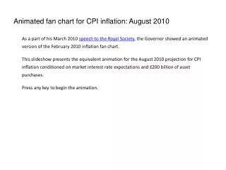
Inflation Report August 2010. Prospects for inflation. Chart 5.1 GDP projection based on market interest rate expectations and £ 200 billion asset purchases.

Inflation Report August 2010
E N D
Presentation Transcript
Inflation Report August 2010
Chart 5.1 GDP projection based on market interest rate expectations and £200 billion asset purchases The fan chart depicts the probability of various outcomes for GDP growth. It has been conditioned on the assumption that the stock of purchased assets financed by the issuance of central bank reserves remains at £200 billion throughout the forecast period. To the left of the first vertical dashed line, the distribution reflects the likelihood of revisions to the data over the past; to the right, it reflects uncertainty over the evolution of GDP growth in the future. If economic circumstances identical to today’s were to prevail on 100 occasions, the MPC’s best collective judgement is that the mature estimate of GDP growth would lie within the darkest central band on only 10 of those occasions. The fan chart is constructed so that outturns are also expected to lie within each pair of the lighter green areas on 10 occasions. In any particular quarter of the forecast period, GDP is therefore expected to lie somewhere within the fan on 90 out of 100 occasions. And on the remaining 10 out of 100 occasions GDP growth can fall anywhere outside the green area of the fan chart. Over the forecast period, this has been depicted by the light grey background. In any quarter of the forecast period, the probability mass in each pair of the identically coloured bands sums to 10%. The distribution of that 10% between the bands above and below the central projection varies according to the skew at each quarter, with the distribution given by the ratio of the width of the bands below the central projection to the bands above it. In Chart 5.1, the ratios of the probabilities in the lower bands to those in the upper bands are approximately 6:4 at Years 1, 2 and 3. See the box on page 39 of the November 2007 Inflation Report for a fuller description of the fan chart and what it represents. The second dashed line is drawn at the two-year point of the projection.
Chart 5.3 Projected probabilities of GDP growth in 2012 Q3 (central 90% of the distribution)(a) Chart 5.2 Projected probabilities of GDP growth in 2011 Q3 (central 90% of the distribution)(a) (a) Charts 5.2 and 5.3 represent cross-sections of the GDP growth fan chart in 2011 Q3 and 2012 Q3 for the market interest rate projection. They have been conditioned on the assumption that the stocks of purchased assets financed by the issuance of central bank reserves remain at £200 billion throughout the forecast period. The coloured bands in Charts 5.2 and 5.3 have a similar interpretation to those on the fan charts. Like the fan charts, they portray the central 90% of the probability distribution. If economic circumstances identical to today’s were to prevail on 100 occasions, the MPC’s best collective judgement is that GDP growth in 2011 Q3 and 2012 Q3 would lie somewhere within the range covered by the histogram on 90 occasions. GDP growth would lie outside the range covered by the histogram on 10 out of 100 occasions. The grey outlines in Charts 5.2 and 5.3 represent the corresponding cross-sections of the May 2010 Inflation Report fan chart, which was conditioned on the same assumption about the stock of purchased assets financed by the issuance of central bank reserves. (b) Average probability within each band; the figures on the y-axis indicate the probability of growth being within ±0.05 percentage points of any given growth rate, specified to one decimal place. As the heights of identically coloured bars on either side of the central projection are the same, the ratio of the probability contained in the bars below the central projection, to the probability in the bars above it, is given by the ratio of the width of those bars.
Chart 5.4 Projection of the level of GDP based on market interest rate expectations and £200 billion asset purchases Chained-volume measure (reference year 2006). See the footnote to Chart 5.1 for details of the assumptions underlying the projection for GDP growth. The width of this fan over the past has been calibrated to be consistent with the four-quarter growth fan chart, under the assumption that revisions to quarterly growth are independent of the revisions to previous quarters. Over the forecast, the mean and modal paths for the level of GDP are consistent with Chart 5.1. So the skews for the level fan chart have been constructed from the skews in the four-quarter growth fan chart at the one, two and three-year horizons. This calibration also takes account of the likely path dependency of the economy, where, for example, it is judged that shocks to GDP growth in one quarter will continue to have some effect on GDP growth in successive quarters. This assumption of path dependency serves to widen the fan chart.
Chart 5.5 Frequency distribution of GDP growth based on market interest rate expectations and £200 billion asset purchases(a) • (a) These figures are derived from the same distribution as Chart 5.1. They represent the probabilities that the MPC assigns to GDP growth lying within a particular range at a specified time in the future.
Chart 5.7 CPI inflation projection in May based on market interest rate expectations and £200 billion asset purchases Chart 5.6 CPI inflation projection based on market interest rate expectations and £200 billion asset purchases Charts 5.6 and 5.7 depict the probability of various outcomes for CPI inflation in the future. They have been conditioned on the assumption that the stock of purchased assets financed by the issuance of central bank reserves remains at £200 billion throughout the forecast period. If economic circumstances identical to today’s were to prevail on 100 occasions, the MPC’s best collective judgement is that inflation in any particular quarter would lie within the darkest central band on only 10 of those occasions. The fan charts are constructed so that outturns of inflation are also expected to lie within each pair of the lighter red areas on 10 occasions. In any particular quarter of the forecast period, inflation is therefore expected to lie somewhere within the fans on 90 out of 100 occasions. And on the remaining 10 out of 100 occasions inflation can fall anywhere outside the red area of the fan chart. Over the forecast period, this has been depicted by the light grey background. In any quarter of the forecast period, the probability mass in each pair of the identically coloured bands sums to 10%. The distribution of that 10% between the bands above and below the central projection varies according to the skew at each quarter, with the distribution given by the ratio of the width of the bands below the central projection to the bands above it. In Chart 5.6, the ratios of the probabilities in the lower bands to those in the upper bands are approximately 4:6 in Years 2 and 3; the upward skew is slightly smaller in Year 1. Those skews are larger than those in Chart 5.7. See the box on pages 48–49 of the May 2002 Inflation Report for a fuller description of the fan chart and what it represents. The dashed lines are drawn at the respective two-year points.
Chart 5.8 Assessed probability inflation will be above target The August and May swathes in this chart are derived from the same distributions as Charts 5.6 and 5.7 respectively. They indicate the assessed probability of inflation being above target in each quarter of the forecast period. The width of the swathe at each point in time corresponds to the width of the band of the fan chart in which the target falls in that quarter, or, if the target falls outside the coloured area of the fan chart, the width of the band closest to the target. The bands in the fan chart illustrate the MPC’s best collective judgement that inflation will fall within a given range. The swathes in Chart 5.8 show the probability within the entire band of the corresponding fan chart of inflation being close to target; the swathes should not therefore be interpreted as a confidence interval.
Chart 5.10 Projected probabilities of CPI inflation outturns in 2012 Q3 (central 90% of the distribution)(a) Chart 5.9 Projected probabilities of CPI inflation outturns in 2011 Q3 (central 90% of the distribution)(a) (a) Charts 5.9 and 5.10 represent cross-sections of the CPI inflation fan chart in 2011 Q3 and 2012 Q3 for the market interest rate projection. They have been conditioned on the assumption that the stock of purchased assets financed by the issuance of central bank reserves remains at £200 billion throughout the forecast period. The coloured bands in Charts 5.9 and 5.10 have a similar interpretation to those on the fan charts. Like the fan charts, they portray the central 90% of the probability distribution. If economic circumstances identical to today’s were to prevail on 100 occasions, the MPC’s best collective judgement is that inflation in 2011 Q3 and 2012 Q3 would lie somewhere within the range covered by the histogram on 90 occasions. Inflation would lie outside the range covered by the histogram on 10 out of 100 occasions. The grey outlines in Charts 5.9 and 5.10 represent the corresponding cross-sections of the May 2010 Inflation Reportfan chart, which was conditioned on the same assumption about the stock of purchased assets financed by the issuance of central bank reserves. (b) Average probability within each band; the figures on the y-axis indicate the probability of inflation being within ±0.05 percentage points of any given inflation rate, specified to one decimal place. As the heights of identically coloured bars on either side of the central projection are the same, the ratio of the probability contained in the bars below the central projection, to the probability in the bars above it, is given by the ratio of the width of those bars.
Chart 5.11 Frequency distribution of CPI inflation based on market interest rate expectations and £200 billion asset purchases(a) • (a) These figures are derived from the same distribution as Chart 5.6. They represent the probabilities that the MPC assigns to CPI inflation lying within a particular range at a specified time in the future. • .
Chart 5.12 GDP projection based on constant nominal interest rates at 0.5% and £200 billion asset purchases See footnote to Chart 5.1.
Chart 5.13 CPI inflation projection based on constant nominal interest rates at 0.5% and £200 billion asset purchases See footnote to Chart 5.6.
Table 1 Conditioning path for Bank Rate implied by forward market interest rates(a) Per cent 2010 2011 2012 2013 Q3(b) Q4 Q1 Q2 Q3 Q4 Q1 Q2 Q3 Q4 Q1 Q2 Q3 August 0.5 0.5 0.6 0.7 0.8 1.0 1.2 1.4 1.6 1.9 2.1 2.2 2.4 May 0.5 0.6 0.8 1.1 1.4 1.7 2.0 2.3 2.6 2.8 3.0 3.2 (a) The data are fifteen working day averages of one-day forward rates to 4 August and 7 May 2010 respectively. The curves are based on overnight index swap (OIS) rates. (b) August figure for 2010 Q3 is an average of realised spot rates to 4 August, and forward rates thereafter.
Chart A CPI inflation (a) Based on market interest rate expectations and the assumption that the stock of purchased assets reached £125 billion and remained there throughout the forecast period. See footnote to Chart 5.6 for information on how to interpret the fan chart.
Chart B GDP (a) Based on market interest rate expectations and the assumption that the stock of purchased assets reached £125 billion and remained there throughout the forecast period. See footnote to Chart 5.1 for information on how to interpret the fan chart. (b) Revisions to early estimates of GDP growth account for the gap between the red and black lines prior to the fan chart.
Chart C CPI components(a) (a) The chart contains data for 69 CPI components. Food and non-alcoholic beverages, fuels and lubricants, and electricity, gas and other fuels have been excluded. Due to data availability, the average inflation rates for five components are calculated since December 2000, while one component is calculated since December 2001. Data are non seasonally adjusted.
Chart A Distribution of CPI inflation central projections one year ahead Sources: Projections of 20 outside forecasters as of 26 April 2010 and 21 outside forecasters as of 22 July 2010. (a) A projection that is on the boundary of these ranges is classified in the higher bucket. For example, a 1.8% projection is included within the 1.8% to 2.2% bucket.
Chart B Distribution of GDP growth central projections(a) Source: Projections of outside forecasters as of 22 July 2010. (a) For 2011 Q3 there were 21 forecasts. For 2013 Q3 there were 18 forecasts. (b) A projection that is on the boundary of these ranges is classified in the higher bucket. For example, a 2.0% projection is included within the 2.0% to 2.5% bucket.
Table 1 Averages of other forecasters’ central projections(a) 2011 Q3 2012 Q3 2013 Q3 CPI inflation(b) 2.4 1.8 1.9 GDP growth(c) 2.0 2.3 2.5 Bank Rate (per cent) 1.2 2.1 3.2 Sterling ERI(d) 81.9 82.5 83.9 Source: Projections of outside forecasters as of 22 July 2010. (a) For 2011 Q3, there were 21 forecasts for CPI inflation, GDP growth and Bank Rate and 17 for the sterling ERI. For 2012 Q3 and 2013 Q3, there were 18 forecasts for CPI inflation, GDP growth and Bank Rate and 15 for the sterling ERI. (b) Twelve-month rate. (c) Four-quarter percentage change. (d) Where necessary, responses were adjusted to take account of the difference between the old and new ERI measures, based on the comparative outturns for 2006 Q1.
Table 2 Other forecasters’ probability distributions for CPI inflation and GDP growth(a) CPI inflation Probability, per cent Range: <0% 0–1% 1–1.5% 1.5–2% 2–2.5% 2.5–3% >3% 2011 Q3 2 5 12 20 24 20 18 2012 Q3 4 10 18 27 23 13 6 2013 Q3 3 9 15 26 25 14 8 GDP growth Probability, per cent Range: <-1% -1–0% 0–1% 1–2% 2–3% >3% 2011 Q3 3 6 14 29 36 13 2012 Q3 3 6 12 24 34 21 2013 Q3 3 7 12 22 31 26 Source: Projections of outside forecasters as of 22 July 2010. (a) For 2011 Q3, 21 forecasters provided the Bank with their assessment of the likelihood of twelve-month CPI inflation and four-quarter GDP growth falling in the ranges shown above; for 2012 Q3 and 2013 Q3, 18 forecasters provided assessments for CPI and GDP. The table shows the average probabilities across respondents. Rows may not sum to 100 due to rounding.