Information Visualization Tools
Information Visualization Tools. Ketan Mane Ph.D. Candidate Member of Information Visualization Lab Member of Cyberinfrastructure for Network Science School of Library and Information Science (SLIS) Indiana University, Bloomington, IN kmane@indiana.edu. This Presentation has Three Parts.

Information Visualization Tools
E N D
Presentation Transcript
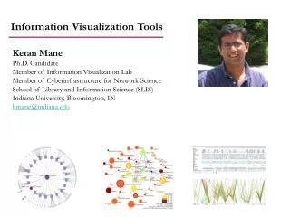
Information Visualization Tools Ketan ManePh.D. Candidate Member of Information Visualization Lab Member of Cyberinfrastructure for Network Science School of Library and Information Science (SLIS) Indiana University, Bloomington, IN kmane@indiana.edu
This Presentation has Three Parts • Information Retrieval Systems • Knowledge Management Visualizations • Visual Computational Diagnostics of Acute Lymphoblastic Leukemia • Patients
This Presentation has Three Parts • Information Retrieval Systems • Knowledge Management Visualizations • Visual Computational Diagnostics of Acute Lymphoblastic Leukemia • Patients
Mane, Ketan & Börner, Katy. (2006). SRS Browser: A Visual Interface to Sequence Retrieval System Visualization and Data Analysis, San Jose, CA, SPIE-IS&T, Jan 15-19, 2006.
SRS Browser – Extends SRS Browser Functionality SRS System SRS Browser
Features of SRS Browser Filter Network to Show Immediate Neighbors
Oncosifter Hierarchical Visualization Interface • Graphical visualization reveal structure in data. • Cancer categories represent hierarchical tree data structure. • Radial tree is used to display cancer categories. • Category classification of cancer is easily available. • Minimum interaction needed to get information.
Oncosifter Hierarchical Search Interface and Corresponding Results Page
This Presentation has Three Parts • Information Retrieval Systems • Knowledge Management Visualizations • Visual Computational Diagnostics of Acute Lymphoblastic Leukemia • Patients
Mapping Topic Bursts Co-word space of the top 50 highly frequent and bursty words used in the top 10% most highly cited PNAS publications in 1982-2001. Mane & Börner. (2004) PNAS, 101(Suppl. 1):5287-5290. 11
PNAS citations received by top U.S. institutions Börner & Penumarthy.(2005) 12
Math Law Computer Tech Policy Statistics Economics CompSci Phys-Chem Vision Chemistry Education Physics Psychology Brain Environment GeoScience Psychiatry MRI Biology BioChem Bio- Materials Microbiology Plant Cancer Animal Infectious Diseases Virology Science map applications: Identifying core competency Funding Patterns of the National Institutes of Health (NIH) GI 13
Math Law Computer Tech Policy Statistics Economics CompSci Phys-Chem Vision Chemistry Education Physics Psychology Brain Environment GeoScience Psychiatry MRI Biology BioChem Bio- Materials Microbiology Plant Cancer Animal Infectious Diseases Virology Science map applications: Identifying core competency Funding Patterns of the National Science Foundation (NSF) Kevin W. Boyack & Richard Klavans, unpublished work. 14
Boyack, Kevin W., Mane, Ketan and Börner, Katy. (2004). Mapping Medline Papers, Genes, and Proteins Related to Melanoma Research. IV2004 Conference, London, UK, pp. 965-971.
Association Maps Gene-Gene Network Gene-Paper Network
Boyack, Kevin W., Mane, Ketan and Börner, Katy. (2004). Mapping Medline Papers, Genes, and Proteins Related to Melanoma Research. IV2004 Conference, London, UK, pp. 965-971.
This Presentation has Three Parts • Information Retrieval Systems • Knowledge Management Visualizations • Visual Computational Diagnostics of Acute Lymphoblastic Leukemia • Patients
Computational Diagnostics • Visualization Goal: Identify factors that cause relapse in patients • Relapse insight can be gained by – • Global overview of medical condition of all patients in the dataset • Ability to identify worst medical condition in patients • Comparing patient medical condition at diagnostic variable(s) level • Ability to identify and compare patient groups that share similar medical condition across multiple variables Jada Pane Dr. Katy Börner Ketan Mane Julie Haydon Dr. Susanane Raggs
Computational Diagnostics – Tool Requested by Client Matrix visualization Phenotype and prognosis Parallel Coordinate Visualization Coupled Windows
Computational Diagnostics – Interactive Visualization System Architecture
Computational Diagnostics - Dataset Details Diagnostic data variables from medical records for Acute Lymphoblastic Leukemia (ALL) patients are categorized into • a. OutcomePatient Variables:relapse, relapse site, alive/death status, and LDKA.b. BiologyPatient Variables: immunophenotype, genetic condition, WBC, Hgb, platelets, • and CNS. • c. HostPatient Variables: diagnostic age (ageDx), gender, and race.d.Treatment • Patient Variables: BM 7 and BM 14.e. Social Factors • Patient Variables: MFI-class, education level, %single family members, and % family employment. • All data was provided by Dr. Susanne Raggs, Julie Haydon and Jada Pane.
Matrix Visualization – Phenotype View • Data is shown independent of other variables. • Color codes help to provide a quick insight into patient medical condition.
Matrix Visualization – Prognosis View • Color codes indicate event free survival in percent (%EFS). • All variable values are dependent on other variable values.
Matrix Visualization – Combined View • Facilitates selection of phenotype/prognosis view for individual diagnostic variables.
Parallel Coordinates Visualization • Uses one axis for each data variable. • For each patient, all data values on different parallel axis are connected. • All patient graphs are shown here. Single or multiple patients can be selected and studied in detail.
Parallel Coordinates Visualization Tool-tip display to show diagnostic values of selected patient.
Parallel Coordinates Visualization – User Interactions Display axes-labels to mark different regions/values along axes • Numerical landmarks along axes showing values for quantitative variables. • Category labels used along axes show values for nominal variables.
Parallel Coordinates Visualization – User Interactions Display zones to show severity values for different variables • Triangular zones indicate variables with quantitative values. • Rectangular zones are used for variables with nominal values.
Parallel Coordinates Visualization – User Interactions Axis selection to study global variations in patient values • Single axis can be selected to study the trend in patient values. • Red-to-green gradient used to indicate values along the selected axis. [Red = High value, Green = Low value]
Parallel Coordinates Visualization A subset of patents can be selected and examined as a group.
Parallel Coordinates Visualization Simultaneous display of patient groups to study differences. Patient Group 1 Patient Group 2 Patient Group 1 & 2
Parallel Coordinates Visualization Multiple Coordinated Views • Patient can be selected and color coded in matrix view. • Corresponding patient lines are highlighted in parallel coordinate view.

