Download
1 / 17
170 likes | 313 Vues
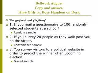
Bellwork August Copy and answer. Have Girls vs. Boys Handout on Desk. What type of sample is each of the following? 1. If you mail a questionnaire to 100 randomly selected students at a school? Random sample 2. If you survey 20 people as they walk past you on the street. Convenience sample

E N D
Bellwork August Copy and answer.Have Girls vs. Boys Handout on Desk • What type of sample is each of the following? • 1. If you mail a questionnaire to 100 randomly selected students at a school? • Random sample • 2. If you survey 20 people as they walk past you on the street. • Convenience sample • 3. You survey visitors to a political website in order to predict the winner of an upcoming election. • Biased sample
Girls vs. Boys • How do populations and samples fit in with central tendencies in the girls vs. boys lab?
Unit 1 Chapter 7 Section 9 Scatter Plots Pg. 416
EQ: • What is the difference between positive correlation, negative correlation, and no relation in scatter plots?
What is a scatter plot? Video Cliphttp://player.discoveryeducation.com/index.cfm?guidAssetId=BBC2764E-EA6D-4145-87FF-1E9FF1971509&blnFromSearch=1&productcode=USDogs • Correlation is the relationship of two or more things, parts, etc. • WRITE DOWN 1 FACT FROM THE VIDEO CLIP.
Definitions: • Scatter plot: a graph with points plotted to show a possible relationship between two sets of data • Negative correlation:two data sets have a negative correlation if one set of data values increase while the other decreases • positive correlation:two data sets have a positive correlation when their data values increases or decreases together • no correlation:two data sets have no correlation when there is no relationship between their data values
To find out if two sets of data may be related, you can make a scatter plot of the data values in each set. A scatter plot has two number lines, called axes—one for each set of data values. Each point on the scatter plot represents a pair of data values. These points may appear to be scattered or may cluster in the shape of a line or a curve.
Correlations There are three ways to describe data displayed in a scatter plot. Positive Correlation Negative Correlation No Correlation The values in both data sets increase at the same time. The values in one data set increase as the values in the other set decrease. The values in both data sets show no pattern.
Steps for creating a scatter plot 1. Determine the scale and interval for each axis 2. Plot the point for each pair of values 3. Label the axes and the graph
Number of Endangered Species Type U.S. Only Rest of World Mammals 63 251 Birds 78 175 Reptiles 14 64 Amphibians 10 8 Fishes 70 11 Clams 61 2 Example 1 Use the data to make a scatter plot. Describe the relationship between the data sets. Number of Endangered Species 300 240 180 120 60 0 Rest of World 0 20 40 60 80 U.S. There appears to be no relationship between the data sets.
Year Number of farm workers in thousands 1940 8,995 1950 6,858 1960 4,132 1970 2,881 1980 2,818 1990 2,864 Example 2 Use the data to make a scatter plot. Describe the relationship between the data sets. Number of Farm Workers 10,000 8,000 6,000 4,000 2,000 Number (in thousands) The number of farm workers decreased from 1940 to 1970, which creates a negative correlation. 1940 1960 1980 2000 Year
Example 3 Write positive correlation, negative correlation, or no correlation to describe each relationship. Explain. The graph shows that as area increases, population increases. So the graph shows a positive correlation between the data sets.
Example 4 Write positive correlation, negative correlation, or no correlation to describe each relationship. The graph shows that as the length of string increases, frequency decreases. So the graph shows a negative correlation between the data sets. vps = vibrations per second
Example 5 Write positive correlation, negative correlation, or no correlation to describe each relationship. Explain. height and number of vacation days The number of vacation days is not related to height. So there would not be any correlation between these two variables.
Work Session- A Sport with Teeth • A scatter plot shows the relationship between 2 quantities. • Look at the scatter plot on your handout. • Use the scatter plot on your paper to answer the questions. • Read each question carefully. • Good Luck!
Closing- Positive, Negative, or No Correlation? Positive Negative