Enhancing Information Visualization: Principles and Best Practices for Effective Dashboards
160 likes | 275 Vues
This overview discusses the fundamental concepts of information visualization, aiming to enhance understanding and cognition. It covers methods to increase brain resource availability, reduce search times, and improve pattern recognition. Key topics include types of relationships, the use of different visual elements like tables and graphs, and common mistakes in dashboard design. The principles of effective visualization are emphasized, such as the data-ink ratio and the importance of clear design. The goal is to create dashboards that provide critical information at a glance while ensuring clarity and usability.

Enhancing Information Visualization: Principles and Best Practices for Effective Dashboards
E N D
Presentation Transcript
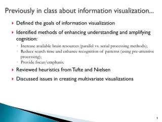
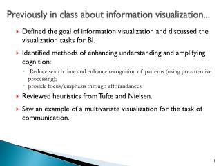
Previously in class about information visualization... • Defined the goals of information visualization • Identified methods of enhancing understanding and amplifying cognition: • Increase available brain resources (parallel vs. serial processing methods); • Reduce search time and enhance recognition of patterns (using pre-attentive processing); • Provide focus/emphasis. • Reviewed heuristics from Tufte and Nielsen • Discussed issues in creating multivariate visualizations
Previously in the readings... • Understand quantitative relationships • Nominal vs. ordinal vs. interval vs. hierarchical relationships • Ranking vs. ratio vs. correlation • Measures of average and distribution • Concepts of tables and graphs • Tables are used to see individual values; graphs are used to reveal relationships among multiple values • Tables and graphs should be sorted to highlight key message. • Relative use of pie charts, bar charts, line charts, sparkline, small multiples, box plot... • Showing relationships vs. deviation vs. correlation vs. ranking vs. time-series vs. part-to-whole vs. distribution • Importance of sorting tables and graphs.
Dashboards (Stephen Few’s definition) • Visual display • Key Information • Most important information to monitor one or more objectives • Usually related directly to key performance indicators • Consolidated • Fits on one screen (no scrolling!) • Designed to be monitored at a glance
Dashboard examples galore! http://www.infosol.com/business%20intelligence/library-dashboards.aspx http://www.dundas.com/dashboard/online-examples/ http://www.tableausoftware.com/ http://www.exceluser.com/dash/samples.htm http://dashboardsbyexample.com/ http://www.dashboardzone.com/
Dashboard videos abound! http://www.it-performs.com/services/dashboard-centre/dashboard-videos http://www.dminebi.com/dmine-dashboard-videos/ http://www.youtube.com/watch?v=V9GMCS-WjyI&feature=related http://www.youtube.com/watch?v=0AS9TIK1QFk&feature=related
Dashboards are not new... Derived from the work on executive information systems (late 1980’s through 1990’s). Further roots in the work on the “balanced scorecard” concept to broaden perspective from financials alone. Uses the dashboard metaphor to develop fast recognition and appeal.
Common mistakes • Overall design • Exceeding boundaries of a single screen. • Limiting design to the dashboard metaphor. • Choosing ineffective or inappropriate visualization methods. • Poor flow/arrangement of presentation of data. • Content • Choosing a deficient, inappropriate or ineffective measure. • Supplying inadequate context for the data. • Displaying excessive detail or precision. • Detailed design (look and feel) • Misusing or overusing color; meaningless variety of color and shape. • Poor highlighting of important data. • Cluttering the display with useless decoration.
Well-designed dashboard • Delivers information that is: • Exceptionally well-organized. • Condensed. • Provides summaries and exceptions. • Specific to the requirements of the audience. • Presented on the media of choice for the audience (computer, phone, tablet, etc.) • Flexible. • Able to be pursued in more detail beyond the dashboard.
Key Goals (Tufte, 1980’s, Few, 2010’s) Understand and make best use of screen real estate Maximize the data-ink /total-ink ratio (or data pixels/total pixels ratio...) Eliminate all unnecessary non-data pixels De-emphasize all non-data pixels and make them slip into the background of the overall design Highlight the most important data pixels
Emphasized Neither emphasized or de-emphasized Emphasized Neither emphasized or de-emphasized De-emphasized
Junk pixels Grid lines in graphs that don’t need precision Backgrounds that don’t provide delineation of sections on the dashboard 3-D that doesn’t provide additional variables or layers of analysis Drawings that are not part of the data – including detailed logos Colors that don’t highlight or emphasize data Meters and gaugesthat don’t incorporate preattention
Good design Arrange the overall design to reflect how the intended audience “thinks” about the decisions to be made. Group related data. Arrange the data in a meaningful order (low to high; high to low) Use bright colors sparingly and judiciously. Avoid use of a colored background. White space is an effective delimiter. Use fonts with good legibility and readability.
