Download

1 / 3
0 likes | 17 Vues
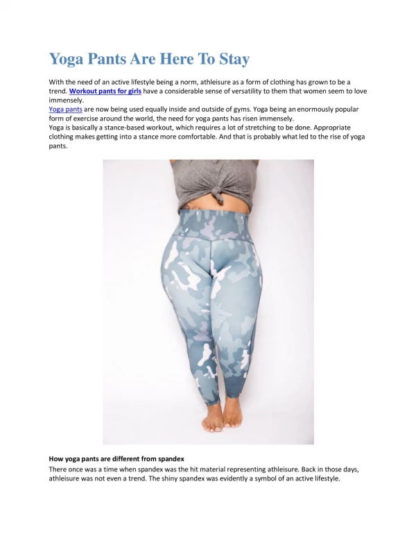
Dark mode user interfaces, with their black or dark backgrounds and white or brightly colored text/graphics, have become an incredibly popular design trend in mobile UI/UX designs over the past few years. While early dark mode designs were aimed primarily at developers, the sleek look and increased comfort for users has led many major apps and operating systems to adopt dark themes. It's now clear that dark mode is much more than just a trend - it's emerged as a highly desired feature that's likely here to stay. Read on to learn how proper dark theme implementation unlocks desirability.<br>

E N D
Dark Mode: A UI Trend That's Here to Stay ================================================================== The early years of personal computing predominantly involved interfaces with light backgrounds. This was likely due to the positive associations with white paper and the high contrast of dark text. However, as screens have advanced and more work/leisure activities involve staring at displays for hours on end each day, dark mode has surged in popularity. Recent research has uncovered various reasons for this rise. Readability on modern displays is equal, if not improved, with dark backgrounds and appropriately colored text. Dark mode reduces eye strain for many users, lowers power usage on devices with OLED displays, and simply provides an Additionally, dark mode themes in UX/UI designs are already prevalent in contexts where displays are viewed in darker environments, such as in theaters. As device usage habits shift, dark appearances have become increasingly associated with elegantly designed digital interfaces in mobile UI/UX design services. aesthetically pleasing, modern look. Major technology players like Microsoft, Apple, and Google have responded by building dark themes into their operating systems and many stock apps. Mobile UI/UX designers have done the same for custom interfaces. And support for switching an OS, app, or website design between light and dark modes is now commonplace and considered a hallmark of good design. Benefits of Dark Mode UI Beyond the modern stylistic advantages, dark mode UI brings some key benefits: ● Eye Strain Reduction Staring at brightly lit screens in darker environments leads to eye strain over time. Dark mode in UX/UI designs alleviates this by reducing overall brightness and providing higher contrast for the human eye in such contexts. Light text on dark backgrounds is easier to focus on. ● Lower Power Consumption For devices with OLED displays, using darker colors saves battery life. Pixels displaying black and dark colors require less power than lighter ones. Whites consume the most
power. Global tech giants have reported significant power savings from adopting dark modes, especially for tasks people spend hours at such as coding or reading. ● Enhanced Focus The higher contrast of light elements against dark backgrounds also leads to increased focus and attention. Reduced glare and eye strain certainly play a role here as well. But dark mode in mobile UI/UX designs also provides a more subtle background for distraction-free reading, coding, writing, etc. ● Customization Options Now that support for dark mode is commonplace, users can customize interfaces to best suit their environment and preferences. Bright daylight viewing may favor a light UI, whereas nighttime usage likely aligns better with darker themes. Users can manually toggle settings or have devices automatically shift modes based on ambient light conditions. Either way, the choice is there. Dark Mode in User Experience (UX) Design For UX designers, dark mode presents updated best practices: Ensure proper color contrasts- White text on black works well, but other element colors may need tweaking to maintain readability. Brighter more saturated hues tend to work better than dull lighter colors against dark backgrounds. Test for usability- No matter how aesthetically pleasing a dark design might be, usability testing is still essential to ensure UI elements are usable for users. Testing may spur further color/contrast tweaks. Make dark mode consistent- The entire UI design should shift to dark, avoiding mixing bright and darker elements without purpose. Keep layouts as consistent Accommodate images/videos with filters/overlays if needed. as possible between modes. Automate switching- Users expect their OS, apps, and websites to respond automatically to system-level light/dark scheme changes. UI/UX designers should build this toggle support in from the start.
Account for lighting conditions- Very dark UIs in very bright daylight viewing conditions could still potentially strain user eyes. Allow overrides for user comfort. Properly implementing dark color schemes involves much more than simply changing background colors and calling it “dark mode”. But when thoughtfully designed and tested, dark interfaces unlock aesthetics, usability and flexibility today’s users desire. As screens continue proliferating our lives, so shall support for dark modes. Their increasing ubiquity confirms dark UI as a much more meaningful long-term design trend rather than a passing fad. Developing lighting-agnostic UX design skills will only grow more relevant in the years to come. Expect dark interfaces to expand across platforms and one day potentially eclipse their light counterparts Conclusion Trend Set to Expand Looking ahead, as digital devices continue permeating nearly all daily user activities and contexts, support for agnostic interface themes that maximize usability across lighting conditions appears certain in mobile UI/UX designs. Though still requiring intentional design considerations around color/contrast and testing, the long-term trajectory points to dark modes steadily expanding across platforms. Eventually dark interfaces may even eclipse their light counterparts in dominance. Developing UX/UI design skills flexible to light and dark use will only grow more relevant for brands seeking to engage users in an increasingly multi-device world. Leading UX/UI design agency Consagous Technologies lives at the intersection of effective visual interfaces and next-generation technologies. Our human-centered focus allows us to craft beautiful, functional digital experiences that not only satisfy end users but also achieve core business goals for clients. Get in touch today to see how our UI/UX design services can take your mobile app or website to the next level by implementing cutting-edge interfaces like dark mode.