1 / 2
20 likes | 48 Vues
Responsive web designing responds to the preferences of the users, optimally and automatically. This is regardless of the screen or software they are using. Responsive designing is an approach in which the site is planned

E N D
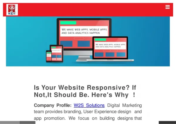
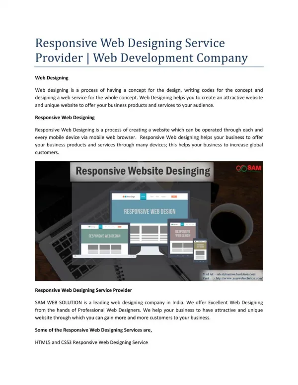
Understanding the Basics of Responsive Web Designing Responsive web designing has become quite popular with the fast and inevitable shift from desktop to mobile. Today, designers are not just creating websites for devices with a mouse and keyboard but also for hand-held devices such as tablets and smartphones. Since the number of these devices has increased, the variety of browser specifications and screen resolutions has also gone up. Creating a new version of the website for each screen size or device is an almost impossible and impractical idea. Therefore, designers have started focusing on responsive designing. Responsive web designing responds to the preferences of the users, optimally and automatically. This is regardless of the screen or software they are using. Responsive designing is an approach in which the site is planned, designed as well as developed for appearing optimally on a range of devices. With the help of this front-end development process, website design can be moulded according to the device it is being viewed on, be it desktop, mobile or tablet. A designer named Ethan Marcotte was the first one to advocate the concept of responsive web designing back in 2010. He also advocated the use of flexible images, fluid grids and media queries. These are the top three techniques that work in conjunction in responsive web designing. Net Magazine had voted the responsive web design approach as the second top web design trend in 2012. Since then, this web design approach is being widely used by designers across the globe. Since the use of mobile phones has increased and people are using their device to browse products, services and information on-the-go, responsive designing has become a necessity. With the change in the landscape of web browsers, user expectations have also increased. People are wanting to browse the web on their smart phones or tablets as easily as they are browsing the web on their laptop or desktop. Regardless of the industry you are in or the product or services you are offering, having a responsive website will help enhance user experience. Customers want everything on-the-go and if they can easily access your site on their smartphone or tablet while travelling or commuting to work, then they will keep coming back to the site for more. User experience should be the number one priority for your business and a well-designed responsive site can help you achieve the same. With this design approach, users will be able to engage seamlessly with the site, irrespective of the device they are using. They can do this at any given time and without too much of a hassle. So in order to succeed with your online presence and tap the customer base of tablet and smartphone users, don’t hesitate in investing in responsive design. Also, make sure that you have
hired a team of professional designers who will handle this task for you. Only a good team of designers will be able to deliver desired results.