Download
1 / 37
390 likes | 632 Vues
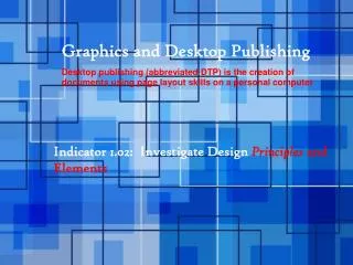
Graphics and Desktop Publishing Desktop publishing (abbreviated DTP) is the creation of documents using page layout skills on a personal computer. Indicator 1.02: Investigate Design Principles and Elements. The Six Principles of Design!!! IN DESKTOP PUBLISHING.

E N D
Graphics and Desktop Publishing Desktop publishing (abbreviated DTP) is the creation of documents using page layout skills on a personal computer Indicator 1.02: Investigate Design Principles and Elements
The Six Principles of Design!!! IN DESKTOP PUBLISHING
The Six Principles of Design!!! • Alignment • Balance • Contrast • Proximity/Unity • Repetition/Consistency • White Space • (Bob Painted A White Car Red) See teacher
Alignment • Alignment of elements in a pattern or grid. • Visual relationship between all of the elements in a layout, even if the elements are far apart.
Symmetrical Balance • Elements of the design are centered or evenly divided both vertically and horizontally.
Asymmetrical Balance • Off-center alignment is created with an odd or mismatched number of elements.
Radial Balance • The elements radiate from or swirl around in a circular or spiral path.
Contrast • The use of big and small elements, black and white text, squares and circles. • Adds emphasis to important information • Adds appeal
Proximity/Unity • Grouping elements to demonstrate their relationship to each other. • Makes it easier for the reader to understand the relationships between elements. • Examples: • Captions placed with the pictures they describe. • Images placed near the text they are depicting.
Repetition/Consistency • Repeat some aspect of the design throughout the entire layout. • Aids navigation • Improves readability
White Space • Negative or space empty of any color. • Gives a design breathing room. • Smoothes transition between elements.
Graphics and Desktop Publishing ELEMENTS OF DESIGN!! IN DESKTOP PUBLISHING
1 2 3 Grids Rule of Thirds Rule of Thirds and Grids • Using imaginary grids to visually divide the page into thirds vertically and/or horizontally and placing most important elements within those thirds.
1 2 3 Z Optical Center Z-Pattern Optical Center and Z-Pattern • Optical Center – The spot the eye first sees when it encounters a page. • It is slightly above and to the right of the actual center of the page. • Z-Pattern – The pattern eye follows when scanning a page. • Place important elements along the Z-pattern
Lines as Design Elements • Lines are a powerful but simple method of enhancing a publication. • Lines can be of any size, shape, texture or pattern and may be placed in any direction. • Curves, dot leaders and arrows are considered lines! • Lines can be used to: • Organize information such as tables or catalogs. • Simulate movement • Connect pieces of information or graphics. • Separate one part of the layout from another. • Provide texture. • Convey mood or emotion. • Define shapes (outline). • Provide emphasis
Leaves Speaker X’s Post Hat Box Fence Lines Can Connect
Lines Can Separate • Lines are being used to separate the columns of text in these examples.
Lines Can Provide Texture • Lines can be used to create texture.
Magazine Article Title Newspaper Title Lines Can Provide Emphasis Magazine Article Title
Shapes as Design Elements • Shapes are often used in logos, but can be used many different ways. • Shapes can be: • Geometric Shapes – Triangles, Squares, Circles • Natural Shapes – Leaves, Flower Pedals • Abstract Shapes – A blend of natural and geometric shapes • Used to: • Highlight information • Organize or separate information • Make the design more interesting
Shapes Have Meaning… • Squares and Rectangles symbolize honesty, equality, stability and comfort. • Circles symbolize infinity, security and completeness. • Triangles symbolize action or conflict.
Mass as a Design Element • Mass then refers to the size, space and “heaviness” of an object. • Every object, or element, has mass whether it is a line, shape, text or graphics. • Darker colors are visually heavier than lighter colors. Mass Mass Mass
Texture as a Design Element • Texture is an effect applied to a background or as the fill for an object. • It can be drawn or be an actual image. • Texture can refer to visual texture (how it looks) and the physical texture of the paper. • Different paper texture will make colors look different.
Color as a Design Element • Color is one of the most important elements of design. • It evokes emotion and action and can attract or detract attention. • It is hard to get accurate color when creating publications on the computer because different devices create color in different ways. • Two main devices are the monitor and printer.
Color on Monitors • Computer monitors and televisions show color as light. • The colors are a mixture of red, green and blue light, referred to as RGB color. • The amount of red, green and blue are shown in different amounts in different “spots” on the monitor to produce an image.
Color on Monitors Continued… • RGB – Red, Green, Blue • RGB colors are expressed as hexadecimal numbers when used on web pages. • Each color is assigned a number between 0 and 255 to show how much of that color to add. • As each color is added, the mixed color becomes lighter. • When all three are set to 255, the mixed color is white. • When all three are set to 0, the mixed color is black. • Both numbers below are the same RGB color. • 255 150 0 • FF9600 (Hexadecimal)
Color and Printers • Printers cannot print with light, they must use ink or toner. • Printers and printing presses use a color method called CMYK. • Stands for: Cyan, Magenta, Yellow and Black. • They are based on percentages. • If each is set to 100%, the color is black. • As each percentage for each color is subtracted, the color changes. • If all colors are subtracted, or set to 0%, the color is white.
The Color Wheel • A color wheel is a chart used to show the relationship between colors. Can be used to pick colors that will look good together in desktop publishing. Shows the relationship between colors. • Complementary Colors - Colors that look good when used together to create a more visually pleasing publication. • Color Schemes • Cool Colors – The half of the wheel with blue in them. Considered calming. • Warm Colors – The half of the wheel with red in them. Considered Exciting.
Color Terms • Hue – A color. • Shade – A hue + Black • CMYK and RGB can be made darker by adding black. • The original color is not changed, it just becomes darker. • Tint – A hue + White • CMYK and RGB colors can be made lighter by adding white. • The original color is not changed, is just become lighter. • Saturation – The amount of the hue used. • Value – Refers to the lightness or darkness of the hue.
Color Matching • Since color is displayed differently on monitors than it is printed with printers, color matching must be used. • This is the process of matching the printed ink color as closely as possible to the color displayed on the monitor. • The goal is to make the printed publication as close to the one on the monitor as possible.
Website Resources View More Examples OF Six Design Principles!!! • http://desktoppub.about.com/od/designprinciples/l/aa_pod2.htm • http://www.alifetimeofcolor.com/main.taf?p=3,1,1,8 • http://www.alifetimeofcolor.com/main.taf?p=3,1,1,9 • http://desktoppub.about.com/od/designprinciples/l/aa_pod2.htm • .
Website Resources View More Examples OF Elements of Design • (link to about.com for line examples) • Link to about.com for an additional example of lines used to separate. • Link to about.com for more about paper textures. • Link to about.com for more about visual textures • (Link to about.com for color meanings) • Link to RGB example on Wikipedia. • Link to Wikipedia for CMYK color. • .