Google analytics to Power Bi visualization
40 likes | 53 Vues
From simple bar charts to pie charts, Power BI offers a wide range of visualisations. You may create the visualisation by <br>dragging field names from the fields plane and dropping them onto the report canvas, then selecting the visualisation type.<br>You also monitor, study, and visualise your Google Analytics data using Power BI.Connecting to Google Analytics in Power <br>BI is simple, and you'll get insights into your site's usage in the last six months almost immediately.<br>

Google analytics to Power Bi visualization
E N D
Presentation Transcript
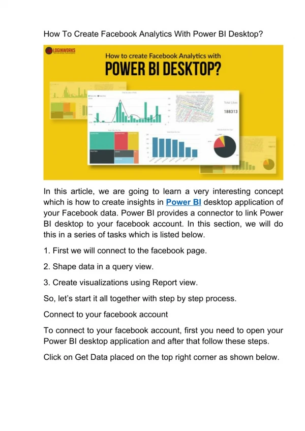
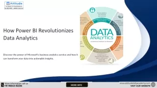
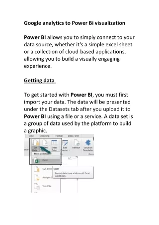
Google analytics to Power Bi visualization Power BI allows you to simply connect to your data source, whether it's a simple excel sheet or a collection of cloud-based applications, allowing you to build a visually engaging experience. Getting data To get started with Power BI, you must first import your data. The data will be presented under the Datasets tab after you upload it to Power BI using a file or a service. A data set is a group of data used by the platform to build a graphic.
Modelling You'll need all of this data to operate together once you've integrated data from various sources. Modeling aids in the creation of a logical link between diverse data sources. This connection is referred to as a relationship in Power BI. Visualization in power Bi From simple bar charts to pie charts, Power BI offers a wide range of visualisations. You may create the visualisation by dragging field names from the fields plane and dropping them onto the report canvas, then selecting the visualisation type.You also monitor, study, and visualise your Google Analytics data using Power BI.Connecting to Google Analytics in Power BI is simple, and you'll get insights into your site's usage in the last six months almost immediately.
1 2)