
Uploaded by
devin-huff
2 SLIDES
165 VUES
20LIKES
Visualizing Color Distribution in Tallies: Scatter Plot Analysis
DESCRIPTION
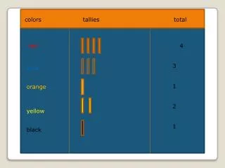
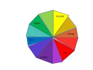
This analysis presents a scatter plot showcasing the distribution of various colors based on tally counts. The dataset includes categories such as red, blue, orange, yellow, and black, with recorded tallies of 4, 3, 1, 2, and 1 for each color. The scatter plot vividly illustrates the frequency of each color and allows for easy comparison. This visual representation helps in understanding color trends and can be beneficial for studies in design, marketing, or data analysis.
Download
1 / 2
Télécharger la présentation 
Visualizing Color Distribution in Tallies: Scatter Plot Analysis
An Image/Link below is provided (as is) to download presentation
Download Policy: Content on the Website is provided to you AS IS for your information and personal use and may not be sold / licensed / shared on other websites without getting consent from its author.
Content is provided to you AS IS for your information and personal use only.
Download presentation by click this link.
While downloading, if for some reason you are not able to download a presentation, the publisher may have deleted the file from their server.
During download, if you can't get a presentation, the file might be deleted by the publisher.
E N D
Presentation Transcript
colors tallies total red 4 3 1 2 1 red 4 3 1 2 1 blue blue orange orange yellow yellow black black


More Related