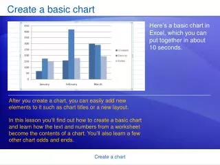
Create a basic chart
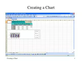
Create a basic chart. Here’s a basic chart in Excel, which you can put together in about 10 seconds. . After you create a chart, you can easily add new elements to it such as chart titles or a new layout.

Create a basic chart
E N D
Presentation Transcript
Create a basic chart Here’s a basic chart in Excel, which you can put together in about 10 seconds. After you create a chart, you can easily add new elements to it such as chart titles or a new layout. In this lesson you’ll find out how to create a basic chart and learn how the text and numbers from a worksheet become the contents of a chart. You’ll also learn a few other chart odds and ends. Create a chart
Create your chart Here’s a worksheet that shows how many cases of Northwind Traders Tea were sold by each of three salespeople in three months. You want to create a chart that shows how each salesperson compares against the others, month by month, for the first quarter of the year. Create a chart
Create your chart The picture shows the steps for creating the chart. Select the data that you want to chart, including the column titles (January, February, March) and the row labels (the salesperson names). Click the Insert tab, and in the Charts group, click the Column button. Create a chart
Create your chart The picture shows the steps for creating the chart. You’ll see a number of column chart types to choose from. Click Clustered Column, the first column chart in the 2-D Column list. That’s it. You’ve created a chart in about 10 seconds. Create a chart
Create your chart If you want to change the chart type after creating your chart, click inside the chart. On the Design tab under Chart Tools, in the Type group, click Change Chart Type. Then select the chart type you want. Create a chart
How worksheet data appears in the chart Here’s how your new column chart looks. It shows you at once that Cencini (represented by the middle column for each month) sold the most tea in January and February but was outdone by Giussani in March. Create a chart
How worksheet data appears in the chart Data for each salesperson appears in three separate columns, one for each month. The height of each chart is proportional to the value in the cell that it represents. So the chart immediately shows you how the salespeople stack up against each other, month by month. Create a chart
How worksheet data appears in the chart Each row of salesperson data has a different color in the chart. The chart legend, created from the row titles in the worksheet (the salesperson names), tells which color represents the data for each salesperson. Giussani data, for example, is the darkest blue, and is the left-most column for each month. Create a chart
How worksheet data appears in the chart The column titles from the worksheet—January, February, and March—are now at the bottom of the chart. On the left side of the chart, Excel has created a scale of numbers to help you to interpret the column heights. Create a chart
Chart Tools: Now you see them, now you don’t Before you do more work with your chart, you need to know about the Chart Tools. After your chart is inserted on the worksheet, the Chart Tools appear on the Ribbon with three tabs: Design, Layout, and Format. On these tabs, you’ll find the commands you need to work with charts. Create a chart
Chart Tools: Now you see them, now you don’t When you complete the chart, click outside it. The Chart Tools go away. To get them back, click inside the chart. Then the tabs reappear. So don’t worry if you don’t see all the commands you need at all times. Take the first steps either by inserting a chart (using the Charts group on the Insert tab), or by clicking inside an existing chart. The commands you need will be at hand. Create a chart
Change the chart view You can do more with your data than create one chart. You can make your chart compare data another way by clicking a button to switch from one chart view to another. The picture shows two different views of the same worksheet data. Create a chart
Change the chart view The chart on the left is the chart you first created, which compares salespeople to each other. Excel grouped data by worksheet columns and compared worksheet rows to show how each salesperson compares against the others. Create a chart
Change the chart view But another way to look at the data is to compare sales for each salesperson, month over month. To create this view of the chart, click Switch Row/Column in the Data group on the Design tab. In the chart on the right, data is grouped by rows and compares worksheet columns. So now your chart says something different: It shows how each salesperson did, month by month, compared against themselves. Create a chart
Add chart titles It’s a good idea to add descriptive titles to your chart, so that readers don’t have to guess what the chart is about. You can give a title to the chart itself, as well as to the chart axes, which measure and describe the chart data. This chart has two axes. On the left side is the vertical axis, which is the scale of numbers by which you can interpret the column heights. The months of the year at the bottom are on the horizontal axis. Create a chart
Add chart titles A quick way to add chart titles is to click the chart to select it, and then go to the Charts Layout group on the Design tab. Click the More button to see all the layouts. Each option shows different layouts that change the way chart elements are laid out. Create a chart
Add chart titles The picture shows Layout 9, which adds placeholders for a chart title and axes titles. You type the titles directly in the chart. The title for this chart is Northwind Traders Tea, the name of the product. The title for the vertical axis on the left is Cases Sold. The title for the horizontal axis at the bottom is First Quarter Sales. Create a chart