
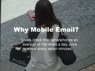
Why Mobile Email?
Why Mobile Email?. Users check their smartphones an average of 160 times a day, once about every seven minutes. 48% of emails are opened on a mobile device - mobile open rates have increased 300% between Oct ’10-Oct ‘12.

Why Mobile Email?
E N D
Presentation Transcript
Why Mobile Email? • Users check their smartphones an average of 160 times a day, once about every seven minutes.
48%of emails are opened on a mobile device - mobile open rates have increased 300% between Oct ’10-Oct ‘12
80% of email users will delete an email that doesn’t look good on their device -30% will unsubscribe
Email mobile-friendliness • Email mobile-friendliness breaks down into three buckets: • responsive design, which is the most sophisticated approach Use responsive design with caution. While it can work well in certain situations, it is not supported by all email apps including Gmail.
Email mobile-friendliness • Email mobile-friendliness breaks down into three buckets: • responsive design, which is the most sophisticated approach Use responsive design with caution. While it can work well in certain situations, it is not supported by all email apps including Gmail. • mobile-aware design, which uses basic email design tools to create a one-size-fits-all email
Email mobile-friendliness Email mobile-friendliness breaks down into three buckets: responsive design, which is the most sophisticated approach Use responsive design with caution. While it can work well in certain situations, it is not supported by all email apps including Gmail. mobile-aware design, which uses basic email design tools to create a one-size-fits-all email desktop-centric design, which has been the status quo and is inherently not mobile-friendly
Mobile-Aware Design Best Practices • Learn what percentage of your subscribers is viewing your emails on a mobile device. • Review how your emails currently look on various mobile devices. • Optimize for bandwidth. • If possible, aim for 100 kilobytes or less. • Simplify the design. • Max message width of 600 pixels. • Using a single-column layout • Employing large images, text, and buttons • Spacing out links so there are fewer mis-taps • Keep it simple – pare down text if you can • Optimize the pre-header.
Resources • Email +Mobile: What Did You Change This Year? • http://blog.returnpath.com/blog/stephanie-colleton/email-mobile-what-did-you-change-this-year#sthash.1zEYRPzW.dpuf • 2 Key Techniques for Making Email Content More Mobile-Friendly • http://contentmarketinginstitute.com/2013/11/making-email-content-mobile-friendly/ • Creating an Effective EMail Campaign - 5 Takeaways from the 2013 MARKETINGSHERPA EMAIL SUMMIT • http://www.bluehornet.com/articles/full/creating-an-effective-email-campaign-5-takeaways-from-the-2013-marketingshe • Designing for the Mobile Inbox - download • http://pages.exacttarget.com/EN-DesignMobileInbox • The How-To Guide to Responsive Email Design • https://litmus.com/blog/the-how-to-guide-to-responsive-email-design-infographic


