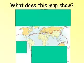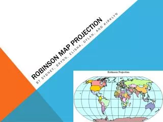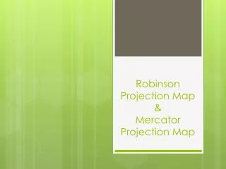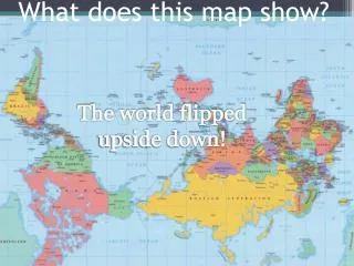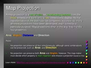
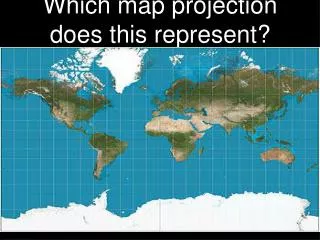
Which map projection does this represent?
Which map projection does this represent?. The World At Night. Quick Map Quiz. After each map, list what type of map it is, what is the variable that is represented (what kind of information we could use that map for/what kind of conclusions could we make based on the map data)

Which map projection does this represent?
E N D
Presentation Transcript
Quick Map Quiz • After each map, list what type of map it is, what is the variable that is represented (what kind of information we could use that map for/what kind of conclusions could we make based on the map data) • Some maps it will be easier to tell what kind than to know what kind of information. • Disclaimer: My answers are not in full detail so it is up to you to fully learn about each map.
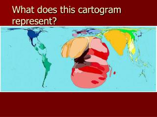
Cartogram • The size of the countries is substituted for the representative size of their GDP
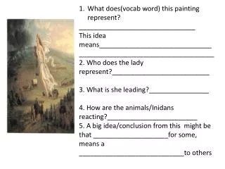
Mental Map • Someone’s random drawing of some random event
Isoline Map • Isoline maps are the easiest to detect because they have swurvy lines that represent varying levels of something • This map is demonstrating varying water transfer regions
Reference Map • Strictly the facts • Could be used for navigation or general reference
Cartogram • Another GDP Cartogram, in another format
Dot Map • One dot represents 100,000 people
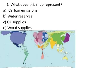
Proportional Symbol Map • symbol represents certain amounts of oil; bigger the symbol = more oil & vice versa
Choropleth Map • common variable applied across a region
Dot Map • dots represent specific sites • dots can also be used to represent density
Choropleth Map • theme is the term used to reference soda (its proper name)
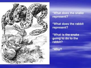
Mental (Cognitive) Map • This map was generated by google search terms to produce prejudices regarding each region of the world
Choropleth Map • Variable - cancer rates • One could make interesting correlations between the demographics of Baltimore and the occurances of cancer. Does it have to do with lifestyle? Income? Race? Could get controversial...