Download
1 / 15
160 likes | 415 Vues
http://football-teamkits.com/... Our football kits, full team kits, category is designed to make it easy to buy discount football kits online. It will be delivered in 2 - 3 weeks fully printed, numbered and embroidered.

E N D
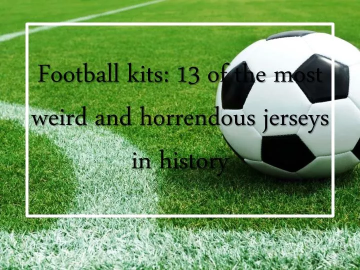
Football kits: 13 of the most weird and horrendous jerseys in history
Nottingham Forest decked themselves out in this garish 'Jackson Pollock' number away from home between 1995 and 1997, recalls iposter. Indeed, they wore it in the Quarter-finals of the Uefa Cup in the 95-96 season, when they were dispatched 7-2 on aggregate by the eventual winners, Bayern Munich.
How could we forget this one? Like a Magic Eye book, it might take you a minute to spot what was going on in this Fiorentina design from 1992-93 yep, that's right, a few dozen swastika-style lines were 'accidentally' incorporated into what the manufacturers called 'an optical effect'.
Many of you wrote about this tiger- print kit that we felt obliged to dig it up. Presumably all Hull's future kits will be like this now the owner, AssemAllam, has changed the club's name to Hull City Tigers against fans‘ Wishes.
Anyone thinking the 90s was the most visually offensive era for kit design should have a look at Liverpool's recent efforts. If this one isn't bad enough, their third kit is Split into thirds. The days of the classic Crown Paints kit are long gone.
Bilbao became a home for Spanish arts when Frank Gehry's Guggenheim Museum opened in 1997. Seven years later, to mark the local football club's centenary, Basque artist Dario Urzay, inspired by works he'd seen at the museum, designed this splatter-effect football kit - as highlighted by Richmutey.
UncleFester proposed Barcelona's 'Sunny Delight‘ away kit as a contender for the worst design - or The most thirst-inducing. More shocking, perhaps, was their kit 12 months earlier when They ended their long and admirable refusal to Wear corporate sponsorship on their shirts.
OpiumEater reminds us of VfL Bochum's technicolour attire from 1997. Handy as it is to wear a paint chart, the idea didn't stick. Not that Bochum's kits have improved: this Distressed design is rather, umm, Distressing.
In the long and unglamorous history of awful football kits, no one Has ever dared create a kit that looks like a stick of broccoli – until this one. La Hoya Lorca, who were in the Spanish Tercera Division, unveiled this outrageous kit last season. The club is based in Murcia, 'the vegetable garden of Spain' – justification of sorts for a truly bizarre design. They went on to win the league last season and, fittingly, they've released another broccoli-based design this season.
Coventry City have been much derided for their infamous brown 'egg-timer' kit of the 1970s, often cited as the worst kit of all time, but this supposedly ingenious design, worn from 1981-83, trumps even that one. The Brainchild of former manager Jimmy Hill, it incorporated the sponsor's logo into the kit design, giving the brand extra emphasis.
Goalkeepers jerseys have a rich tradition of being garish. But none Could beat this one, a fluorescent Count Dracula effort, designed and Worn by Mexico's goalkeeper Jorge Campos at the 1994 World Cup.
Here's an unusual design with an interesting premise. SC Heereveen's kit is based on the Frisian flag, the official flag of the Dutch province of Friesland. The seven red Pompeblêd – seal lily leaves – symbolise seven independent regions from Medieval times.
Recreativo opted for a polkadot away kit last season – and what's most surprising is that Danish manufacturing legends Hummel were responsible for it. It was predictably mocked for looking like it was inspired by Minnie Mouse.
Japanese side Shimizu S-Pulse have a habit of wearing eye-popping kits – this effort, from 2001, is among of collection of bright orange designs featuring world maps across the chest. Also the subtle camouflage pattern in the background
Thank You!!!! For More Information, Visit: http://football-teamkits.com/