Typeface Spacing
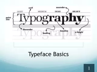
Typeface Spacing. Monospace Proportional Leading Kerning Tracking. Monospaced Typefaces. Each letter takes up the same amount of space regardless of the letter size. Advantages Easier to see thin punctuation marks. Similar characters look more different.

Typeface Spacing
E N D
Presentation Transcript
Typeface Spacing • Monospace • Proportional • Leading • Kerning • Tracking
Monospaced Typefaces • Each letter takes up the same amount of space regardless of the letter size. • Advantages • Easier to see thin punctuation marks. • Similar characters look more different. • If limited to a certain number of characters per line, each line will look alike. • Used often in computer programming and biology • Courier is monospaced
Proportional Typefaces • Proportional • The amount of space each character takes up is adjusted to the width of that character. • Therefore, an i is not as wide as an m and receives less space. • Advantages • Does not take up as much space as monospaced typefaces. • Easier to read. • Used in most documents and publications. • Times New Roman is proportional
The vertical spacing between lines of text. Pronounced “led-ding.” In most software programs, it is referred to as line spacing. In Desktop Publishing, it is still referred to as leading because typesetters used long pieces of lead between the moveable type to create blank lines between the text. Leading
Leading Continued • If there were no space between the lines of text, the letters would touch the lines above and below them and would be extremely difficult to read. • Used to: • Slightly increase or decrease the length of a column of text so that it is even with an adjacent column. • To make a block of text fit in a space that is larger or smaller than the text block.
Leading Look in the nook to find the book that you borrowed to read. Leading (vertical spacing between lines of text) Leading (vertical spacing between lines of text)
Horizontal spacing between pairs of letters Used to add or subtract space between pairs of letters to create a more visually appealing and readable text. BOOK – before kerning. – after kerning the O’s. Kerning
Tracking • Horizontal spacing between all of characters in a large block of text. • Makes a block of text seem more open or more dense. • Examples
Tracking Continued • Makes a block of text more open and airy or more dense. • Used to expand or contract a block of text for the purpose of aligning two columns.
Kerning, Leading, Tracking LOOK in the nook to find the book that youborrowed to read. Kerning (horizontal spacing between pairs of letters) Leading (vertical spacing between lines of text) Tracking (horizontal spacing between all characters in a large block of text.
Glossary Sites • www.typenow.net/glossary.htm • www.adobe.com/type/topics/glossary.html • www.typophile.com/wiki/Terminology
Useful Sites • www.identifont.com • www.typeculture.com • www.typographi.com • www.typophile.com • http://www.dubbocoll-m.schools.nsw.edu.au/Training/DTP/DTPtypeface.htm • http://www.x24d.com/blog/?p=34