Download

1 / 1
60 likes | 326 Vues
Table 1: Example of Results Table. Table 3: TBL vs. Lecture-based Course Exam Comparisons . Title of Poster (remove shadowing & italics if default) – use bold Arial font Authors’ full names and titles should be included here.

E N D
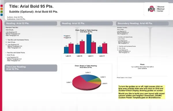
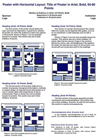
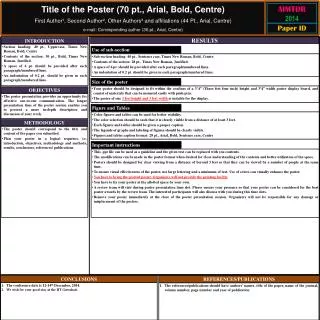
Table 1: Example of Results Table Table 3:TBL vs. Lecture-based Course Exam Comparisons Title of Poster (remove shadowing & italics if default) – use bold Arial font Authors’ full names and titles should be included here. The University of Oklahoma Health Sciences Center College of Pharmacy; Oklahoma City, Oklahoma Example of Methods Schema • Results – Objective 1 • Consider reporting your results using your study objectives to demonstrate alignment and facilitate comprehension. • Try to put your results into a readable table or picture format. • A summary section of text can accompany the table in a separate text box such as this example. • Make sure to refer to the table (See Table 1). • Discussion • For this section you could number your content to match your objectives. For example, discuss the results from objective 1 here. • Then discuss or interpret results from objective 2 here. • Objectives • Make sure to include objectives that start with measurable action verbs • Should an abstract be included on the poster? If the conference guidelines request its inclusion then yes, otherwise the abstract can be omitted for 3 reasons: • Some abstracts are printed in the conference pamphlet, so it may already available. • If lack of space is an issue, the abstract can be deleted since the ideas are available in the remaining poster sections • A printout could be available for conference attendees that has a picture of your poster on one side and your abstract, contact information, and poster references on the other side • Conclusions • This section could also be called summary, recommendations, etc. • You could also include a “future studies” slide. Table 2: Avoid These Tables • Notes on Using Tables. Etc. • Using tables as seen in the example above encouraged when creating your poster. • Line or bar graphs, timelines and other schemas are also encouraged. • Sometimes inserting a table into this slide can be difficult. It may be easier to create the table in word and copy and paste it into your text box or save & insert it as a picture • A table like table 2 below should be avoided because it is hard for the audience to comprehend your message. Use alternate diagram instead or make sure to explain with text. • Other Poster Guidelines • Final guidelines to consider: • Recommended poster dimensions are 3 x 5 ft • (36 by 56 inches – defaulting to 56) • or (18 by 30 inches and tell Photo services to double the poster size (which will also double your current font size) • 3 x 5 is more affordable option (vs. 4X6). • Photographic services can print your poster (405-271-2173 in OKC). Remember to give yourself at least 3 days for drying time. • To use this template, delete text and use (or copy and paste) text boxes. • Box widths can be adjusted. • Introduction • Guidelines for the text box sections of the poster • Use Arial or other sanserif font. Use only 1 font on poster. • Bold the title of each section for emphasis. • Remove italics and shadowing on all text. – hard to read • Avoid using all capital letters. • All capital letters are easy to ignore and italics and show are hard to read. • Use bold and underline instead. • When creating the sections for your poster, avoid typing in paragraphs and instead bullet or number all information. • Each bullet should be no more than 2 lines of text per bullet. • Add spaces between bullets so all of the text in the section is not crowded together. • Open space facilitates reading the poster at a distance. • Align text using unjustified (uneven line lengths) because easier to read from a distance • There is an implied poster flow from left to right and top to bottom. • Consider 4 columns– intro, methods, results, discussion/summary • Results – Objective 2 • Grade Analysis • Sample language structure for results: Analysis of student performance using multivariate linear regression on scores from TBL activities to determine impact on final grade revealed that IRAT and team contribution scores significantly predicted overall grades in the course (p<.001). • Remember to state test used & p-values. Font Size Guidelines Template developed by Dr. M. Medina version 7.3.08 – please delete this textbox prior to printing.