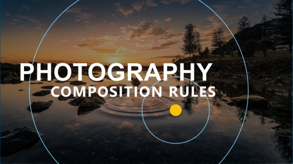
Rules for Photography
Rules for Photography. Let’s take some gooooood pictures!. A note about rules. Rules are great because they help us know what has been tried before and what has failed or worked Rules give the amateur some guidance and structure Rules keep idiots from getting too cocky. Rule of thirds.

Rules for Photography
E N D
Presentation Transcript
Rules for Photography Let’s take some gooooood pictures!
A note about rules • Rules are great because they help us know what has been tried before and what has failed or worked • Rules give the amateur some guidance and structure • Rules keep idiots from getting too cocky
Rule of thirds • Significant compositional elements be placed along imaginary lines that break the image into thirds, both horizontally and vertically. • Elements of particular interest can be placed at the intersection of these lines, for a more expressive and dynamic composition.
Leading Lines • When we look at a photo our eye is naturally drawn along lines. By thinking about how you place lines in your composition, you can affect the way we view the image, pulling us into the picture, towards the subject, or on a journey "through" the scene. • There are many different types of line - straight, diagonal, curvy, zigzag, radial etc - and each can be used to enhance our photo's composition.
Golden Ratio • Very math-heavy theory • Simply a way of dividing the image frame into rectangular segments. These 'golden rectangles' have proportions that the ancient Greeks thought to be especially harmonious and pleasing to the eye. • Placing compositional elements of importance either inside of or at the intersection of these rectangles can give them greater prominence and create a well-balanced image.
A golden rectangleis one whose short side (a) and long side (a + b) are in this 1:1.6 proportion. With any golden rectangle you can further divide it with a line that divides the long side by this same 1:1.6 ratio. This is exactly what has been done in the illustration below, to create line segment b. You can continue this pattern of division to create smaller and smaller rectangles, one inside the other.
Pattern and Repetition – Emphasize! • Filling your frame with a repetitive pattern can give the impression of size and large numbers. The key to this is to attempt to zoom in close enough to the pattern that it fills the frame and makes the repetition seem as though it’s bursting out (even if the repetition stops just outside of your framing). • Some examples of this technique might include faces in a crowd, bricks on a wall, a line of bicycle wheels all on the same angle etc. Almost any repeated appearance of objects could work.
Pattern – Break it • Broken repetition might include adding a contrasting object (color, shape, texture) or removing one of the repeating objects. • Pay particular attention to where in your frame to place the break in the pattern. It might be that the rule of thirds comes in to play here (the example to left might be improved simply by placing the red bead slightly higher or lower in the frame). • Also consider your focal point in these shots – the broken pattern might be a logical spot to have everything focused sharply.
Symmetry • We are surrounded by symmetry and patterns, both natural and man-made. They can make for very eye-catching compositions, particularly in situations where they are not expected. • Another great way to use them is to break the symmetry or pattern in some way, introducing tension and a focal point to the scene.
Asymmetry • Creating a 'thirds' composition often introduces asymmetry into an image which helps to create a sense of drama that can be lacking in perfectly symmetrical images. • In the image on the next slide, you can see that the eyes of both the model and the horse rest along the imaginary grid. And the horse's right eye is located at the intersection of two gridlines. Eyes are obviously strong compositional elements. Our gaze is naturally drawn to the eyes of others. Placing important elements like these - whether a body part or a product for sale - along the thirds grid helps to draw attention to them.
Diagonals • Diagonal lines can lead the eye through an image and help to generate a sense of movement. • In landscape photography, diagonals are often formed using roads, streams, walls, or other linear features. • When photographing people, the silhouette of a model's arm, leg or back can be used. It's important to understand that compositional diagonals need not be limited to explicit lines or the edges of a shape. The concept of diagonals can be used as a way of positioning elements in the scene, in much the same manner as the rules we discussed previously.
Balancing Elements • Placing your main subject off-centre, as with the rule of thirds, creates a more interesting photo, but it can leave a void in the scene which can make it feel empty. You should balance the "weight" of your subject by including another object of lesser importance to fill the space.
Viewpoint • Our viewpoint has a massive impact on the composition of our photo, and as a result it can greatly affect the message that the shot conveys. • Rather than just shooting from eye level or the “usual” angle, consider photographing from high above, down at ground level, from the side, from the back, from a long way away, from very close up, and so on. – don’t get too carried away
Background • The human eye is excellent at distinguishing between different elements in a scene, whereas a camera has a tendency to flatten the foreground and background, and this can often ruin an otherwise great photo. • Thankfully this problem is usually easy to overcome at the time of shooting - look around for a plain and unobtrusive background and compose your shot so that it doesn't distract or detract from the subject.
Depth • Because photography is a two-dimensional medium, we have to choose our composition carefully to conveys the sense of depth that was present in the actual scene. • You can create depth in a photo by including objects in the foreground, middle ground and background. • Another useful composition technique is overlapping, where you deliberately partially obscure one object with another. The human eye naturally recognizes these layers and mentally separates them out, creating an image with more depth.
Framing • The world is full of objects which make perfect natural frames, such as trees, archways and holes. By placing these around the edge of the composition you help to isolate the main subject from the outside world. • The result is a more focused image which draws your eye naturally to the main point of interest.
Cropping • Often a photo will lack impact because the main subject is so small it becomes lost among the clutter of its surroundings. • By cropping tight around the subject you eliminate the background "noise," ensuring the subject gets the viewer's undivided attention.