
Tutorial 4 Creating Page Layouts with CSS
Tutorial 4 Creating Page Layouts with CSS. Objectives. Set display properties Create a reset style sheet Define a background image Set background image properties Use browser extension styles Explore fixed, fluid, and elastic layouts Float elements in a Web page. Objectives.

Tutorial 4 Creating Page Layouts with CSS
E N D
Presentation Transcript
Objectives • Set display properties • Create a reset style sheet • Define a background image • Set background image properties • Use browser extension styles • Explore fixed, fluid, and elastic layouts • Float elements in a Web page New Perspectives on HTML, CSS, and XML, 4th Edition
Objectives • Set margin and padding spaces • Format an element border • Create rounded corners • Display an element outline • Explore absolute and relative positioning • Work with overflow content • Explore clipped objects • Stack objects in a page New Perspectives on HTML, CSS, and XML, 4th Edition
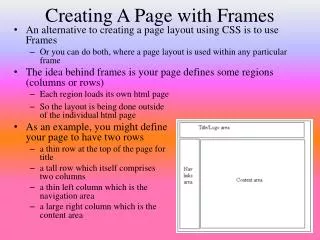
Backgrounds and Floating Objects New Perspectives on HTML, CSS, and XML, 4th Edition
The display style • Most page elements are displayed in one of two ways • Blocks occupy a defined rectangular area within a page • Inline elements flow within a block New Perspectives on HTML, CSS, and XML, 4th Edition
The Box Model • Elements also are laid out in a Web page following the structure of the box model • the content of the element itself • the padding extending between the element’s content and the border • the border of the box surrounding the padding space • the margin containing the space between the border and the next page element New Perspectives on HTML, CSS, and XML, 4th Edition
Creating a Reset Style Sheet • Many designers create a reset style sheet to define their own default styles New Perspectives on HTML, CSS, and XML, 4th Edition
Designing the Background • CSS also supports background images using background-image: url(url); • Background Image Options: • background-repeat • background-position • background-attachment • background-size • background-clip New Perspectives on HTML, CSS, and XML, 4th Edition
Designing the Background • You can combine the various background properties into the shorthand property • background: color url(url) attachment position repeat; • CSS allows you to specify multiple images and their properties in a comma-separated list • background-property: value1, value2, … ; New Perspectives on HTML, CSS, and XML, 4th Edition
Adding a Page Background New Perspectives on HTML, CSS, and XML, 4th Edition
Exploring Browser Extensions • Browser extensions that are not part of the official CSS specifications can be identified through the use of a vendor prefix that indicates the browser vendor that created and supports the property New Perspectives on HTML, CSS, and XML, 4th Edition
Fixed and Fluid Layouts New Perspectives on HTML, CSS, and XML, 4th Edition
Elastic Layouts • Some designers propose the use of elastic layouts, in which all measurements are expressed relative to the default font size using the emunit • If a user or the designer increases the font size, the width, height, and location of all of the other page elements, including images, change to match New Perspectives on HTML, CSS, and XML, 4th Edition
Floating Elements • Floating an element takes that element out of the normal flow of the document and positions it along the left or right edge of its containing element float: position; New Perspectives on HTML, CSS, and XML, 4th Edition
Floating Elements • Clearing a float clear: position; New Perspectives on HTML, CSS, and XML, 4th Edition
Margins, Padding, and Borders New Perspectives on HTML, CSS, and XML, 4th Edition
Setting Margin and Padding Space in the Box Model • To set the margin space around an element, use margin: length; where length is the size of the margin using one of the CSS units of measure • To set the padding space within an element, use the following: padding: length; • To set a margin or padding for one side of the box model only, specify the direction (top, right, bottom, or left). For example, use margin-right: length; to set the length of the right margin. New Perspectives on HTML, CSS, and XML, 4th Edition
Setting Margin and Padding Space in the Box Model • To set multiple margin or padding spaces, specify the values in a space-separated list starting from the top and moving clockwise around the element. For example, the style margin: top right bottom left; sets margins for the top, right, bottom, and left sides of the element, respectively • To set matching top and bottom values and matching right and left values for margins and padding, enter only two values. For example, the style margin: vertical horizontal; sets margins for the top and bottom sides of the element to the value specified by vertical, and sets margins for the right and left sides of the element to the value specified by horizontal New Perspectives on HTML, CSS, and XML, 4th Edition
Working with Borders • To set the border width, use the property border-width: width; where width is the thickness of the border using one of the CSS units of measure. • To set the border color, use border-color: color; where color is a color name or value. New Perspectives on HTML, CSS, and XML, 4th Edition
Working with Borders • To set the border design, use border-style: style; where style is none, solid, dashed, dotted, double, outset, inset, groove, or ridge • To set all of the border options in one style, use the following: border: width color style; New Perspectives on HTML, CSS, and XML, 4th Edition
Creating Rounded Corners • Rounded corners can be applied to any of the four corners of a block element using the styles border-top-left-radius: radius; border-top-right-radius: radius; border-bottom-right-radius: radius; border-bottom-left-radius: radius; border-radius: top-left top-right bottom-right bottom-left; New Perspectives on HTML, CSS, and XML, 4th Edition
Creating Rounded Corners New Perspectives on HTML, CSS, and XML, 4th Edition
Creating Rounded Corners New Perspectives on HTML, CSS, and XML, 4th Edition
Managing Your Layout • To add an outline around an element, use the style property outline: width color style; where width, color, and style are the outline width, outline color, and outline style, respectively New Perspectives on HTML, CSS, and XML, 4th Edition
Managing Your Layout New Perspectives on HTML, CSS, and XML, 4th Edition
Positioning Elements New Perspectives on HTML, CSS, and XML, 4th Edition
Positioning Objects • To position an object at a specific coordinate, use the style properties position: type; top: value; right: value; bottom: value; left: value; where type indicates the type of positioning applied to the object (absolute, relative, static, fixed, or inherit), and the top, right, bottom, and left properties indicate the coordinates of the object New Perspectives on HTML, CSS, and XML, 4th Edition
Positioning Objects • Absolute positioning places an element at specific coordinates either in the page or within a container element • Relative positioning is used to move an element relative to where the browser would have placed it if no positioning had been applied New Perspectives on HTML, CSS, and XML, 4th Edition
Working with Overflow and Clipping • When you force an element into a specified height and width, you can define how browsers should handle content that overflows allotted space using the style overflow: type; New Perspectives on HTML, CSS, and XML, 4th Edition
Working with Overflow and Clipping • To specify how browsers should handle content that overflows an element’s boundary, use the style overflow: type; where type is visible (to expand the element height to match the content), hidden (to hide the excess content), scroll (to always display horizontal and vertical scroll bars), or auto (to display scroll bars if needed) • To specify how browsers should handle content that overflows in the horizontal direction, use the following style: overflow-x: type; New Perspectives on HTML, CSS, and XML, 4th Edition
Working with Overflow and Clipping • To specify how browsers should handle content that overflows in the vertical direction, use the following style: overflow-y: type; • To clip an element’s content, use the style clip: rect(top, right, bottom, left); where top, right, bottom, and left define the boundaries of the clipping rectangle New Perspectives on HTML, CSS, and XML, 4th Edition
Clipping an Element New Perspectives on HTML, CSS, and XML, 4th Edition
Stacking Elements • Positioning elements can sometimes lead to objects that overlap each other • By default, elements that are loaded later by the browser are displayed on top of elements that are loaded earlier • To specify a different stacking order, use the style property z-index: value; New Perspectives on HTML, CSS, and XML, 4th Edition
Stacking Elements New Perspectives on HTML, CSS, and XML, 4th Edition

