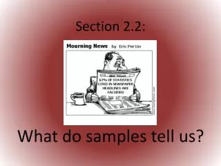
Data Analysis Techniques in Statistics Studies
Learn about stem-and-leaf plots, pie charts, Pareto charts, and scatter plots. Understand measures of central tendency like mean, median, and mode. Calculate weighted means and explore shapes of distributions.


Data Analysis Techniques in Statistics Studies
E N D
Presentation Transcript
Section 2.2 More Graphs and Displays
Stem-and-Leaf Plots • Each number is separated into a STEM and LEAF component. • The STEM is the leftmost digit(s). • The LEAF is the rightmost digit. • It’s important to include a key to identify values. For example… Key: 15 | 5 = 155
Make a stem-and-leaf plot: • Ages of the top 30 highest paid CEOs (Forbes Magazine).
Pie Chart (for Qualitative Data) • A circle divided into sectors that represent categories. • The area of each sector is proportional to the frequency of the category.
Pareto Chart (for Qualitative Data) • Vertical bar graph in which the height of each bar represents the frequency or relative frequency. • Bars are positioned in order of decreasing height, left to right. • EX: Make a Pareto chart • Ultraviolet indices for 5 cities at noon:
Scatter Plot (for Paired Data Sets) • Paired data Ordered pairs. • Plot on a coordinate plane. • Independent variable on the x-axis.
Section 2.3 Measures of Central Tendency
Measure of Central Tendency: • A value that represents a typical, or central, entry of a data set. • 3 most common are MEAN, MEDIAN, and MODE
MEDIAN • The data entry in the MIDDLE. • List data from least to greatest. • Find the middle value. • (For even n, find the average of the 2 middle values)
MODE • Data entry that occurs MOST often (highest frequency) • A data set may have no mode or have more than mode. • BIMODAL = 2 modes.
EX: Find mean, median, and mode for the data set. • The 2012-2013 tuition and fees (in thousands of dollars) for the top 14 universities: 41 39 42 47 45 42 42 44 44 40 45 44 44 44
EX: find the weighted mean • The scores and their percents of the final grade for an archaeology student are shown. What is the student’s mean score:
Ex: find the weighted mean • The mean scores for students in a statistics course (by major) are shown below. What is the mean score for the class? 9 engineering majors: 85 5 math majors: 90 13 business majors: 81
EX: Find the mean • The city mileage (in miles per gallon) for 24 family sedans:
Shapes of Distributions • Distributions may look .. • Symmetric • Uniform • Skewed Left • Skewed Right