Analysis of Drive-Up Teller Window Usage Times at a Financial Institution
Investigating the variation in transaction times based on different time segments - morning, afternoon, and evening - at a credit union's drive-up teller windows. An ANOVA test was conducted, indicating no significant differences. Further study may delve into factors affecting transaction times.

Analysis of Drive-Up Teller Window Usage Times at a Financial Institution
E N D
Presentation Transcript
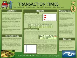
Abstract Results Conclusion The purpose of the study is to investigate and determine when the best time is to use the drive-up teller windows at financial institutions. The target population is all customers who use the drive through at the West Jordan Branch of America First Federal Credit Union. The research question guiding the study was: “Does the time it takes to perform each transaction at the drive-up windows vary depending on the time of the day it is performed, such as the morning, afternoon, and evening?” H0: The mean transaction times are the same for each 3-hour segment. H1: At least one of the 3-hour segment means is different. Using the results from the Analysis of Variance (ANOVA) test, we fail to reject the null hypothesis (H0) since the p-value of 0.6003 is greater than the level of significance α=0.05. Based on the collected data there is not sufficient evidence to suggest that the drive-up service transaction times differ depending on the time of day of the transaction. Further study may provide a greater understanding as to various factors that may increase/decrease total time spent at the drive-up teller windows at a financial institution, such as wait time in line before the actual transaction begins. Summary Statistics After collecting the data, the data was compiled to create a five-number summary and Boxplot. The boxplots, shown at right, highlight that the median values are nearly the same and each of the time segments studied are similar. The interquartile range (IQR) is a measure of statistical dispersion and the difference between Q3 (the right edge of the red TRANSACTION TIMES rectangles) and Q1 (left edge) and each IQR shows similar spread, with the morning data being the most compact. The boxplots also show some outliers to the right. Results of Analysis The one extreme outlier during the evening segment (indicated by the arrow above) was a unique transaction type, a cashier’s check. No other cashier’s checks were recorded in our data and it is a type of transaction that is not typically performed at the drive-up service. Due to its uniqueness, it was excluded from the analysis in order to use an ANOVA test to compare the data sets. Sue Blackburn Brady Brown Randy Christensen Kilee Robinson Methodology The data (without the outlier) was entered and an ANOVA test, which compares the means of the three data sets, was performed to give a better Transaction time data was collected in seconds from the morning (9:00-11:59 AM), afternoon (12:00-2:59 PM) and evening (3:00-6:00 PM), resulting in three data sets. At least 30 transactions were randomly observed from each 3-hour time segment to create the data sets. To ensure the data was from a systematic sample, data was collected from every fourth transaction. All data was collected from March 12, 2013 through March 20, 2013. Sources understanding of the relationship of the three mean times and decreasing the chance of committing a Type I Error. The P-value (60.03%) signifies that if there truly is no difference in the mean transaction times between morning, afternoon, and evening, then data sets like those observed would be observed 60% of the time, which is quite significant. Data was collected at the West Jordan Branch of America First Federal Credit Union March 12, 2013 through March 20, 2013. Analyzed using StatCrunch Software, http://www.statcrunch.com/. The ANOVA provides a statistical test of whether or not the means of several groups are all equal. The data represents samples from three populations. The means plot at left visually illustrates what the ANOVA test is comparing and shows the confidence interval estimates of the population means. Graphically, it shows there is no evidence of a difference between the population means because the intervals overlap with each population mean falling within the confidence interval, as emphasized by the blue lines. Math 2040 Statistics for Applied Science – Group Project