Basics of Statistics
420 likes | 1.79k Vues
Statistics is the science of collecting, presenting, analyzing, and interpreting data. Through statistical methods, insights are gained by summarizing and predicting relations among variables, facilitating informed decision-making with any dataset.

Basics of Statistics
E N D
Presentation Transcript
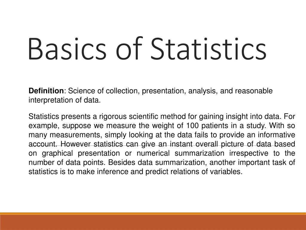
Basics of Statistics Definition: Science of collection, presentation, analysis, and reasonable interpretation of data. Statistics presents a rigorous scientific method for gaining insight into data. For example, suppose we measure the weight of 100 patients in a study. With so many measurements, simply looking at the data fails to provide an informative account. However statistics can give an instant overall picture of data based on graphical presentation or numerical summarization irrespective to the number of data points. Besides data summarization, another important task of statistics is to make inference and predict relations of variables.
Statistical Description of Data • Statistics describes a numeric set of data by its • Center • Variability • Shape • Statistics describes a categorical set of data by • Frequency, percentage or proportion of each category
Some Definitions Variable - any characteristic of an individual or entity. A variable can take different values for different individuals. Variables can be categorical or quantitative. Per S. S. Stevens… • Nominal - Categorical variables with no inherent order or ranking sequence such as names or classes (e.g., gender). Value may be a numerical, but without numerical value (e.g., I, II, III). The only operation that can be applied to Nominal variables is enumeration. • Ordinal - Variables with an inherent rank or order, e.g. mild, moderate, severe. Can be compared for equality, or greater or less, but not how much greater or less. • Interval - Values of the variable are ordered as in Ordinal, and additionally, differences between values are meaningful, however, the scale is not absolutely anchored. Calendar dates and temperatures on the Fahrenheit scale are examples. Addition and subtraction, but not multiplication and division are meaningful operations. • Ratio - Variables with all properties of Interval plus an absolute, non-arbitrary zero point, e.g. age, weight, temperature (Kelvin). Addition, subtraction, multiplication, and division are all meaningful operations.
Some Definitions Distribution - (of a variable) tells us what values the variable takes and how often it takes these values. • Unimodal - having a single peak • Bimodal - having two distinct peaks • Symmetric - left and right half are mirror images.
Frequency Distribution Consider a data set of 26 children of ages 1-6 years. Then the frequency distribution of variable ‘age’ can be tabulated as follows: Frequency Distribution of Age Grouped Frequency Distribution of Age:
Cumulative Frequency Cumulative frequency of data in previous page
Data Presentation Two types of statistical presentation of data - graphical and numerical. Graphical Presentation: We look for the overall pattern and for striking deviations from that pattern. Over all pattern usually described by shape, center, and spread of the data. An individual value that falls outside the overall pattern is called an outlier. Bar diagram and Pie charts are used for categorical variables. Histogram, stem and leaf and Box-plot are used for numerical variable.
Data Presentation –Categorical Variable Bar Diagram: Lists the categories and presents the percent or count of individuals who fall in each category.
Data Presentation –Categorical Variable Pie Chart: Lists the categories and presents the percent or count of individuals who fall in each category.
Graphical Presentation –Numerical Variable Histogram: Overall pattern can be described by its shape, center, and spread. The following age distribution is right skewed. The center lies between 80 to 100. No outliers.
Graphical Presentation –Numerical Variable Box-Plot: Describes the five-number summary Figure 3: Distribution of Age Box Plot
Numerical Presentation A fundamental concept in summary statistics is that of a central value for a set of observations and the extent to which the central value characterizes the whole set of data. Measures of central value such as the mean or median must be coupled with measures of data dispersion (e.g., average distance from the mean) to indicate how well the central value characterizes the data as a whole. • To understand how well a central value characterizes a set of observations, let us consider the following two sets of data: • A: 30, 50, 70 • B: 40, 50, 60 • The mean of both two data sets is 50. But, the distance of the observations from the mean in data set A is larger than in the data set B. Thus, the mean of data set B is a better representation of the data set than is the case for set A.
Methods of Center Measurement Center measurement is a summary measure of the overall level of a dataset Commonly used methods are mean, median, mode, geometric mean etc. Mean: Summing up all the observation and dividing by number of observations. Mean of 20, 30, 40 is (20+30+40)/3 = 30.
Methods of Center Measurement Median: The middle value in an ordered sequence of observations. That is, to find the median we need to order the data set and then find the middle value. In case of an even number of observations the average of the two middle most values is the median. For example, to find the median of {9, 3, 6, 7, 5}, we first sort the data giving {3, 5, 6, 7, 9}, then choose the middle value 6. If the number of observations is even, e.g., {9, 3, 6, 7, 5, 2}, then the median is the average of the two middle values from the sorted sequence, in this case, (5 + 6) / 2 = 5.5. Mode: The value that is observed most frequently. The mode is undefined for sequences in which no observation is repeated.
Mean or Median The median is less sensitive to outliers (extreme scores) than the mean and thus a better measure than the mean for highly skewed distributions, e.g. family income. For example mean of 20, 30, 40, and 990 is (20+30+40+990)/4 =270. The median of these four observations is (30+40)/2 =35. Here 3 observations out of 4 lie between 20-40. So, the mean 270 really fails to give a realistic picture of the major part of the data. It is influenced by extreme value 990.
Methods of Variability Measurement Variability (or dispersion) measures the amount of scatter in a dataset. Commonly used methods: range, variance, standard deviation, interquartile range, coefficient of variation etc. Range: The difference between the largest and the smallest observations. The range of 10, 5, 2, 100 is (100-2)=98. It’s a crude measure of variability.
Methods of Variability Measurement Variance: The variance of a set of observations is the average of the squares of the deviations of the observations from their mean. In symbols, the variance of the n observations x1, x2,…xn is Variance of 5, 7, 3? Mean is (5+7+3)/3 = 5 and the variance is Standard Deviation: Square root of the variance. The standard deviation of the above example is 2.
Methods of Variability Measurement Quartiles: Data can be divided into four regions that cover the total range of observed values. Cut points for these regions are known as quartiles. In notations, quartiles of a data is the ((n+1)/4)qth observation of the data, where q is the desired quartile and n is the number of observations of data. The first quartile (Q1) is the first 25% of the data. The second quartile (Q2) is between the 25th and 50th percentage points in the data. The upper bound of Q2 is the median. The third quartile (Q3) is the 25% of the data lying between the median and the 75% cut point in the data. Q1 is the median of the first half of the ordered observations and Q3 is the median of the second half of the ordered observations.
Methods of Variability Measurement In the following example Q1= ((15+1)/4)1 =4th observation of the data. The 4th observation is 11. So Q1 is of this data is 11. An example with 15 numbers 3 6 7 11 13 22 30 40 44 50 52 61 68 80 94 Q1 Q2 Q3 The first quartile is Q1=11. The second quartile is Q2=40 (This is also the Median.) The third quartile is Q3=61. Inter-quartile Range: Difference between Q3 and Q1. Inter-quartile range of the previous example is 61- 40=21. The middle half of the ordered data lie between 40 and 61.
Deciles and Percentiles Deciles: If data is ordered and divided into 10 parts, then cut points are called Deciles Percentiles: If data is ordered and divided into 100 parts, then cut points are called Percentiles. 25th percentile is the Q1, 50th percentile is the Median (Q2) and the 75th percentile of the data is Q3. In notations, percentiles of a data is the ((n+1)/100)p th observation of the data, where p is the desired percentile and n is the number of observations of data. Coefficient of Variation: The standard deviation of data divided by it’s mean. It is usually expressed in percent. Coefficient of Variation =
Five Number Summary Five Number Summary: The five number summary of a distribution consists of the smallest (Minimum) observation, the first quartile (Q1), The median(Q2), the third quartile, and the largest (Maximum) observation written in order from smallest to largest. Box Plot: A box plot is a graph of the five number summary. The central box spans the quartiles. A line within the box marks the median. Lines extending above and below the box mark the smallest and the largest observations (i.e., the range). Outlying samples may be additionally plotted outside the range.
Boxplot Distribution of Age in Month
Choosing a Summary The five number summary is usually better than the mean and standard deviation for describing a skewed distribution or a distribution with extreme outliers. The mean and standard deviation are reasonable for symmetric distributions that are free of outliers. In real life we can’t always expect symmetry of the data. It’s a common practice to include number of observations (n), mean, median, standard deviation, and range as common for data summarization purpose. We can include other summary statistics like Q1, Q3, Coefficient of variation if it is considered to be important for describing data.
Shape of Data • Shape of data is measured by • Skewness • Kurtosis
Skewness • Measures asymmetry of data • Positive or right skewed: Longer right tail • Negative or left skewed: Longer left tail
Kurtosis • Measures peakedness of the distribution of data. The kurtosis of normal distribution is 0.
Class Summary (First Part) So far we have learned- Statistics and data presentation/data summarization Graphical Presentation: Bar Chart, Pie Chart, Histogram, and Box Plot Numerical Presentation: Measuring Central value of data (mean, median, mode etc.), measuring dispersion (standard deviation, variance, co-efficient of variation, range, inter-quartile range etc), quartiles, percentiles, and five number summary Any questions ?
Brief concept of Statistical Softwares There are many softwares to perform statistical analysis and visualization of data. Some of them are SAS (System for Statistical Analysis), S-plus, R, Matlab, Minitab, BMDP, Stata, SPSS, StatXact, Statistica, LISREL, JMP, GLIM, HIL, MS Excel etc. We will discuss MS Excel and SPSS in brief. Some useful websites for more information of statistical softwares- http://www.galaxy.gmu.edu/papers/astr1.html http://ourworld.compuserve.com/homepages/Rainer_Wuerlaender/statsoft.htm#archiv http://www.R-project.org
Microsoft Excel A Spreadsheet Application. It features calculation, graphing tools, pivot tables and a macro programming language called VBA (Visual Basic for Applications). There are many versions of MS-Excel. Excel XP, Excel 2003, Excel 2007 are capable of performing a number of statistical analyses. Starting MS Excel: Double click on the Microsoft Excel icon on the desktop or Click on Start --> Programs --> Microsoft Excel. Worksheet: Consists of a multiple grid of cells with numbered rows down the page and alphabetically-tilted columns across the page. Each cell is referenced by its coordinates. For example, A3 is used to refer to the cell in column A and row 3. B10:B20 is used to refer to the range of cells in column B and rows 10 through 20.
Microsoft Excel Opening a document: File Open (From a existing workbook). Change the directory area or drive to look for file in other locations. Creating a new workbook: FileNewBlank Document Saving a File: FileSave Selecting more than one cell: Click on a cell e.g. A1), then hold the Shift key and click on another (e.g. D4) to select cells between and A1 and D4 or Click on a cell and drag the mouse across the desired range. • Creating Formulas: 1. Click the cell that you want to enter the formula, 2. Type = (an equal sign), 3. Click the Function Button, 4. Select the formula you want and step through the on-screen instructions.
Microsoft Excel Entering Date and Time: Dates are stored as MM/DD/YYYY. No need to enter in that format. For example, Excel will recognize jan 9 or jan-9 as 1/9/2007 and jan 9, 1999 as 1/9/1999. To enter today’s date, press Ctrl and ; together. Use a or p to indicate am or pm. For example, 8:30 p is interpreted as 8:30 pm. To enter current time, press Ctrl and : together. Copy and Paste all cells in a Sheet: Ctrl+A for selecting, Ctrl +C for copying and Ctrl+V for Pasting. Sorting: Data Sort Sort By … Descriptive Statistics and other Statistical methods: ToolsData Analysis Statistical method. If Data Analysis is not available then click on Tools Add-Ins and then select Analysis ToolPack and Analysis toolPack-Vba
Microsoft Excel Statistical and Mathematical Function: Start with ‘=‘ sign and then select function from function wizard Inserting a Chart: Click on Chart Wizard (or InsertChart), select chart, give, Input data range, Update the Chart options, and Select output range/ Worksheet. Importing Data in Excel: File open FileType Click on File Choose Option ( Delimited/Fixed Width) Choose Options (Tab/ Semicolon/ Comma/ Space/ Other) Finish. Limitations: Excel uses algorithms that are vulnerable to rounding and truncation errors and may produce inaccurate results in extreme cases.