
colormixers
colormixers.com. Physics. Physics of Light. Electromagnetic Spectrum Visible light is a small part 400 nm 700 nm. Physics of Light. Black = no light White = equal amounts of each 3 Primary Colors Red, Green Blue Humans don’t see all colors equally. Physics of Light.

colormixers
E N D
Presentation Transcript
Physics of Light • Electromagnetic Spectrum • Visible light is a small part • 400 nm • 700 nm
Physics of Light • Black = no light • White = equal amounts of each • 3 Primary Colors • Red, Green Blue • Humans don’t see all colors equally
Physics of Light • Most is Green (middle) • little Red • little Blue • HIGH amounts of Luminance / Brightness / Gray
Humans • Humans interpret colors • White is “loosely” interpreted • Physiology applies, as A.I. research is showing, our perception of colors of an object isn’t absolute • Current Claim: you can see ≈ 1-2 million colors
Mock Banding • Seeing something that is NOT there • Humans look for contrast too much • Below you should see extra shades near the edges of high contrast below • Anti-aliasing is used to counter this
Color Models • RGB - additive model (computers) • YUV - goofy additive model (tv,jpg) • RYB - subtractive model (paint) • HSB - subtractive model (paint / graphic artists) • CMYK - subtractive model (print)
Additive Models • The Light model • Adding colors produces lighter colors • Add all colors = white • Add no colors = black • Opposite of paint/print
RGB • Corresponds with the light physics • Red Green Blue Light • Computers, digital devices • 3 Bytes: 0-255 or 00-FF (hex) • Monitors can’t reproduce • 16.7 million possible colors
#000000 = Black#FFFFFF = White #FF0000 #FF00FF #FFFF00 #0000FF #00FF00 #00FFFF
YUV • Additive but limited in range • Models human perception • Y=Luminance: brightness • U: Extracted Blue, tied to Y • V: Extracted Red, tied to Y • Less colors than RBG (less gamut)
result Y U V
YCbCr / YCC / YPbPr • Similar to YUV - JPEG, MPEG, cameras • Y = Luminance (brightness) most important • Cb & Cr = are Blue & Red • Difference is in how the 2 color components are calculated
Chroma subsampling • U/V (Cb/Cr) • Cut down quality • These are lesser noticed colors anyhow
Subtractive Models • Reflection of the light; the inverse • Paint / Print • The color you see is the reflected light, the other colors are absorbed! • “Subtractive” because it subtracts light
RYB • Red Yellow Blue • Painting / Art School • Psychological & Traditional • Add all colors you get black • Take away all color you get white • Not typically used on computers
CMY / CMYK • Cyan Magenta Yellow Black • Similar to RYB • Standard printing ink colors • K (black) because its hard & costly to mix all inks • Less colors possible than RGB (gamut)
HSB / HSL / HSV • Hue Saturation • Brightness / Lightness / Value • Traditional paint-based description • Hue= color; degrees around a wheel • Saturation= 0-100% (how much color) • Brightness= 0-100%
HSB / HSL / HSV • Popular model • Pick a Hue • Pick Saturation • Pick Brightness / Lightness / “Value”
HSB / HSL / HSV • Verbal descriptions fit best • Has as many colors as RGB does • requires fractional percent • often missing needed precision • Circular arrangement makes picking schemes easier (so they say)
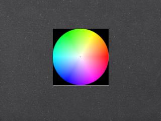
HUE Saturation Brightness
Other Models • There are MANY subtractive color models for art • Long history with many opinions, techniques, styles, models etc. • Few use additive color model • Some exist solely for design and have no basis in physics or ink mixing!
Color Schemes • Lots of factors influence wether a color scheme is “good” = no absolute rules • Makes use the Traditional Art Color wheel • Primary colors on the wheel are RYB
Primary Colors • Red • Yellow • Blue
Secondary Colors • Mixed primary colors (RYB) • Orange • Green • Purple • Thought of as “weaker” colors
Tertiary Colors • Yellow-Green • Yellow-Orange • Red-Orange • Red-Violet • Blue-Violet • Blue-Green
Art 12 Color Wheel • Conceptual foundation • HUE Based • Brightness & Saturation are “add-ons”
Visual Contrast • Contrast of “Value” (Brightness) • Contrast of Hue (Which Color) • Contrast of Temperature • Contrast of Proportion • Contrast of Saturation • Complementary Contrast • Simultaneous Contrast
Contrast of “Value” • Humans see light / dark contrast more than any color and we seek the edges • Quickest way to confuse a user is to lack contrast (similar for everything)
Contrast of Hue • Flags and Symbols use these • Strong Hue (color) changes (not shades) • Makes it look more busy • Undermines cohesiveness of the whole
Contrast of Temperature • Warm & Cool • The difference between them creates a contrast • Psychological, metaphorical • The mind groups these colors and makes them opposite - and notices the transitions (contrast)
Contrast Proportion • Hues are given a relative value • Red and Green can be used in similar amounts (space covered) • Blue is ⅔ and Orange is ⅓ • Formal way of saying don’t use too much of one color vs another.
Contrast of Saturation • Humans also will linger on high colored areas • Logos and Flags also use this • A few films used the extreme of this
Complementary Contrast • Placing opposing hues near each other • Each makes the other look more intense - psychological • “balance” in our field of vision • Can cause retinal fatigue
Simultaneous Contrast • A color is altered by the surroundings! (see Ted talk) • Hue, Brightness, Saturation, Temperature are all impacted • Dark/Bright backgrounds can make a color seem lighter/darker • Saturation is also relative