Download
1 / 26
270 likes | 482 Vues
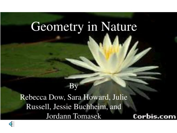
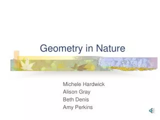
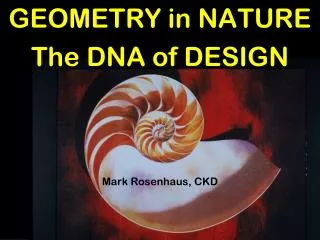
GEOMETRY in NATURE The DNA of DESIGN Mark Rosenhaus, CKD. Nautilus shell fits into a Golden Rectangle and is the same spiral as the side of your fist.

E N D
GEOMETRY in NATURE The DNA of DESIGN Mark Rosenhaus, CKD
Nautilus shell fits into a Golden Rectangle and is the same spiral as the side of your fist.
Drawing the Nautilus Golden Rectangle. Begin with a 1x1 square (Acc) , add a smaller (cDd) square 62% of the original square. This will produce a Golden Rectangle, where the width is 62% of it’s length (1:1.62). Add another square (dBe) 62% of the second square, followed by square (efh) which is 62% of the previous square, and so on. Scribe an arc from A - c, then another arc from c - d, then d - e, e - f, f - g and g - h to complete the spiral.
Spiral of the galaxies The spiral of the galaxies is the same swirl as the Nautilus and the side of your fist.
DNA building block pattern repeats within a square and Golden Rectangle. What is inherent in Nature and humans, is the reason we enjoy this proportion in everything else.
Sunflower spirals in a clockwise direction count 34; counter clockwise there are 55. Exactly Fibonacci Numbers in a 62% relation.
Fish Proportions: The main body is a Golden Rectangle, 1 unit high and 1.618 (1.62) units wide. The remaining tail section is 1 x 1. The mouth is 62% of the body height.
Leonardo Da Vinci’s Vitruvian Man is the familiar icon of proportion. The width of the outstretched arms equals his height (within the square). The chest is 62% of the arms. A perfect star fits within the circle using the same proportions.
Michelangelo’s “David” has a beautiful body. The floor to navel distance is 62% of his height. At birth the navel is in the middle of the body. Boys at 13 years may also have perfect proportions, then between 13 - 17 their proportions will vary until growth stops. My son at 13 had perfect proportions, then his legs grew more and now we say he has long legs.
Fibonacci proportions of the finger: The first digit is 62% of the second digit, which is 62% of the third. The total length of the first two digits equals the third digit.
Audrey Hepburn – face analysis: A square is formed as the width of her face equals the height from chin to eyebrows. Another square is formed from the corners of her mouth up to the underside of her eyes. A Golden Rectangle is the width of her face, then from chin to the top of her head. Each cheek is 62% of her mouth as is the chin to mouth distance, and from the underside of her eyes to the top of her eyebrows. Most women have nice size cheeks, but a large chin distance makes a long face while the eye area is usually too small. Some women shave, then redraw their eyebrows. A friend with a narrow face pulls her hat down to her eyes and is more attractive because it ‘squares her up’. Drawing diagonal lines through the two squares of her face intersect at the tip of her nose. Scribing an arc from her nose to the corners of her mouth delineates the curve of her lower lip.
Why is a Greek Urn so beautiful? Similar to the face, the width is 62% of the height as are the upper and lower sections 62% of the middle. Good decoration emphasizes form, as provided by the figures. The width of the outer portion of the opening (17.5) is 62% of the inside diameter (11.6). The three segments of the lower portion (above the base), are in Fibonacci sequence.
Stonehenge Golden Proportions: The distance between the center stones is 62% wider than the space from the stones to the outer edge of the ring. Once again, proportions similar to the face mouth to cheek distance.
Empire State Building. The focal point is designed within a square. Three pairs of Generating Lines crossing at strategic points determine location of windows, decoration and change in setbacks of the building. Outside corners of the building guide to the top of the tower. Placement as well as proportion create a lasting impression.
Mies Van Der Rohe. The chair is designed within a square. The proportions of the back and seat are also squares. Arcs from the corner and mid point determine the curves.
Previously the portrait was centered on the $10 note. Now, the distance from the right edge to the right eyebrow – which is the focal point – is 62% of the total length of the bill.
The Space Shuttle’s wingspan and length are 78 feet and 122 feet - a 64% ratio. (62% might have prevented its problems.)
The original definition of symmetry was the balance of harmony and proportion based on weight and mass. A ballerina in the arabesque position is balanced at the center of gravity of the sacrum, upheld by the tip of her toe and one outstretched leg; she moves and the beauty of the moment is gone. The modern definition has regressed into the idea of axial (or mirror) symmetry – a vertical line with two items equidistant from each side. This works with small objects or only minimal time to understand the design. On a large scale it is monotonous.
The dynamic tension is a diagonal created by his arms and her legs forming an ‘X’ from his back foot, hands and her chest towards the stone at the upper right.
Note the difference where the photos are cropped. In the lower picture, his hand points directly to the corner. Not so in the upper photo. His arm to hers leads to the lower corner. His front leg to her chest curves to the right corner, then returns to the lower right corner. Though they are not in the center, the picture is balanced and you can feel the movement. We are, at first, attracted to his face which gazes at hers in the center of the picture. The upper photo is static.
The beauty of gracefulness in line, form and movement. The beginning is not the same as the end. It is not axial symmetry, yet it is balanced.
Georges Seurat skillfully positions precisely sized objects around the canvas to direct the scene. Notice the red umbrella, where the man to its left is looking tangent to it towards the tree, then down in between the seated girls. From the black umbrella in the upper right, a diagonal goes through the girls as the dog’s tail and nose are exactly on the line.
The Cathedral of Notre Dame is designed within a Golden Rectangle. A square defines the lower portion. The size and placement of the rosette is tangent to the diagonals of the square and the larger Golden Rectangle. The bottom of the rosette is at the midpoint of the square – just as the eye is on a face.
The Taj Mahal is designed within a square. The entrance is a square with its size determined by a diagonal from the midpoint at the base up to the outer square. The distance above the door is 62% of the overall height.