Creating Mobile Optimized Websites Using WordPress
If your WordPress site has a desktop theme in which everything is set in pixels then adopting a responsive website design would be a right choice.Here we will give four ways how to make your WordPress blog or website mobile friendly.<br>

Creating Mobile Optimized Websites Using WordPress
E N D
Presentation Transcript
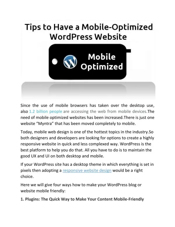
Since the use of mobile browsers has taken over the desktop use, also 1.2 billion people are accessing the web from mobile devices.The need of mobile optimized websites has been increased.There is just one website “Myntra” that has been moved completely to mobile. Today, mobile web design is one of the hottest topics in the industry.So both designers and developers are looking for options to create a highly responsive website in quick and less complexed way. WordPress is the best platform to help you do that. All you have to do is to maintain the good UX and UI on both desktop and mobile. If your WordPress site has a desktop theme in which everything is set in pixels then adopting a responsive website design would be a right choice. Here we will give four ways how to make your WordPress blog or website mobile friendly: 1. Plugins: The Quick Way to Make Your Content Mobile-Friendly
If your site is all about a good informative content and you want user to be able to read it without having to zoom in, then you should consider these plugins- WPtouch - Displays the content which is user-friendly, robust and easy to read. WordPress Mobile Pack - It has a mobile interface for editing posts BuddyPress Mobile –It has theming options, and you can edit the style sheet to make the mobile design your own. 2. Mobile Themes: The Next Level Up Twenty Eleven - WordPress’ default theme Carrington - It allows you to edit the CSS and functions to suit your needs.
Schezro- You can use it as a parent theme. It uses a mobile-first responsive website design. 3. A Different Theme for Mobile Devices If you want to serve two versions of your website from the same database is possible, by using a mobile switcher here are the two plugins that may help you: WordPress Mobile Pack WPtap Mobile Detector 4. Finally, Make Your Current Theme Responsive Build a responsiveness into your existing themes DEFINING THE MEDIA QUERIES First, you will need to define media queries in the style sheet then add CSS that is different for mobile devices. Define the screen width for each screen type.
@media screen and (max-width: 320px) { } @media screen and (max-width: 480px) { } MAKING THE LAYOUT RESPONSIVE Overall width of website body{ width: 100%; float: none; } @media screen and (max-width: 480px) { body{ width: 100%; float: none; } } Width of content and sidebar #content, #primary, #secondary { width: 100%; float: none; margin: 10px 0;
} Footer content, especially widgets footer .widget-area { width: 100%; float: none; margin: 10px 0; } Image sizes bodyimg{ max-width: 100%; } Text size body{ font-size: 60%; line-height: 1.4em; } CHANGING THE NAVIGATION MENUS AND CREATING AN APP-LIKE INTERFACE Summary Hopefully this article will help you make you WordPress website design mobile friendly.