Download

1 / 34
340 likes | 475 Vues
This piece explores the nuanced distinctions between visual art and visual design, emphasizing the artist's self-expressive goals versus the user-centered objectives of design. It delves into the essential skills graphic designers must possess, including an understanding of color, typography, and user interaction. Key concepts such as avoiding visual noise, establishing contrast, and effective layering are discussed to enhance information design. The article underlines the importance of cohesive visual communication and appropriate use of imagery for effective branding and user engagement.

E N D
Designing Look and Feel Cooper 19 William H. Bowers – whb108@psu.edu
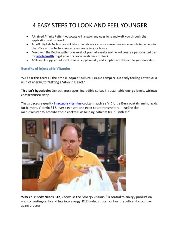
Visual Art vs. Visual Design • Artists produce artifacts to provoke an aesthetic response • Art is self-expressive • Art meets the artist’s goals • Visual design meets the goals of the user, not the designer • Communicates to the end user William H. Bowers – whb108@psu.edu
Graphic Design and Visual Interface Design • Design is within a functional framework • Designer must understand color, typefaces, form and composition • Also must understand interaction with and the behavior of the software William H. Bowers – whb108@psu.edu
Graphic Design and UIs • Graphic design has been mostly print • Graphic designers understand visual principles • Weaker understanding of software and UIs William H. Bowers – whb108@psu.edu
Visual Interface and Information Design • Some graphic design skills necessary • Focus is on organizational aspects • Must be knowledgeable of interaction • Match visual structure with logical William H. Bowers – whb108@psu.edu
Visual Interface and Information Design • Communicate program states to users • In web design, content outweighs function • Work closely with information architects William H. Bowers – whb108@psu.edu
Visual InformationDesign Principles • Avoid visual noise and clutter • Use contrast, similarity and layering • Provide structure and flow • Be cohesive, consistent and appropriate • Integrate style and function William H. Bowers – whb108@psu.edu
Avoid Visual Noise and Clutter • Superfluous visual elements • Makes it impossible to communicate • Over embellished elements • Overuse of lines and rules • Jumbled, overcrowded screens • Too much functionality in too little space William H. Bowers – whb108@psu.edu
Avoid Visual Noise and Clutter • Keep non-entertainment UI’s simple • Use simple forms and graphics • Muted (less saturated) colors • One or two fonts in one or two sizes • Make similar items appear similar • Use controls that can serve multiple purposes William H. Bowers – whb108@psu.edu
Contrast • Visual contrast between active and passive elements • Contrast between logical sets • Can indicate importance • Pseudo 3D • Hue, saturation and brightness • Spatial (positional) contrast • Shape, orientation, size William H. Bowers – whb108@psu.edu
Layering • Receding • Dark • Cool • Desaturated • Small elements William H. Bowers – whb108@psu.edu
Layering • Advancing • Light • Warm • Saturated • Large elements William H. Bowers – whb108@psu.edu
Figure and Ground • We usually perceive • Light objects as figures • Dark objects as background • Center the figures on the background • Give figures and background equal weight William H. Bowers – whb108@psu.edu
Visual Testing • Squint • Use a mirror • Invert the screen William H. Bowers – whb108@psu.edu
Structure and Flow • Grouping • Position or proximity • Alignment • Color • Texture • Size Shape • Use clear, simple grids William H. Bowers – whb108@psu.edu
Alignment and Grids William H. Bowers – whb108@psu.edu
Logical Flow William H. Bowers – whb108@psu.edu
Symmetry and Balance William H. Bowers – whb108@psu.edu
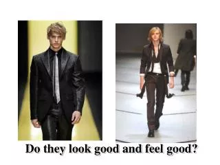
Appropriate Imagery • Understand what needs to be communicated • Understand how the user thinks about what must be communicated • Must know the visual language of the user’s domain and environment • Culturally dependent William H. Bowers – whb108@psu.edu
Function Oriented Icons • Represent action and verb • Make sure meanings are appropriate for the audience • Group related functions • Keep icons simple • Reuse elements, when possible William H. Bowers – whb108@psu.edu
Branding • Sum of interactions people have with a company • First impressions of product are important • Build customer relationships through branding William H. Bowers – whb108@psu.edu
Principles of Visual Information Design • Two problems (according to Tufte) • Difficult to display multidimensional information on 2D surface • Resolution does not support dense information William H. Bowers – whb108@psu.edu
Tufte’s Grand Principles • Enforce visual comparisons • Show causality • Show multiple variables • Integrate text, graphics and data • Quality, relevance and integrity • Show things adjacent in space • Don’t de-quantify quantifiable data William H. Bowers – whb108@psu.edu
Enforce Visual Comparisons • Compare related variables • Show trends • Compare before and after • Use previews William H. Bowers – whb108@psu.edu
Show Causality • Show consequences • Demonstrate cause and effect William H. Bowers – whb108@psu.edu
Show Multiple Variables • Display if related • Don’t sacrifice clarity William H. Bowers – whb108@psu.edu
Integrate Text, Graphics and Data • Separate keys and legends are less effective • Shifting focus is distracting • http://www.koa.com/where/pa/ William H. Bowers – whb108@psu.edu
Quality, Relevance and Integrity • Insure data supports goals • Insure quality of data • Poor quality or missing data destroys credibility William H. Bowers – whb108@psu.edu
Show Things Adjacent in Space • Don’t superimpose • Show sequential images William H. Bowers – whb108@psu.edu
Don’t De-quantify Quantifiable Data • Graphs are useful to see relationships • Must retain numbers to be meaningful William H. Bowers – whb108@psu.edu
Text • Text forms recognizable shapes • ALL CAPS ARE HARD TO READ • Visually show what • Textually show which • Use high contrast with background • Don’t use less than 10 point fonts • Keep text short William H. Bowers – whb108@psu.edu
Color • Draws attention • Improves navigation and scanning speed • Shows relationships • Seven or more degrades use • Don’t put complementary colors together William H. Bowers – whb108@psu.edu
Standards and Guidelines • Develop for the product • Does not insure a good UI • Must evolve with technology • Should not be rigid rules • Violate only when necessary William H. Bowers – whb108@psu.edu
Questions & Discussion William H. Bowers – whb108@psu.edu